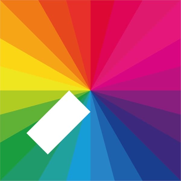
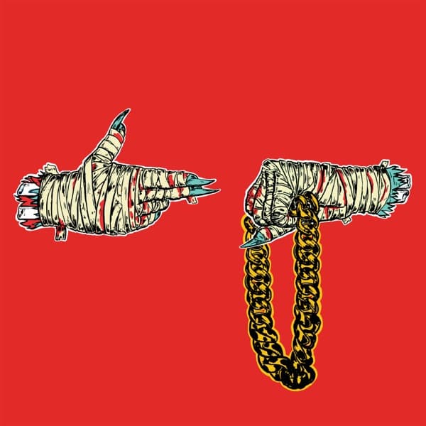
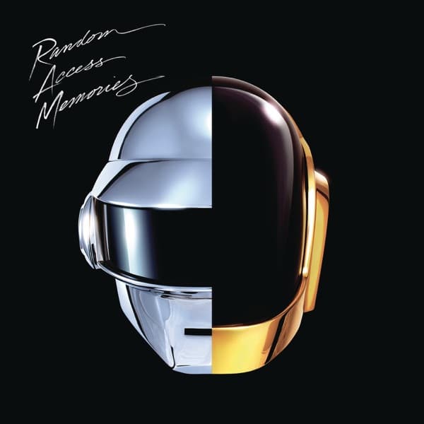
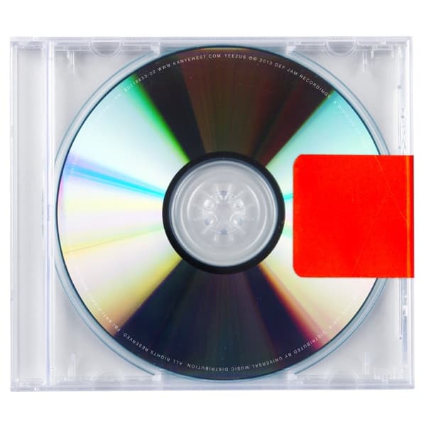
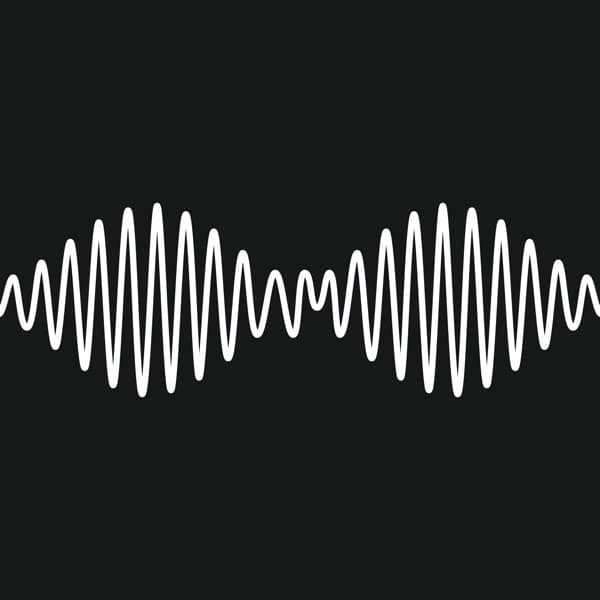
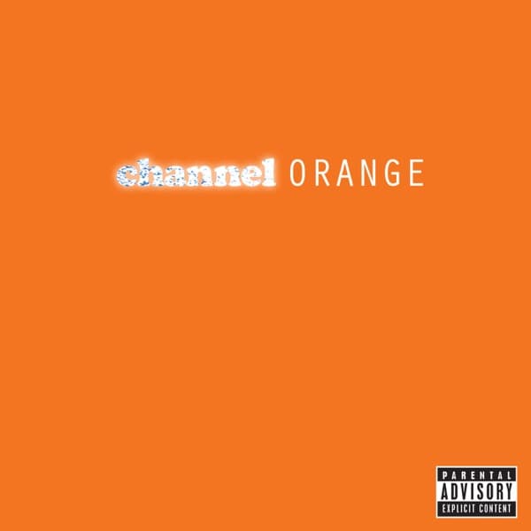
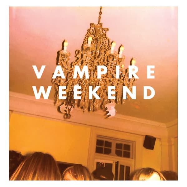
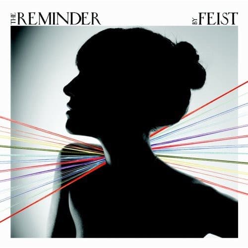
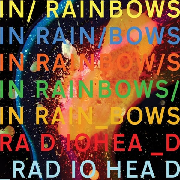
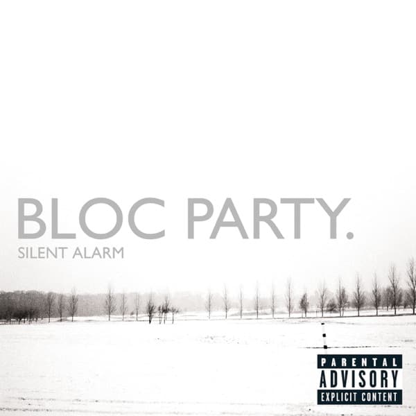
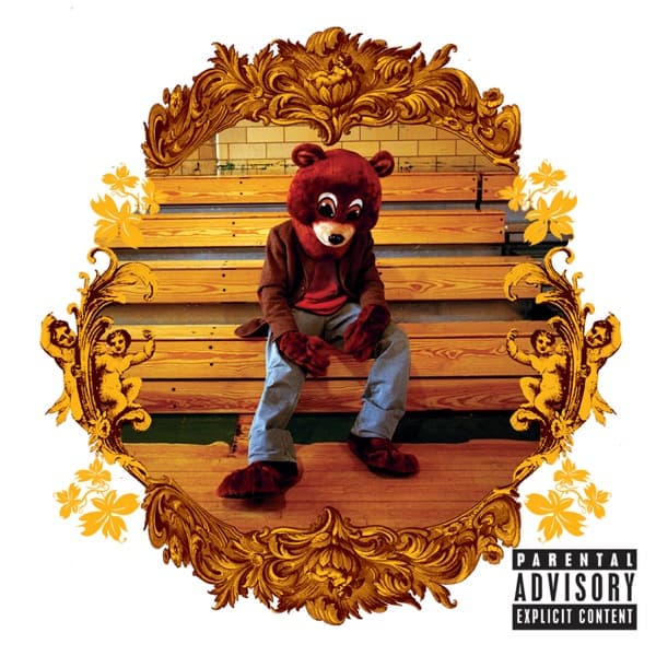
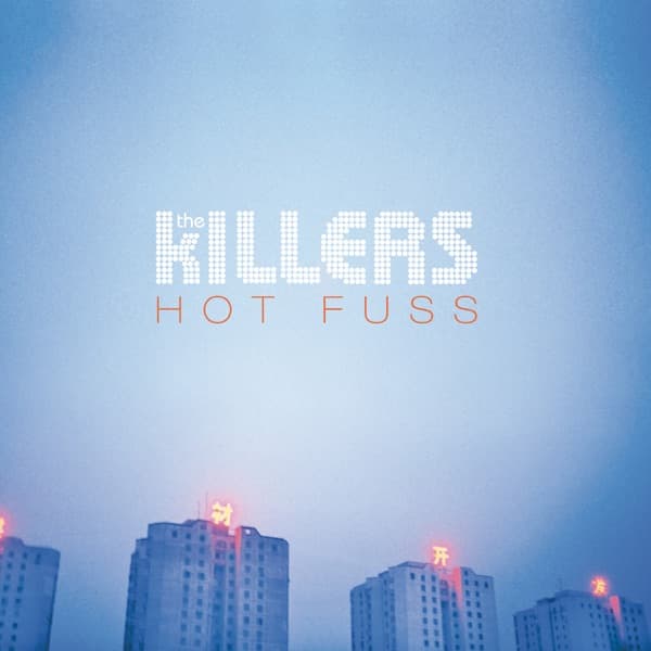
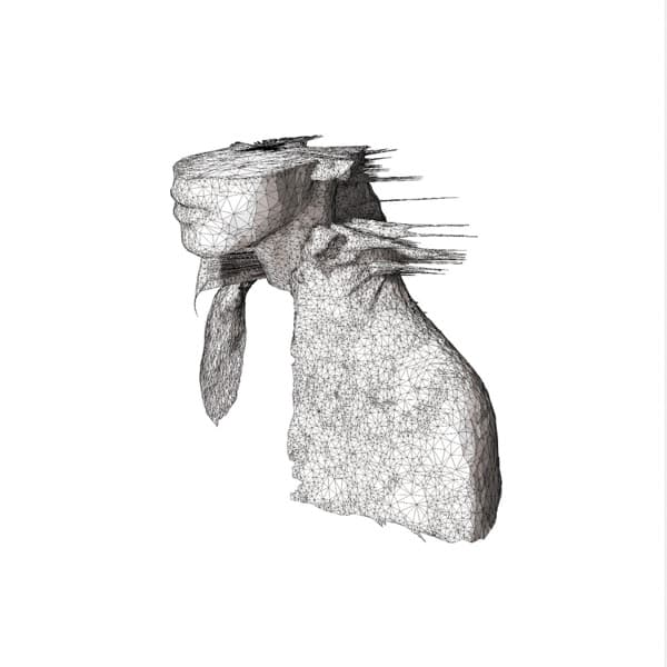
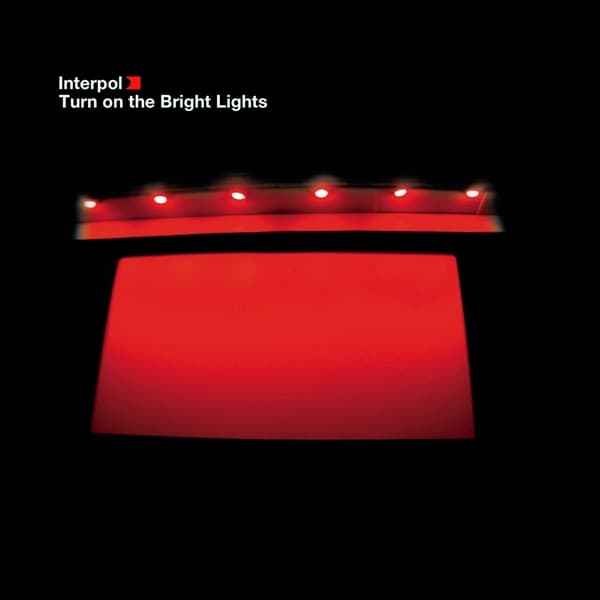
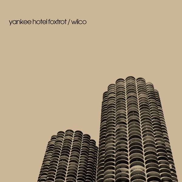
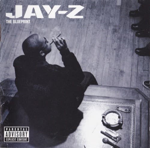
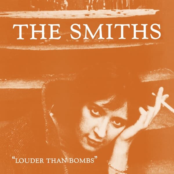
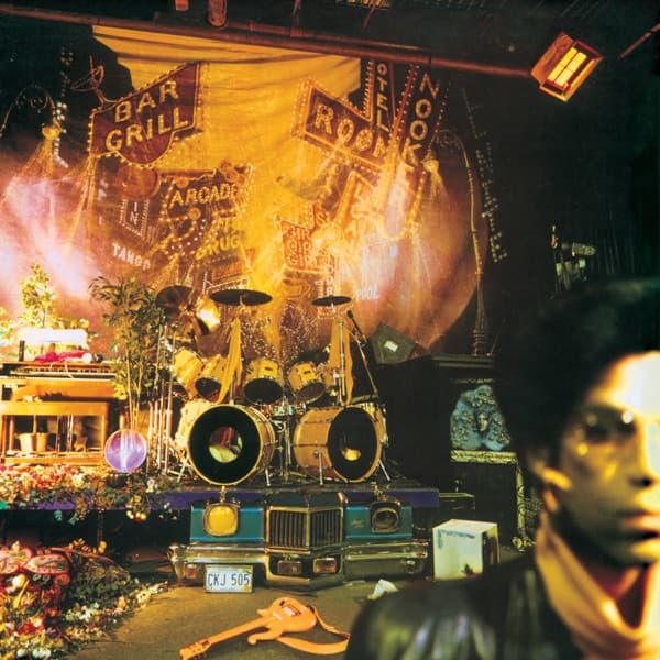
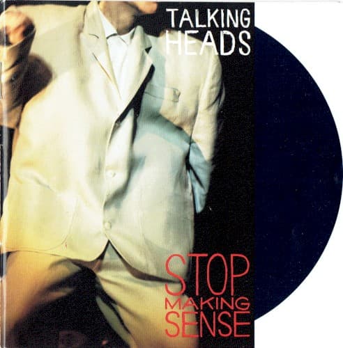
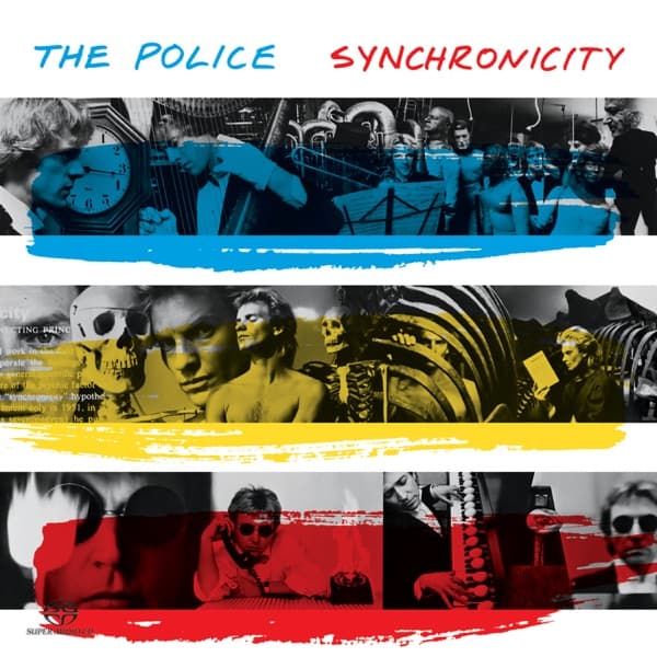
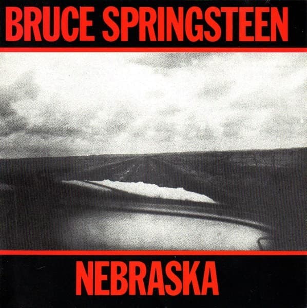
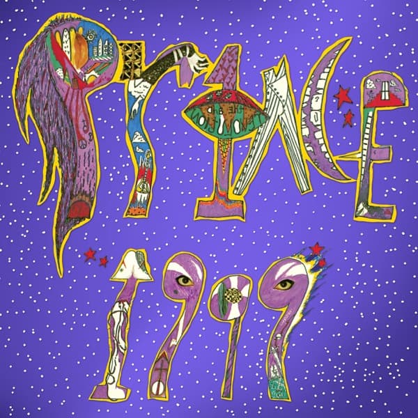
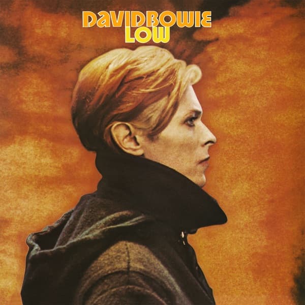
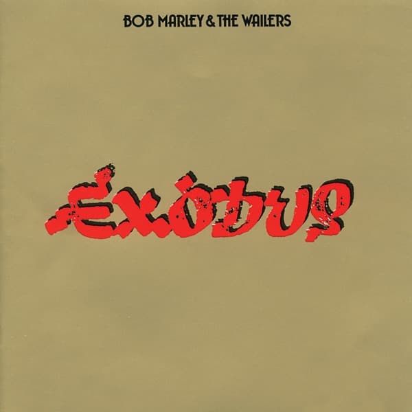
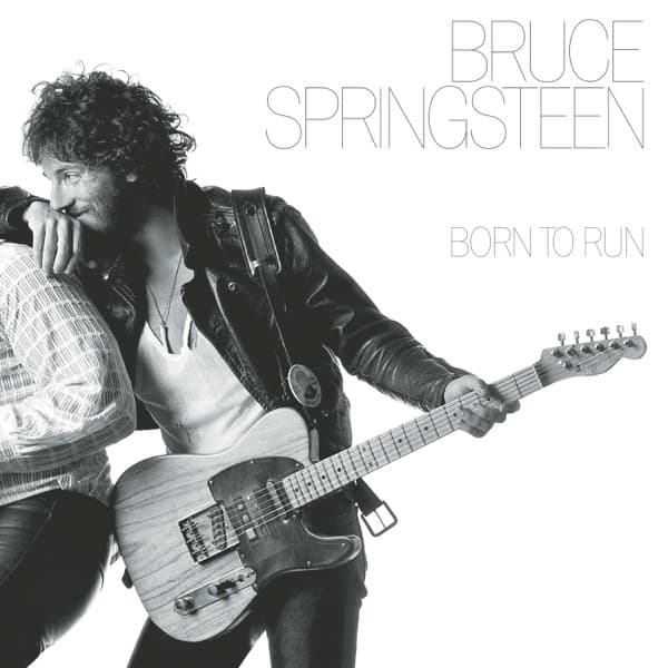
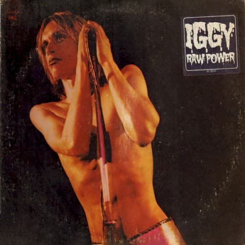
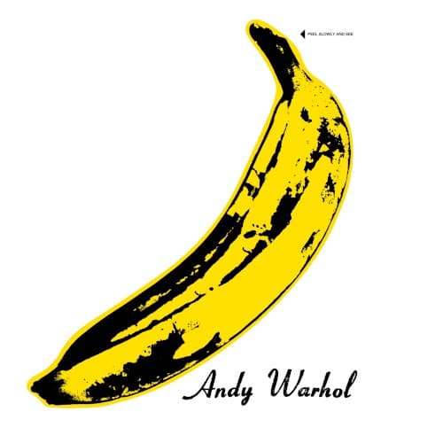
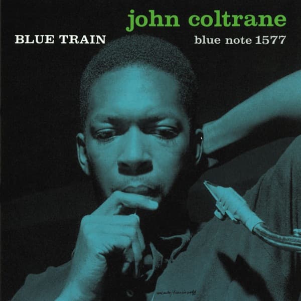
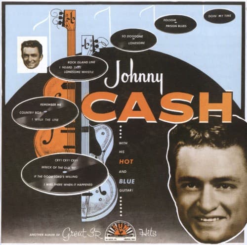
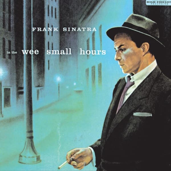
A minimalist album cover is a bet. It wagers that one idea — a single shape, a word, a field of colour, a photograph with all the air left in — can hold up an entire record without any help. When the bet pays off, the result is the kind of image you can redraw from memory: a prism, a waveform, a lime-green rectangle.
This is a working list of 105 of them, running from Frank Sinatra's In the Wee Small Hours and Reid Miles' Blue Note sleeves in the 1950s all the way to Charli XCX's Brat and Kendrick Lamar's GNX. What links a 1955 torch-song record to a 2024 pop album is not a look — it's a method: decide what the cover is about, then delete everything that isn't that.
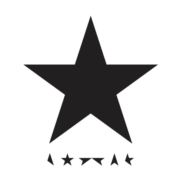
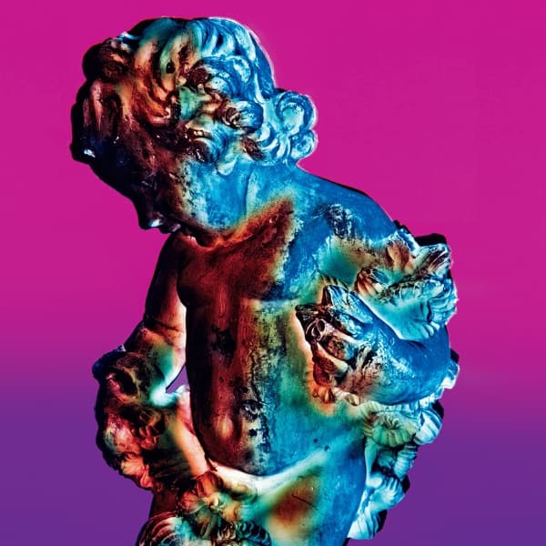
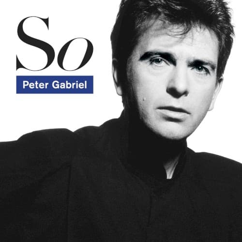
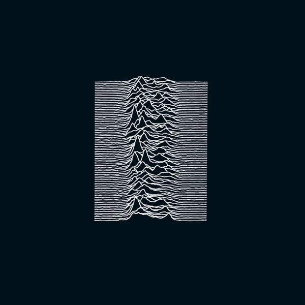
A few threads run through the set. The first is that minimalism is not the same as emptiness. Peter Saville's Unknown Pleasures is mostly black space, but the space is the point — it isolates the pulsar signal until it stops being a data plot and starts being a mountain range, a heartbeat, a horizon. The second is authorship: a striking amount of this list runs through a small number of hands — Saville (Joy Division, New Order, Peter Gabriel, Bloc Party), Reid Miles at Blue Note, Storm Thorgerson's prism, Barnbrook's Blackstar. Minimalism rewards a designer with a system.
The third thread is the newest, and it explains why the list gets denser toward the top. In the streaming era a cover has to work as a thumbnail before it works as a sleeve — a square the size of a fingernail in a phone playlist. Dense artwork dissolves at that scale; a single bold mark survives it. Brat, Midnights, CHROMAKOPIA, DAMN. — these covers aren't just minimal because it looks good. They're minimal because it's legible at 40 pixels, and legibility is now distribution. Minimalism stopped being only an aesthetic and became a strategy.
The thing most people miss is how much confidence a spare cover demands. A crowded sleeve can bury a weak idea in detail; a minimal one has nowhere to hide, so every choice — the weight of a typeface, the exact grey, whether the band's name appears at all — is load-bearing. The list is ordered newest-first, but the lineage runs the other way. Each card links to the full story of the album: how the cover was made, who designed it, and why doing less turned out to be the most durable move on the shelf.
For covers chosen for their hidden meaning, see the companion guide to album cover meanings. To follow a single designer's system across the catalogue, browse the designers directory, and to see the covers built purely from type or a single colour, browse by attribute.
- What makes an album cover “minimalist”?
- Restraint that reads as a decision, not an absence. A minimalist cover strips the sleeve down to a single controlling idea — one shape, one word, one photograph, one field of colour — and then trusts that idea to carry the whole record. It is not the same as a cover that simply has nothing on it: the discipline is in what gets removed and how deliberately, from the exact grey of Kraftwerk's Autobahn to the empty white expanse Peter Saville left around the pulsar waveform on Unknown Pleasures.
- Isn't a plain cover just the lazy option?
- It's usually the harder one. A busy cover can hide a weak idea behind detail; a minimalist cover has nowhere to hide, so every choice — typeface, kerning, the position of a single line — is load-bearing. Reid Miles' Blue Note sleeves, Saville's New Order work, and Jonathan Barnbrook's Blackstar are studied precisely because that little is doing that much. The lazy version exists, but it's the one you forget by the next track; the great ones you can redraw from memory.
- Why have minimalist covers surged in the streaming era?
- Legibility at thumbnail size. A cover now has to survive as a fingernail-sized square in a phone playlist before it's ever seen as a 12-inch sleeve, and dense artwork turns to mud at that scale while a bold minimal mark stays sharp. Charli XCX's lime-green Brat, Taylor Swift's Midnights, Tyler, The Creator's CHROMAKOPIA and Kendrick Lamar's GNX all weaponise that constraint — a colour or a word you can recognise in a scroll. Minimalism went from an aesthetic to a distribution strategy.
- Which designers are most associated with minimalist covers?
- Peter Saville above all — Unknown Pleasures, New Order's Technique, Peter Gabriel's So, Bloc Party's Silent Alarm all run through him. Before him, Reid Miles built the visual language of Blue Note in the 1950s, and Storm Thorgerson's prism for The Dark Side of the Moon proved a single icon could outlast the band. More recently Jonathan Barnbrook (Blackstar) and Me Company (Björk's Debut and Vespertine) carry the thread. Browse the full designers directory to follow any of them across the catalogue.
- What's the most famous minimalist album cover?
- The two usual answers are The Dark Side of the Moon's prism and Joy Division's Unknown Pleasures waveform — both so reduced that they long ago escaped the records themselves and became pure symbols, printed on more t-shirts than either album has sold copies. Which one wins depends on whether you grew up with classic rock or post-punk; that a fifty-year-old prism and a plotted radio signal from a dead pulsar are both still everywhere is the whole argument for minimalism in one sentence.