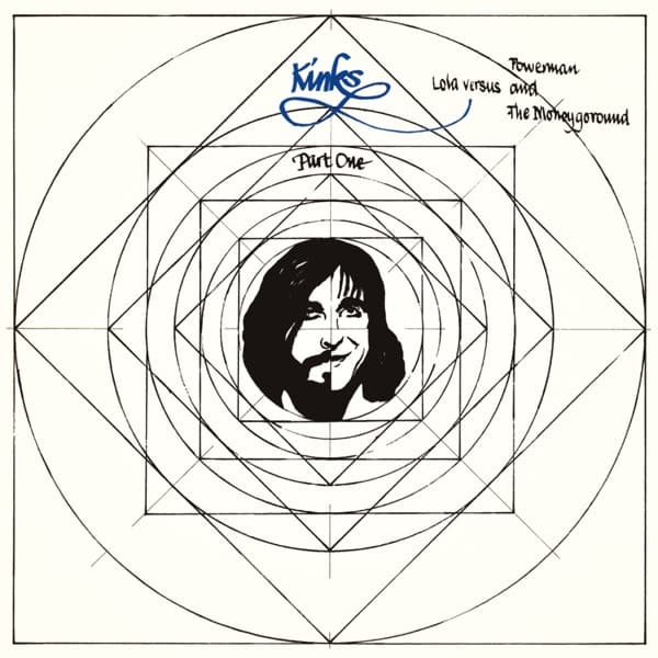
Look past the pull toward the center and study how the geometry is actually constructed, because the drawing announces its own method. This is not decoration laid over a background; it is a working diagram, the kind of ruled construction a draughtsman leaves visible while solving a problem. Squares are inscribed inside circles, then rotated forty-five degrees so their corners touch the next circle out, then squared again, each rotation generating a diamond nested inside a diamond. Faint diagonals run corner to corner across the whole field, the guide lines you are usually told to erase. Keeping them means the sleeve reads as process rather than product: proportion being worked out in front of you. That is the point of the Leonardo da Vinci reference Ray Davies has named. The Vitruvian ideal is about fitting the human body to circle and square, and here the apparatus of that idealizing geometry is drawn out at full size, with a single face lowered into the exact mathematical middle as if to be measured against it.
The tonal scheme sharpens the argument. Almost the entire image is line, thin uniform strokes on cream, no shading, no weight, a nervous-system diagram with nothing living in it. Then the face arrives as the one passage of solid black. It is drawn in brushy high-contrast ink, hair dropping in heavy masses on either side, eyes and mustache set as dark blots, the whole thing built from filled shapes rather than the hairline rules around it. That contrast in technique, pen-ruled geometry versus loaded-brush portrait, is the whole tension of the cover compressed into a difference of mark-making. The mechanical world is weightless and exact; the human face is smudged, warm, irregular, and it refuses to dissolve into the grid trying to contain it.
Scale does a lot of quiet work. The head is tiny relative to the sheet, an oval you could cover with a thumb, and it sits inside the smallest ring of the whole nested system, the last enclosure before the center. Everything around it is larger, cooler, more ordered. The effect is of a person shrunk to fit a specification, dwarfed by the coordinate system built around him. Yet the face is turned slightly and softened by that half-smile, so the reading is not simply captivity. It is a man aware of the machine and holding his expression anyway.
The lettering is deliberately handmade, and its placement matters. The band name at upper left is a looping blue cursive, closer to a signed autograph than a set typeface, its final flourish curling back on itself like a ribbon. The title beside it, running down the right, is in a slanted informal hand, the words stacked in short lines, casual and quick. Lower center, floating on one of the ruled lines, sits "Part One" in the same script. Nothing here is typeset in a clean geometric font, which would have matched the diagram. Instead the words are all human handwriting, and they cluster in the upper third and center, deliberately breaking the symmetry a compass would demand. The one wet, curling blue signature set against all that dry black ruling is a small rebellion against the grid it sits on: the human hand signing across the machine's blueprint.
The background is not empty space so much as active field. The cream paper reads as drawing stock, and leaving so much of it bare lets the ruled lines breathe and keeps the whole thing feeling like a page from a notebook rather than a finished poster. The circles bleed almost to the edges of the square jacket, so the outermost ring is cropped by the sleeve itself, which quietly makes the record cover the final square in the sequence, the physical object completing the nested geometry that the drawing began.
Small things reward a second look. The corner-to-corner diagonals create a faint eight-pointed star behind the diamonds, a pattern that reads almost like a mandala or a compass rose, which pushes the clinical diagram toward something ceremonial, a target or an altar for the little head at the center. The brush portrait is loose enough that the smile is genuinely ambiguous, more a set of the mouth under the mustache than a clear grin, which is why it holds you.
Put together, the image argues its record's subject before a note plays. A working figure is placed at the dead center of a beautiful, cold, self-generating system of ideal proportions, measured and framed and reduced to scale by it, and instead of being crushed he is drawn in warmer, messier ink than anything around him, signing his own name in wet blue across the top. The machine wants a perfect specimen; the man at the middle stays stubbornly, smudgily human. That is why the composition works: the geometry does all the funneling, and the face wins anyway.