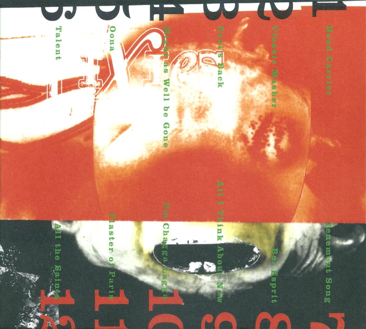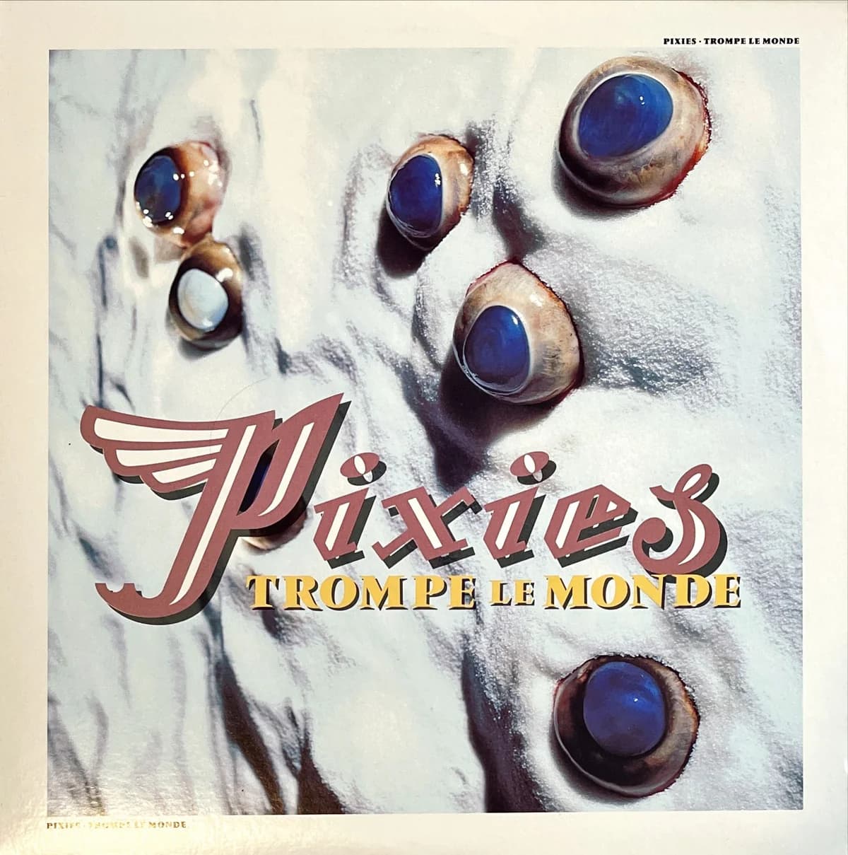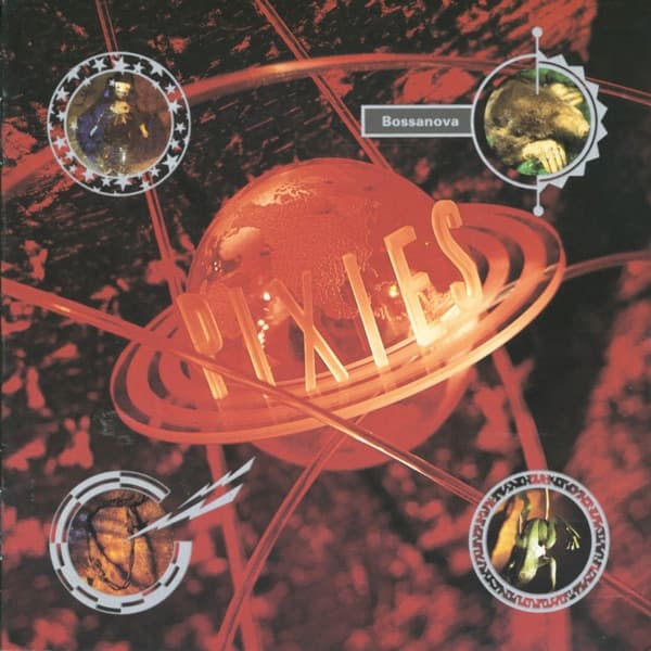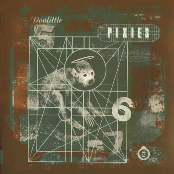
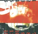

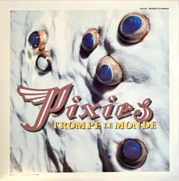
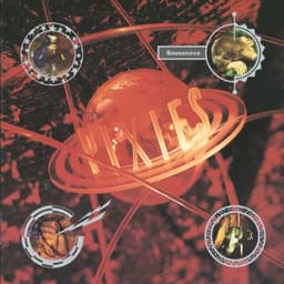
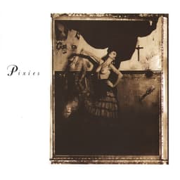
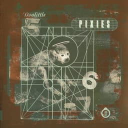
When Pixies returned with Indie Cindy, the easiest visual move would have been nostalgia. Vaughan Oliver had already given the band one of alternative rock's most recognizable runs of sleeves: the staged heat of Surfer Rosa, Doolittle's haloed monkey, Bossanova's glowing planet and Trompe le Monde's bull's-eye landscape. Twenty-three years after the last of those studio albums, he chose not to rebuild any of them.
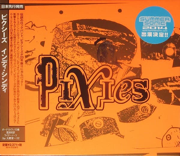
Instead, Oliver commissioned Ian Pollock, an illustrator whose work he had followed for more than three decades without previously getting the chance to use. Oliver later singled out Indie Cindy as a fresh move for Pixies artwork and described Pollock's front-cover illustration as mischievous, provocative and beautiful. That first-person assessment matters more than trying to force the image into one literal symbolic reading: the point was not to reproduce the old 4AD vocabulary, but to give the returning band a new visual voice.
Pollock's drawing dominates the front. It is a surreal, character-driven image rather than the kind of staged photography associated with Simon Larbalestier's classic Pixies sleeves. Vaughan Oliver handled the art direction and design, while release credits also identify Michael Speed with additional illustration and design work. The package therefore belongs to the same collaborative tradition as the older records even though its surface looks different.
That shift mirrored the strange status of Indie Cindy itself. The record gathered the songs from EP1, EP2 and EP3 into Pixies' first studio album since Trompe le Monde. It arrived after Kim Deal had left the band during the recording period, with Black Francis, Joey Santiago and David Lovering joined in the studio by bassist Simon Archer. Contemporary coverage treated the album as a test of whether Pixies could make new work without simply living inside their own reunion.
The sleeve answers that question visually by declining to impersonate the past. There is no rerun of the Doolittle grid, no Larbalestier specimen photograph and no attempt to make a sequel to Bossanova's miniature cosmos. Oliver kept the continuity where it actually mattered: strong collaborators, an image that resists immediate explanation, and typography treated as part of the object rather than as a neutral label.
That is also why the cover is useful in the larger Pixies story. A catalog can become visually coherent through repetition, but Oliver's Pixies work is coherent through method. Different records use dancers, taxidermy, planetary constructions, animal anatomy and illustration, yet each sleeve gives the music a strange parallel world instead of explaining it literally. Indie Cindy extends that method into the reunion era.
The physical editions pushed that sense of object-making beyond the front image. Oliver later highlighted the inner sleeve's fluorescent orange and gold foil as part of the surprise of the package. Those production choices are a reminder that the front cover is only one panel of the design: Pollock's illustration introduces the world, while color, material and print treatment carry it through the object.
The result does not look like a lost 1991 Pixies record, and that is its real historical value. Indie Cindy marks the point where Oliver proved that a visual identity built in the late 1980s could survive by changing collaborators and materials rather than freezing itself into a heritage style.