Vaughan Oliver was the house designer at 4AD Records, the London-based independent label whose visual identity he had single-handedly defined through a decade of collaboration with photographer Simon Larbalestier. Together, they had created a distinctive aesthetic that combined manipulated photography, textured typography, and an almost tactile sense of surface into packages that communicated the label's music before a note was heard. For the Pixies' second album, Doolittle, Oliver and Larbalestier produced a cover that distilled their aesthetic to its essence.
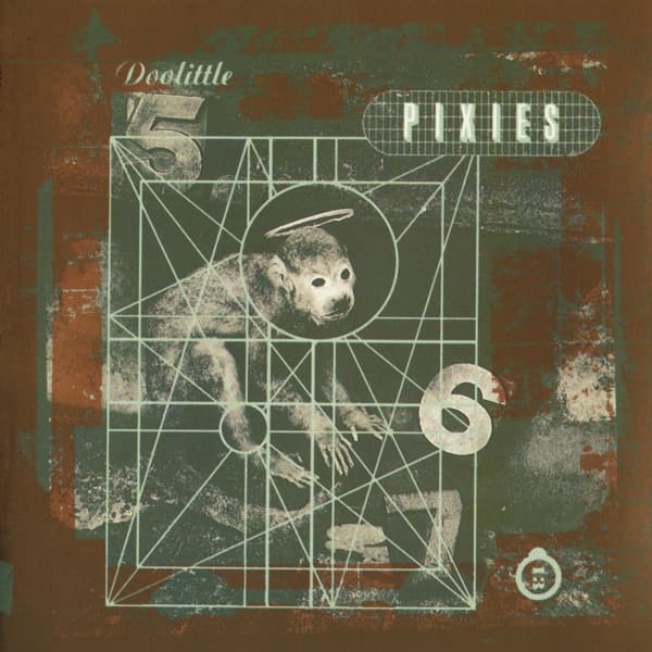
The front cover presents a photograph of a monkey against a warm, sepia-toned background. The image is treated with Oliver's characteristic processing: slightly degraded, its tones shifted toward amber, the surface texture suggesting an aged document or a photograph recovered from water damage. The monkey occupies the center of the frame, its body turned slightly but its face directed at the camera, creating an interspecies gaze that is simultaneously comic and unsettling. Larbalestier photographed the specimen at the Grant Museum of Zoology in London, using natural light and minimal equipment.
The choice of subject was driven by the album's content. Black Francis's lyrics for Doolittle are obsessed with Biblical violence, surrealist imagery, and the thin membrane between the human and the animal. The monkey on the cover serves as a visual thesis statement: we are this, the image says, we are primates dressed in culture, and the culture is thinner than we like to believe. The sepia processing gives the image an archival quality, as though it documents a specimen from the Victorian era of natural history, when scientists were first forcing the Western world to confront its kinship with other species.
Oliver's composition places the monkey asymmetrically in the frame, slightly left of center, with the album title running vertically along the right edge in a tall, narrow font that he designed specifically for 4AD releases. The typographic treatment is characteristically unconventional: the letters are spaced widely, stretched vertically, and printed in a tone that is only slightly darker than the background, requiring the viewer to lean in to read them. This deliberate obscurity is a 4AD signature, communicating exclusivity and demanding engagement.
The color palette is restricted to a narrow range of warm tones: the amber of aged paper, the brown of the monkey's fur, the cream of the background. There are no cool tones and no bright accents, creating a uniformly warm image that has the quality of a sepia-toned photograph or a page from an old encyclopedia. This monochromatic warmth gives the cover a timeless quality that resists association with any specific era, placing the album outside the visual trends of 1989 and in a space that feels both ancient and contemporary.
Larbalestier's photography throughout the Doolittle package extends the natural-history aesthetic with images of preserved specimens, close-up textures of organic material, and studies of form that hover between the beautiful and the grotesque. These images, printed on textured stock and arranged with Oliver's exacting eye for layout, create a booklet that rewards physical handling in a way that digital reproductions cannot capture. The tactile quality of the packaging, its feel of weight and surface, is as much a part of the design as the visual content.
The back cover features a different Larbalestier photograph treated with the same amber processing, accompanied by the track listing in Oliver's compressed, vertically oriented typography. The overall package creates a visual world that is self-consistent and immersive, every element serving the same aesthetic vision. This holistic approach to album design, where front cover, back cover, inner sleeve, and booklet function as components of a single visual statement, was Oliver's greatest contribution to the field.
Doolittle's cover established the Pixies' visual identity as something distinct from both the mainstream rock of the era and the lo-fi aesthetic of American indie. Oliver's sophisticated, art-directed approach proved that independent music could have visual production values that rivaled or exceeded those of major labels while maintaining an aesthetic distance from commercial slickness. The cover's influence extends through the 1990s and beyond, its fusion of fine-art photography and typographic experimentation shaping the visual language of alternative rock on both sides of the Atlantic.