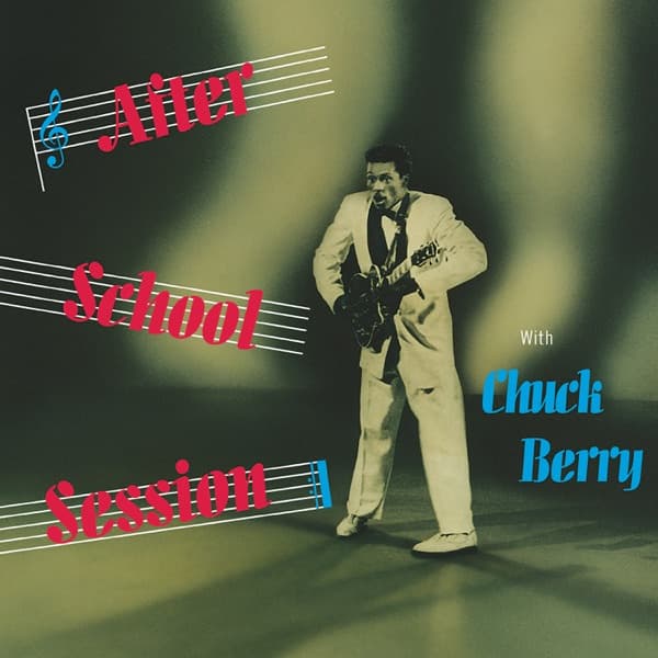
The whole image carries the murky, greenish cast of a film frame rather than a portrait studio. That tonality is the first thing the picture says: this is captured light, not arranged light. Berry's cream suit is the brightest value on the sleeve, and it glows because the dark backdrop swallows everything around it, throwing him forward off a floor washed in a sickly olive. The pale suit and white shoes anchor the eye low and to the right, while the murk drains any sense of a fixed setting. Light falls the way stage light falls, uneven and directional, so the figure feels lit by an event rather than by a photographer.
The figure itself is all arrested motion. The wide stance, the low-slung guitar across the hips, the open mouth mid-phrase, the eyes cut hard to the side: none of it is a pose a subject settles into. It is a body frozen between gestures, which gives the cover its charge. The right hand hovers near the strings, the hollow-body guitar reads as a dark mass against the light suit, and the whole coiled posture insists on the half-second before and after the frame.
What the borrowed photograph cannot do, the typography does. The title climbs the left side in hot pink script set in Allegro (Ludwig and Mayer's 1936 import revision), the words "After," "School," and "Session" each riding a set of slanted musical staff lines that streak across the cover like motion trails. A blue treble clef anchors the top stave; a small bracket of blue notes closes the bottom one. Over on the right, "With" sits in plain News Gothic, modest and small, while "Chuck Berry" blazes in the same swooping blue Allegro, the largest and most confident lettering on the sleeve. The catalog number and "Hi-Fidelity" line would have been set in Spartan or a similar face.
The colour scheme pits cool blue and aggressive pink against the smoky green field, and it choreographs how the eye travels. You land first on the name in blue, then slide down the diagonal staves toward the figure caught mid-song. The tilted staff lines convert the flat rectangle into a field of movement, so the design reads as music made visible, sound rendered as flying lines. The irony is that the central image was never built for any of this. A frame shot for a film becomes, through lettering and layout alone, a picture of a song in the act of being played.