Johnny Cash with His Hot and Blue Guitar! made history as the first full-length album ever released by Sam Phillips' legendary Sun Records in October 1957. The cover became an instant visual symbol of the Memphis label that was revolutionizing American music.
While specific details about the album's designer and photographer remain undocumented in available sources, the cover emerged from the creative environment of Sun Records at 706 Union Avenue. Phillips had established his Memphis Recording Service in 1950, and by 1957, the label was producing some of the most influential music of the decade.
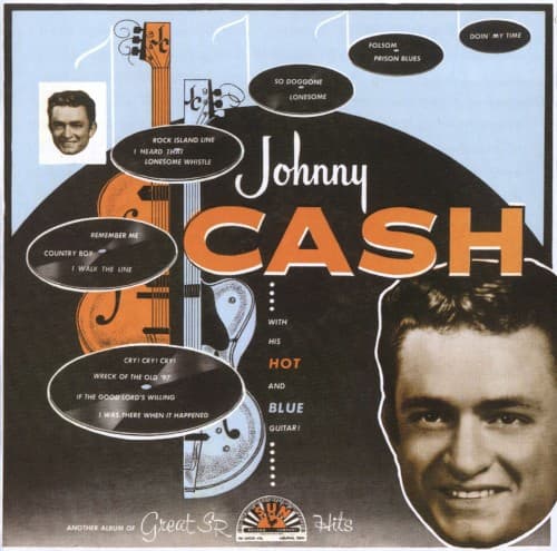
The album cover featured a distinctive design that reflected Sun Records' visual identity. Sources describe variations including a light blue background that was later changed to white on subsequent pressings, with half of a guitar and "CASH" in yellow, while the other half appeared in white. The word "HOT" appeared in yellow lettering, while "BLUE" was rendered in white.
The cover's creation coincided with Cash's meteoric rise at Sun Records. He had walked into the studio in 1955 with just his electric guitar and bass backing from Luther Perkins and Marshall Grant, dubbed "The Tennessee Two" by Phillips. Their stripped-down sound was revolutionary for country music at the time.
Phillips served as both label owner and frequent producer, overseeing the visual and musical direction of Sun Records. The original Sun Records logo, designed by John Gale Parker Jr., featured the iconic yellow label with brown printing and the distinctive sun rays emanating from the center.
The album's release generated significant attention, not just for its groundbreaking music but for its visual presentation. This was Sun's statement piece - their first album-length release featuring one of their biggest stars alongside classics like "Folsom Prison Blues," "I Walk the Line," and "Cry! Cry! Cry!"
The cover art reflected the label's aesthetic philosophy of raw authenticity. Phillips believed in capturing the genuine spirit of his artists, and this extended to their visual presentation. The covers had a distinctive dull finish, as they were not laminated, giving them a more authentic, less commercial appearance.
Reception of the album and its cover was overwhelmingly positive, helping establish the visual language that would become associated with rock and roll's early era. The design choices reflected the rebellious spirit of the music contained within.
The album cover's composition emphasized Cash's name and the guitar imagery, creating a direct connection between the artist and his instrument. The color scheme of blues and yellows evoked both the "hot" and "blue" elements referenced in the title.
Typographically, the cover employed bold, straightforward lettering that matched the honest, no-nonsense approach of Cash's music. This design philosophy would influence countless album covers that followed, establishing a template for rock and country album artwork.
The cultural impact of this cover design extended far beyond its initial release. Later reissues, including a 2026 high-quality vinyl pressing by Intervention Records, specifically noted the restoration of the original artwork, indicating its lasting visual significance.
The album cover became part of Sun Records' legacy as the birthplace of rock and roll. Phillips' approach to both music and visual presentation helped create an aesthetic that captured the raw energy and authenticity of 1950s Memphis.
The cover art's influence can be seen in decades of subsequent album designs that prioritized simplicity and directness over elaborate production. It remains a perfect visual representation of the revolutionary music contained within, embodying the spirit of artistic freedom that Sam Phillips championed at Sun Records.