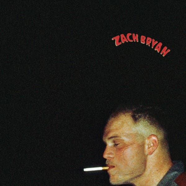
The frame is built almost entirely on absence. Black swallows the top two-thirds of the composition, an expanse of negative space that pushes Bryan and his cigarette down into the lower right corner. The eye has nowhere else to go: it travels first to the one bright accent, the pale glowing tip of the cigarette, then up the illuminated line of the profile, then across empty dark to the small red lettering at the top. That triangular path, ember to face to title, is the whole visual grammar of the cover, and it works because there is so little else to distract from it.
The palette is muted and warm: blacks and grays give way to soft sepia tones across the lit side of the face, so the skin looks lamp-lit rather than photographed. Light falls from one side only, modeling the cheekbone and jaw while leaving the far side of the head to dissolve into the background. The effect is intimate and slightly furtive, a face half-hidden.
Grain is the defining texture. The image was processed with a deliberately grainy, film-like quality that scatters across every surface, giving it an analog feel that could plausibly date from decades ago. That timelessness is doing interpretive work: it strips the picture of any 2023 markers and presents Bryan as if he belongs to an older, rougher lineage of country and Americana storytelling. The lo-fi surface is not a limitation but the argument, a visual claim of unvarnished honesty.
The composition is uncentered and casual, refusing the symmetry of a posed portrait. Bryan sits off to the side, eyes closed, mid-drag, entirely inside his own moment rather than presenting himself to the viewer. There is no eye contact, no invitation, which paradoxically makes the image more magnetic; you lean in to a subject who is not performing for you.
The typography reinforces the restraint. The name is rendered in simple, small hand-drawn lettering, arched gently, in a red that is the only chromatic note besides the ember. It sits far from the face and does not compete with the photograph, functioning almost as a caption rather than a logo. Nothing about the type shouts; it lets the picture carry the weight.
Taken together, the choices read as a single coherent statement. The cigarette, the closed eyes, the darkness, the grain, all point toward interiority and emotional rawness rather than spectacle. The image matches the music it fronts: songs rooted in traditional country and Americana, with some Springsteen-style story-song territory. It says that what matters is happening inside the frame's small pool of light, and that the rest can stay in shadow. The picture works precisely because it withholds, offering a moment of quiet contemplation that invites the viewer to keep looking.