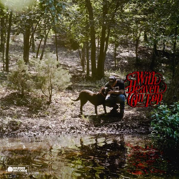
The composition places Bryan and Bud Heavy off-center, tucked into the middle distance rather than pressed to the front of the frame. The eye enters through the sunlit clearing at the upper left, drifts down the sloping bank of trees, and lands on the two figures, then falls with the ground into the pond that occupies the lower third. That downward pull is the picture's whole logic: everything descends toward water.
The reflection is the device the image is built around. The still pond mirrors both man and dog, and that doubling reads as a visual metaphor for memory and reflection, the introspection the album returns to across its 25 tracks. It also stages a duality between the public figure above the waterline and the private self held in the dark surface below, a split that runs through the songs.
Color works by restraint. The palette is entirely natural: earth tones on the forest floor, forest greens in the canopy, water blues and browns in the pond. Nothing is heightened. This organic, unpolished aesthetic mirrors Bryan's stated preference for bare arrangements, live takes, and studio chatter over gloss, so the surface of the picture behaves like the surface of the music.
Light is diffuse and low, filtering through the trees in soft patches rather than a single dramatic source. It keeps the mood contemplative and slightly melancholy, and it flattens the scene into something remembered rather than staged. The lush forest backdrop reads as place itself, evoking his rural Oklahoma origins and the familial values he has long cited.
The crop is wide, giving the figures real negative space. The surrounding woodland dwarfs the crouching man, which is part of the meaning: the human is small inside the landscape, at rest in it rather than commanding it. That scale choice reinforces authenticity over spectacle, an intimate portrait that feels found rather than manufactured.
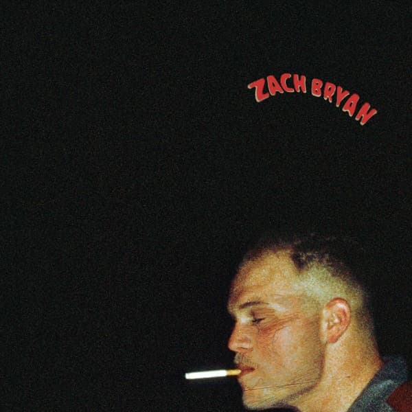
Typography supplies the single deliberate intervention. The title appears in ornate red script in the upper right, its warm hue the only note that breaks the green-and-brown scheme, so the eye is drawn to it precisely because it does not belong to the natural world. The design ties the cover to the visual language of the preceding single. Down in the lower left corner sits the small Warner Records logo, the one mark of the industry apparatus on an image otherwise emptied of it.
Read whole, the picture is an argument for stillness. The contemplative mood prepares a listener for introspection, and the water motif literalizes the opening track's idea of memories floating downstream. Man, dog, forest, and mirror combine into a single statement about place and memory, which is exactly the terrain the album covers. Its power is in what it withholds: in an era of elaborate packaging, the plainness itself becomes the meaning.