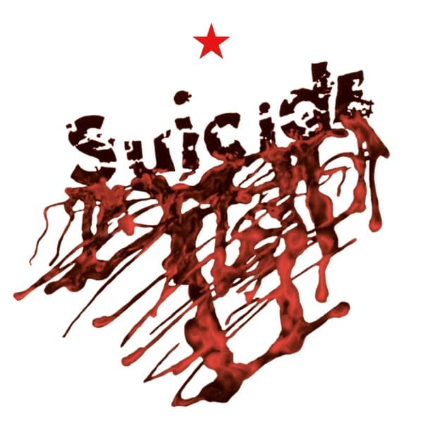
Read the image from the top down, because that is how it wants to be read. First the small five-pointed star, isolated and precise, a fixed point of order. Then the name, set in red press-on letters that sit slightly crooked and jostle one another, each character reading as a physical thing placed by hand rather than typeset. Then the collapse: the lettering bleeds into a spray of red that runs, drips and pools toward the bottom of the frame, thin rivulets trailing off as if something wet had been flung at the surface and left to slide.
The composition is built entirely on that vertical fall. The eye enters at the star, settles on the word, and is then dragged downward by the drip, which does the work of gravity and never lets the gaze come back up. The top half is assembled letter by letter; the bottom half is thrown. That split between order and chaos, control and violence, is the single dramatic gesture the cover makes.
Colour is stripped to almost nothing: red against a clean field, with the small star the only other mark. The restraint concentrates all the tension into the red, so the splatter reads louder than it would in a busier design. Negative space carries real weight here. The emptiness around the name is what makes the drip feel like an incident, a stain on something otherwise blank, rather than decoration.
The typography itself is the tell. The letterforms have been roughed up so their edges turn jagged; they no longer read as clean shop-bought type. That degradation matters, because it drags the neat top half toward the same instability as the drip below it, blurring the line between the assembled word and the violence beneath.
And the reading almost writes itself, which is the point. The word that names the band drips its own meaning down the front of the sleeve. The blood-like red pouring out from under the letters does the interpreting for you; nothing else on the cover is there to soften it or redirect it. Whether the red is literal blood or a rendering of it, the effect is identical: the name bleeds.
What makes the image work is exactly this economy. It refuses everything a buyer might expect from a sleeve and offers only a name pretending to be tidy and then failing, catastrophically, in red. Two impulses collide on one surface, the collaged neatness of stationery letters and the thrown, seeping splatter, and the collision is the whole statement. The design says precisely what it needs to and then drips off the page.