Behind the Covers

Album Cover Meanings: What 24 Iconic Sleeves Actually Stand For

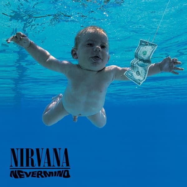
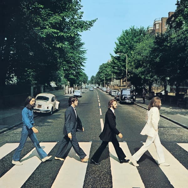
The best album covers do something that's very hard to do with a 12-inch square: they say something. Sometimes they say it immediately — a baby chasing a dollar bill, a prism splitting light, a band crossing a zebra crossing in stride. Sometimes the meaning arrives later, sideways, half by accident.

This is a working guide to the meanings packed into 24 of the most recognisable record sleeves ever made — not a list of trivia, but a reading of each cover as the small, carefully composed argument it actually is. Some of these arguments are political. Some are personal. Some are jokes that hardened into icons because the songs underneath were too good to ignore.

The pattern that emerges across the set is more useful than any single interpretation. Album cover meaning tends to come from three places: the image itself (composition, colour, subject), the context in which the image was made (who designed it, where, for what audience, against what backdrop), and the music it's wrapped around. A great cover holds all three in tension. A dull cover only does one.

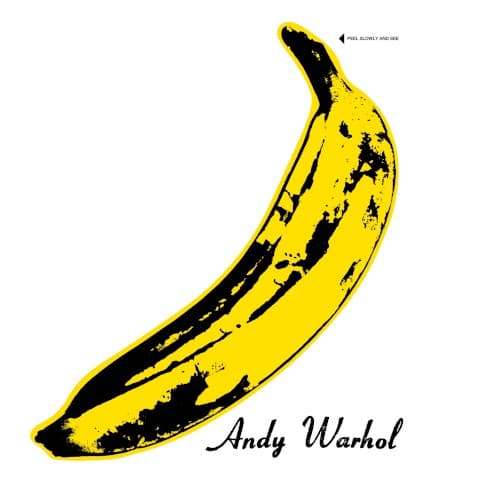
The Velvet Underground & Nico is a Pop-art prank in 1967 New York, a debut album that no major label wanted to promote, and 49 minutes of music that broke rock's vocabulary open. Strip away any one of those and the banana is just fruit. The same is true for every entry below: meaning lives in the conversation between sleeve, studio, and song, not inside the image alone.

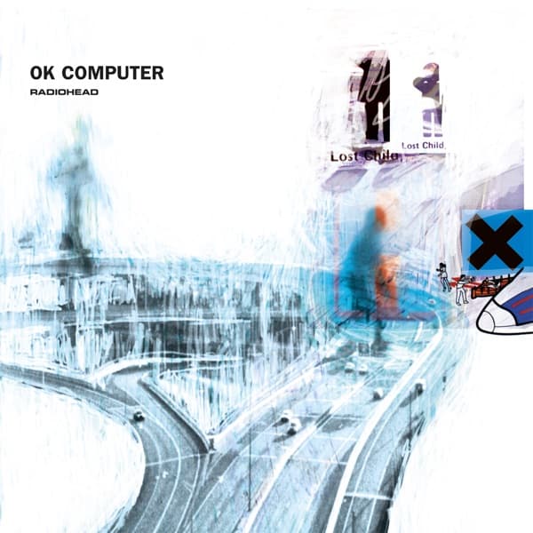
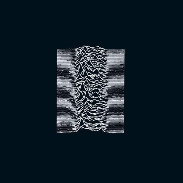
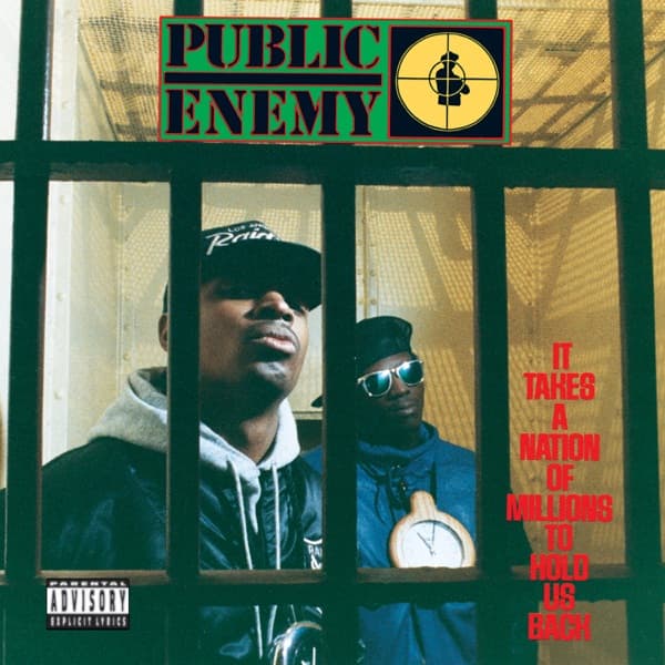
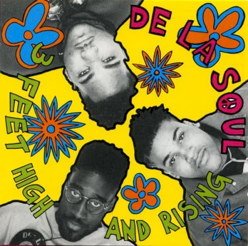
We've picked these 24 covers for breadth — across six decades, across rock and folk and hip-hop and pop, across designers who intended every detail and accidents that became canon. Each entry links to a longer story on the cover itself: how it was made, who made it, what the artist thought of it, and what it's come to stand for since.

For a parallel set focused specifically on covers that have been banned, censored, or fought over, see our controversial album covers guide. To explore by maker rather than meaning, browse by designer or photographer. The real-world places behind these images are mapped on our album cover locations atlas.

The Dark Side of the Moon by Pink Floyd — album cover art

The Dark Side of the Moon

Pink Floyd · 1973

The design firm Hipgnosis created one of the most recognizable images in music history: a prism dispersing white light into a spectrum of color. The band wanted something simple, clinical, and precise — a stark contrast to the psychedelic art dominating progressive rock.

Read the full story →

The Velvet Underground & Nico by The Velvet Underground — album cover art

The Velvet Underground & Nico

The Velvet Underground · 1967

Andy Warhol's simple screen-printed banana on a white background became one of the first interactive album covers — the original pressing featured a peelable sticker revealing a flesh-pink banana underneath.

Read the full story →

Nevermind by Nirvana — album cover art

Nevermind

Nirvana · 1991

Kurt Cobain's concept of a baby swimming underwater chasing a dollar bill on a fishhook became one of the defining images of the 1990s — a commentary on how humans are conditioned from birth to chase money.

Read the full story →

Abbey Road by The Beatles — album cover art

Abbey Road

The Beatles · 1969

The most famous pedestrian crossing in history was captured in just six shots during a 10-minute photo session. Photographer Iain Macmillan stood on a stepladder in the middle of London traffic while a policeman held back cars, creating an image that would spawn conspiracy theories and pilgrimages for decades.

Read the full story →

Sgt. Pepper's Lonely Hearts Club Band by The Beatles — album cover art

Sgt. Pepper's Lonely Hearts Club Band

The Beatles · 1967

The concept was born from Paul McCartney's idea that the Beatles would become an entirely fictional band. The cover depicts the band in colorful satin military uniforms standing in front of a crowd of life-size cardboard cutouts of famous figures.

Read the full story →

The Joshua Tree by U2 — album cover art

The Joshua Tree

U2 · 1987

Photographed at Zabriskie Point in Death Valley, this iconic black-and-white cover emerged from a December 1986 desert road trip. Designer Steve Averill framed the band cinematically against the stark landscape, while the actual Joshua tree photos ended up on the back cover.

Read the full story →

London Calling by The Clash — album cover art

London Calling

The Clash · 1979

Pennie Smith captured bassist Paul Simonon smashing his Fender Precision Bass on stage — a slightly out-of-focus shot she didn't want used, but the band declared it the only possible cover. The typography deliberately mimics Elvis Presley's debut album.

Read the full story →

Horses by Patti Smith — album cover art

Horses

Patti Smith · 1975

Robert Mapplethorpe's photograph of Smith — jacket over shoulder, no makeup, androgynous confidence — demolished gendered expectations for female musicians. It has been called the greatest rock and roll portrait ever taken.

Read the full story →

Wish You Were Here by Pink Floyd — album cover art

Wish You Were Here

Pink Floyd · 1975

Two businessmen shake hands while one is literally on fire in this shocking image that took eight takes to capture safely. The burning handshake became one of rock's most unforgettable covers, symbolizing the music industry's soul-destroying nature.

Read the full story →

Physical Graffiti by Led Zeppelin — album cover art

Physical Graffiti

Led Zeppelin · 1975

Designer Peter Corriston turned a crumbling New York tenement into rock's most interactive album cover, creating die-cut windows that revealed different scenes when you pulled out the vinyl records.

Read the full story →

In Utero by Nirvana — album cover art

In Utero

Nirvana · 1993

Nirvana's final studio album features anatomical collages by artist Robert Fisher that Walmart and Kmart refused to stock, forcing the band to create sanitized alternate covers for major retailers while the original became a statement of artistic integrity.

Read the full story →

Illmatic by Nas — album cover art

Illmatic

Nas · 1994

A childhood photograph of seven-year-old Nas superimposed via double exposure over a nighttime shot of the Queensbridge Houses — the ghostly overlay captures the collision between childhood innocence and adult reality that defines the album.

Read the full story →

Sticky Fingers by The Rolling Stones — album cover art

Sticky Fingers

The Rolling Stones · 1971

Andy Warhol's close-up of a man's crotch in tight jeans featured a real functioning zipper on the original LP — when unzipped, it revealed white underwear. The album also debuted the iconic tongue-and-lips logo by John Pasche.

Read the full story →

Pet Sounds by The Beach Boys — album cover art

Pet Sounds

The Beach Boys · 1966

The iconic photo of The Beach Boys feeding goats at San Diego Zoo was shot by Capitol Records staff photographer George Jerman. The band's visit on February 10 or 13, 1966, was reportedly so chaotic that zoo officials banned them for life.

Read the full story →

OK Computer by Radiohead — album cover art

OK Computer

Radiohead · 1997

Stanley Donwood and Thom Yorke created the disorienting collage of blurred highway imagery and distorted text during the album's recording sessions — a visual representation of information overload and anxiety about technology that proved remarkably prescient.

Read the full story →

Unknown Pleasures by Joy Division — album cover art

Unknown Pleasures

Joy Division · 1979

Peter Saville placed a data visualization of radio pulses from the first pulsar ever discovered on the cover with no text — no band name, no album title, no label logo — creating one of the most widely reproduced images in popular culture.

Read the full story →

It Takes a Nation of Millions to Hold Us Back by Public Enemy — album cover art

It Takes a Nation of Millions to Hold Us Back

Public Enemy · 1988

Public Enemy's radical collage cover packed surveillance imagery, crosshairs, and militant graphics into a visual manifesto that perfectly captured hip-hop's revolutionary spirit. Designer B.E. Johnson created a chaotic information overload that mirrored the group's dense sonic assault.

Read the full story →

3 Feet High and Rising by De La Soul — album cover art

3 Feet High and Rising

De La Soul · 1989

An explosion of day-glo color — peace signs, daisies, Pop Art graphics — was a visual manifesto for the D.A.I.S.Y. Age, declaring that hip-hop could be playful, conscious, and joyful in an era dominated by images of urban toughness.

Read the full story →

My Beautiful Dark Twisted Fantasy by Kanye West — album cover art

My Beautiful Dark Twisted Fantasy

Kanye West · 2010

George Condo's provocative paintings were so controversial that major retailers refused to stock the album. Kanye turned the censorship into a collector's game by releasing multiple variant covers, making the 'banned' version the most desired.

Read the full story →

Yeezus by Kanye West — album cover art

Yeezus

Kanye West · 2013

Kanye West shocked the music world with a clear CD case sealed with red tape—no artwork at all. Virgil Abloh conceived it as an 'open casket' marking the death of physical music formats.

Read the full story →

MONTERO by Lil Nas X — album cover art

MONTERO

Lil Nas X · 2021

Lil Nas X floats nude in this heavenly digital dreamscape shot by Charlotte Rutherford and designed by Pilar Zeta. The psychedelic cover transforms John Stephens' Genesis II artwork into a queer-coded Garden of Eden, sparking the rapper's bold artistic transformation and becoming one of 2021's most talked-about album covers.

Read the full story →

Music from Big Pink by The Band — album cover art

Music from Big Pink

The Band · 1968

Bob Dylan painted the mysterious abstract artwork for The Band's debut album cover while living with them in Woodstock. The Nobel Prize winner's only album cover art was created in the same pink house where these legendary sessions took place.

Read the full story →

The Queen Is Dead by The Smiths — album cover art

The Queen Is Dead

The Smiths · 1986

Morrissey selected a still from the 1964 French film L'Insoumis showing Alain Delon — placing a symbol of Continental glamour on an album attacking the British monarchy was characteristically provocative, a snub to Thatcher-era British institutions.

Read the full story →

Frequently asked questions

What do album covers actually “mean” — are they meant to be decoded?
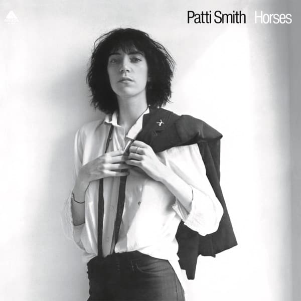
Sometimes yes, sometimes no. Hipgnosis covers for Pink Floyd were designed as visual riddles; Andy Warhol's banana for The Velvet Underground & Nico was a Pop-art prank; Robert Mapplethorpe's Horses portrait was an intentional statement about androgyny. Just as often, an iconic image was the product of a quick shoot or a happy accident — meaning got attached after the fact.
Which album cover has the most layered meaning?
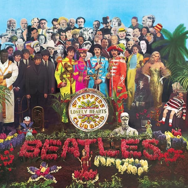
Sgt. Pepper's Lonely Hearts Club Band is a strong contender. Peter Blake and Jann Haworth's tableau of 70+ life-sized cutouts encodes The Beatles' influences, jokes, and provocations into a single staged photograph, and design historians are still arguing about who is and isn't there.
Is the meaning of Nevermind really about money?
That was Kurt Cobain's stated read — a baby chasing a dollar bill as a portrait of capitalism. But the cover was also a practical solution to a budget shoot at the Rose Bowl Aquatics Center, and the symbolism has become more contested as the baby on the sleeve, Spencer Elden, has himself reinterpreted it across his life.
Did designers always intend the meanings critics ascribe to their covers?
Not consistently. Storm Thorgerson preferred ambiguity to allegory and pushed back at neat interpretations. Robert Mapplethorpe's Horses cover was tightly composed but the meaning was Patti Smith's. The story behind a cover is almost always richer than the single-sentence “meaning” a search engine wants.
What's the difference between meaning and symbolism?
Symbolism is the vocabulary — a prism, a crucifix, a flag, a baby, a banana. Meaning is what an artist, designer, or audience does with that vocabulary in a particular cultural moment. The same prism on Dark Side of the Moon meant something different in 1973 than it does on a 2020s vinyl reissue. Both are part of the story.

Keep exploring