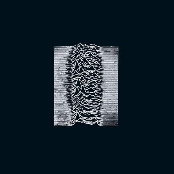
Look at it: a black rectangle floating in a slightly deeper black border, and stacked across the center, roughly a hundred wavering white lines. Each line ripples mostly flat at its edges, then surges into a jagged peak near the middle, the peaks piling on top of one another until the whole block resembles a mountain ridge seen in profile, or a heartbeat repeated again and again. There is no band name. No album title. No catalogue number on the front face at all. For a debut, that silence is the boldest statement in the room.
Those lines are not decoration. They are radio waves from CP 1919, the first pulsar ever observed, detected on 28 November 1967 by Jocelyn Bell Burnell and Antony Hewish as pulses arriving every 1.33 seconds. The signal was so regular that it was half-jokingly nicknamed LGM-1, for 'little green men.' What you are reading on this sleeve, stacked pulse over pulse, is the rhythm of a dead star spinning in deep space.
The plot itself was the work of radio astronomer Harold D. Craft Jr., who built it during his 1970 PhD dissertation on the pulse profiles of twelve pulsars. Craft wrote the program that stacked the traces, and he deliberately tilted them at a slight angle so the image would look, in his words, 'like you were looking up a hillside.' That choice was aesthetic, but practical too: the tilt kept the lines from overlapping into mush. The hillside effect you sense looking at the cover is exactly what he engineered.
The path from a thesis to a record sleeve runs through a book. Bernard Sumner of Joy Division came across the CP 1919 plot in The Cambridge Encyclopaedia of Astronomy, felt the pull of it through his love of 2001: A Space Odyssey, and suggested it to designer Peter Saville. Saville, who had already made posters for Manchester's Factory club in 1978, took the image and made one crucial decision. In the encyclopaedia the plot was black on white. He flipped it. 'I was afraid it might look a little cheap,' he later said. 'I was convinced that it was just sexier in black.' He did this against the band's stated preference, and he was right.
Printed on textured card, white on black, the image gained the depth you see here: those lines feel less like ink and more like light, like something glowing out of the dark. Unknown Pleasures arrived on Factory Records in 1979, recorded that April at Strawberry Studios, and it would become the only Joy Division album released during Ian Curtis's lifetime. Factory, true to its contrary spirit, issued no singles from it.
For years the image's origin was simply lost. It took Scientific American graphics editor Jen Christiansen to trace it: from the Cambridge Encyclopaedia of Astronomy back through a January 1971 Scientific American article, and finally home to Craft's 1970 dissertation. Craft, who went on to direct the Arecibo Observatory, had no idea his data visualization had ridden a post-punk record into the culture at large.
And ride it did. The sleeve became a badge at goth gatherings through the 1980s, then slipped its moorings entirely in the 21st century, turning up on T-shirts worn by people who have never heard a note of the band. It is one of the strangest journeys a piece of cover art can take: a dying star's pulse, plotted by an astronomer, found in a library by a guitarist, flipped to black by a designer who thought it looked sexier, and printed without a single word to tell you whose it was.