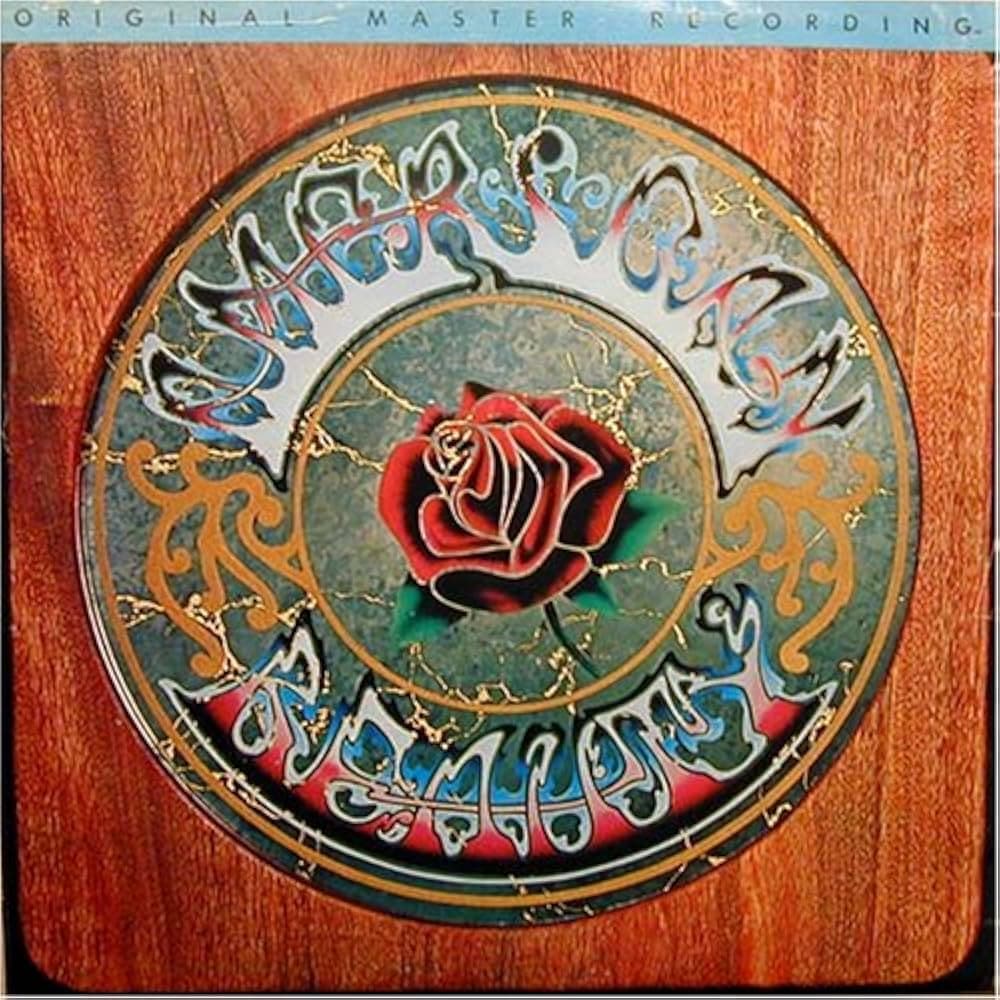
The composition is built as a target, drawing the eye inward. A polished square of wood grain frames a circular medallion, and inside that disc sits a marbled grey-green field, veined and cracked like aged stone. At the very center floats a single deep-red rose, its petals edged in cool blue outline, two green leaves splaying out below. The eye lands on the rose first and stays there, because everything else circles around it: a thin gold ring, then the flowing band of letters, then golden filigree scrollwork at the left and right flanks. The layering of ring inside ring inside frame turns a flat sleeve into something that feels dimensional and hand-built, a ceremonial object rather than a printed square.
The lettering is the star turn. Across the top arc, the words bloom in iridescent blues, silvers and magentas, the strokes thick and liquid, half art nouveau, half something melting. Along the bottom the script continues against a hotter pink ground, the characters so heavily stylized they read almost as decoration first and words second. You have to lean in to decode them, which is exactly the point. The title functions in both the "American Beauty" and "American Reality" readings at once, and that ambiguity is the engine of the whole design.
Colour and tonality carry the argument too. The rose's warm red against the cool, aged grey-green field makes the flower seem to glow from within a weathered surround, while the cracked veining reads as stone worn by time. The wood grain framing everything pulls the object out of the psychedelic and toward the handmade and rooted.
The floral idea does not end on the front. Flip the sleeve over and you meet a diorama: a small staged world of ferns, roses, a bust and assorted curios, shadowboxes and oddities arranged like a Victorian collector's cabinet. Flanking that scene are illustrated panels of guitars, and the guitar strings do not stay strings. They transform into rose stems, threading the front cover's central bloom through the entire package so the rose seems to grow right out of the instruments.
It all coheres into one quiet argument. The rose and the title are the same idea: the double meaning points both to the rose itself and to the Americana the music chases. The rose is beauty and the rose is reality, the lettering says both at once, and even the guitars sprout flowers. Where most designers would simply spell the name and stop, here the second phrase hides in plain sight, rewarding the viewer who slows down to look.