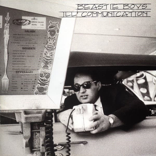
The first thing you meet is his stare, or rather the two black ovals where his eyes should be. A heavyset man in a dark suit and skinny tie leans out through the service window of a drive-in, one arm braced on the sill, the other cradling a boxy white telephone handset with its coiled cord dangling below. His sunglasses are opaque. His mouth is set somewhere between a smirk and irritation. Everything about him says he is in the middle of a transaction you were not invited to witness.
The photograph is black and white, and grainy in the way that only real film pushed hard can be. Bruce Davidson, a photographer with Magnum, made it in 1964 at a Los Angeles drive-in diner called Tiny Naylor's. It was part of an assignment for Esquire, but the magazine never ran the set. So this image sat unpublished for three decades, a slice of California car culture that nobody outside a contact sheet had seen.
Look to the left of the frame and the story deepens. A backlit menu board fills nearly half the cover, its plexiglass panels crowded with prices and a column of little carved tiki masks running down the side like totems. You can read it: SALADS, DESSERTS, BEVERAGES. Chef's Green Salad Bowl, one dollar. Lemon icebox pie. Chocolate sundae. A giant fork stands sentinel at the far left edge, its tines pointing up like a monument to lunch. The whole thing is absurdly specific, a frozen menu from a vanished afternoon, and it grounds the mystery man in a real place doing something as banal as ordering food.
That tension is the cover's engine. The composition splits cleanly in two: the flat, text-heavy geometry of the illuminated menu on the left, and the dark, dimensional lean of the man emerging from shadow on the right. Your eye lands first on the sunglasses, then gets pulled leftward into all that readable clutter, then back again. It reads as a single stolen moment, candid and slightly conspiratorial, which is exactly why it works for a band whose music was built from stolen and recombined pieces.
The choice was deliberate. Mike D and MCA, Adam Yauch, picked the photograph themselves and brought it to a designer to build the packaging around. Yauch drove much of the group's visual identity across their sleeves, and here he arrived at the first meeting carrying reference materials, including several Blue Note album covers, those clean, confident jazz sleeves with their bold type and cropped photography. You can feel that influence in how the image is handled: no clutter, no gloss, just a strong found photograph given room to breathe.
The designer was Gibran Evans, then twenty-two years old, who produced the whole package in QuarkXPress after that initial sit-down with Yauch. Davidson's picture was scaled down to fit the square sleeve. The lettering across the top, BEASTIE BOYS and ILL COMMUNICATION stacked in blocky, slanted, hand-inked capitals, is not a font you can download. It was a hand-drawn typeface created specifically for the album by Jim Evans, an artist and designer who happened to be Gibran's father. That same lettering was used throughout the album's promotion, so the wobble and weight of those letters became the record's signature.
There is a small, funny truth underneath all of it. Bruce Davidson had not heard the Beastie Boys when they came asking. When he finally did listen, he did not understand it, recalling that their demo tape sounded to him like a secret language. He let them use the photo anyway. So the cover is a handshake between two people speaking past each other: a Magnum documentarian who saw a diner in 1964, and a hip-hop group who heard something in that frozen face that the photographer never could.
What you cannot see on the front is where the packaging goes inside. The interior photography was shot by Ari Marcopoulos, and the booklet's middle pages carry a reproduction of the painting Gaia by Alex Grey, a burst of anatomical, cosmic color that could not be more different from the stark gray diner on the outside. That jump, from documentary black and white to visionary painting, mirrors the music, which pulled from hip-hop, punk rock, jazz and funk without apology.
Released in 1994 on Grand Royal and Capitol Records, Ill Communication became the band's second number-one album on the US Billboard 200 and was certified triple platinum by the RIAA, drawing wide critical acclaim. The cover it wore was not a portrait of the band, not a logo, not a staged shoot. It was a fragment of somebody else's abandoned assignment, rescued from an editor's rejection pile and handed a second life.
That is the quiet joke and the real weight of the image at once. A man leans out a window with a phone to his ear, mid-sentence, mid-order, mid-1964, and he has no idea he is about to front one of the decade's biggest records. His sunglasses give away nothing. The menu behind him keeps offering a chocolate sundae for a price nobody will ever pay again. And the whole thing hangs together because someone saw a discarded photograph and understood it was still saying something, even in a language its own maker could not read.