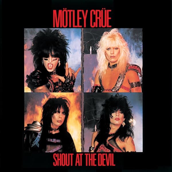
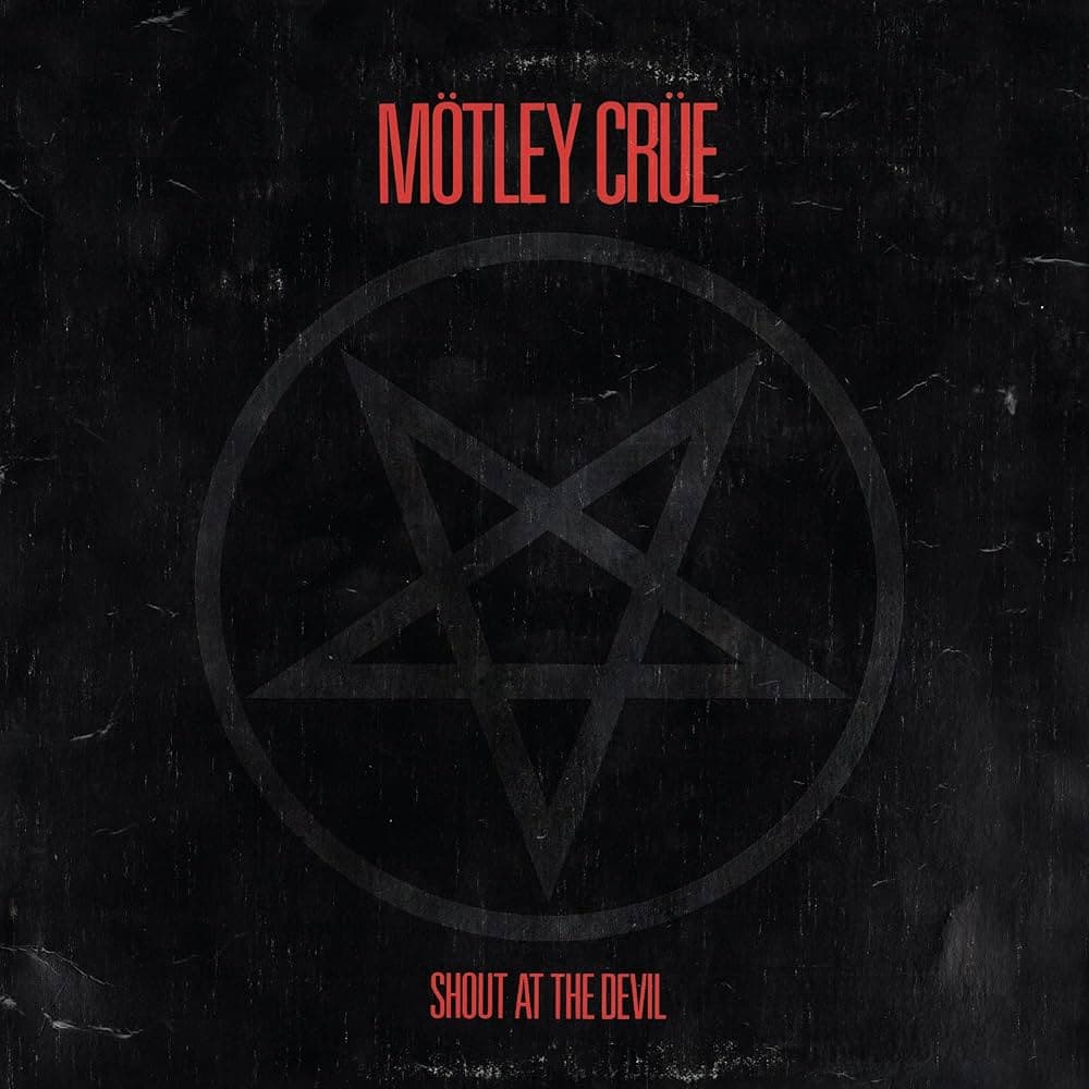
The composition of the original front is an exercise in withholding. A matte black background swallows nearly the entire frame, broken only by red typography at the top and bottom edges and, between them, the pentagram itself. The lettering is kept deliberately understated so that nothing competes for attention, letting the symbol speak louder than words. The eye, given no figure and no scene to land on, is forced inward to the star.
The technique is what makes it read. Levine used studio lighting and a glossy embossed relief against the matte surface so the pentagram appears to float above the black rather than sit printed on it. Matte and gloss do the work color usually does: the pentagram is not a different hue so much as a different texture, catching light where everything around it drinks it. The dramatic contrast of black ground, red text, and reflective star is the entire palette, austere and legible from across a room.
The replacement front reorganizes the same instincts into portraiture. Four square photographs sit in a grid inside heavy black borders, each band member shot individually against smoky orange flame. The red logo still crowns the top and the title still anchors the bottom, preserving the color scheme, but now the members carry the meaning: teased and towering hair, heavy eye makeup and painted faces, studded leather and metal-collar attire. One figure snarls open-mouthed toward the camera, others glare flatly outward, and the grid stacks four separate confrontations into one wall of aggression. The flame behind them supplies the heat the matte black had only implied, literalizing the album's title where the pentagram had suggested it.
Read together, the two treatments show a single idea approached two ways. The pentagram version is pure suggestion: a symbol loaded with connotation, hidden in plain sight, demanding the viewer physically tilt the object to make it appear, which turns looking into a small act of complicity. The four-square version relocates the danger into the bodies themselves, trading the abstract emblem for glammed-up theatrics, the corpse-white makeup and tough posturing that formed glam metal's visual language. Both refuse warmth, both work in high contrast, and both let a minimum of elements do maximum work. The genius of the first is that it makes darkness into an image; the genius of the second is that it makes four faces read as one threat.