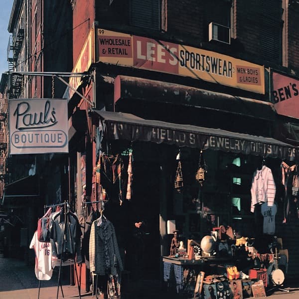
The composition is anchored on a single street corner, shot at an angle so the two faces of the building meet at a central vertical edge, splitting the frame and giving the eye a pivot to swing around. The storefront reads left to right as a stack of horizontal signs, each competing for attention, so the gaze climbs and settles rather than resting on one focal point. The staged "Paul's Boutique" sign sits at lower left, small and modest against the far louder commercial signage above it, which is the visual joke: the fiction is quiet, the reality is shouting.
Colour does much of the emotional work. The palette is warm and muted, dominated by brick reds, ochres and the amber of low-angle sun striking the upper facade, while the shadowed recesses under the awning drop into cool cyan and green. That split between warm illuminated surfaces and cold shade gives the picture a documentary, end-of-day feeling, unglamorous and lived-in. Nothing is retouched into prettiness; the tonality is the tonality of an actual street at an actual hour.
Light falls from the upper left, catching the top signs and the fire escape while leaving the ground-floor merchandise in a dim, jumbled half-light. This is why the eye moves top-down: the bright signage pulls first, then the reader descends into the shadowed abundance of goods on the racks and the table, where a globe, hanging jackets and assorted objects reward a second look. Those secondary details reward slow reading and reinforce the sense of a real place, overstuffed and specific.
Typography here is found, not designed. The lettering belongs to the shops themselves, hand-painted and commercial, and the only inserted piece, the boutique sign, deliberately blends into that vernacular rather than announcing itself as cover art. The effect is that the packaging pretends not to be packaging.
The format is the boldest choice. This is a panorama built for a gatefold, so the front image is a fragment; unfolding the sleeve extends the single corner into a sweep of the entire intersection. The cropping on the front withholds, the fold delivers, and the result is a cinematic widening of scope. Scale is human throughout: everything sits at eye level, at sidewalk distance, so the viewer is placed on the pavement as a passer-by rather than an observer of a set.
The subject, finally, is the street itself rather than the band, who appear nowhere on the front. By quoting the plain language of street photography and the everyday grammar of shop signage, the picture presents a gritty, authentic slice of New York and lets a small invented storefront pass as part of it. What it means is a sleight of hand: fiction smuggled into fact, a made-up name hidden in plain sight among the true ones, which is exactly the game the sleeve plays with its own authorship.