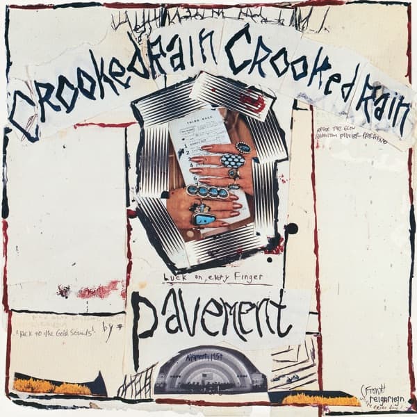

There are no concrete steps on the cover of Crooked Rain, Crooked Rain. Pavement's 1994 sleeve instead looks like something assembled on a worktable: cream paper, uneven black lines, hand-drawn words, a found image embedded at the center and small bursts of red, orange and blue-green.
The lettering is part of the picture. Crooked Rain Crooked Rain bends across the upper half rather than sitting inside a clean typographic grid, while Pavement is drawn beneath the central image in the same deliberately unstable hand. The sleeve does not hide typography; it makes typography one of its most visible materials.
That changes the story of the cover completely. BTC's old version treated the artwork as a grainy documentary photograph of weathered stairs chosen as an anti-commercial statement. The real visual logic is collage, hand lettering, paper texture and found material. Roughness is not the subject of the image; roughness is the construction method.
Current release-credit records identify Stephen Malkmus with artwork. Mark Ohe is also associated with artwork and later reissue art direction, so BTC should keep those roles edition-aware rather than turning a reissue credit into settled original-front authorship. A release history also identifies the central image as material sourced from National Geographic. That source-image provenance should not be converted into a cover-photographer credit unless the original magazine image and photographer are independently verified.
The result is more specifically Pavement than the invented staircase story ever was: loose, funny, handmade and visibly resistant to polish without pretending that the front is empty, monochrome or image-free.