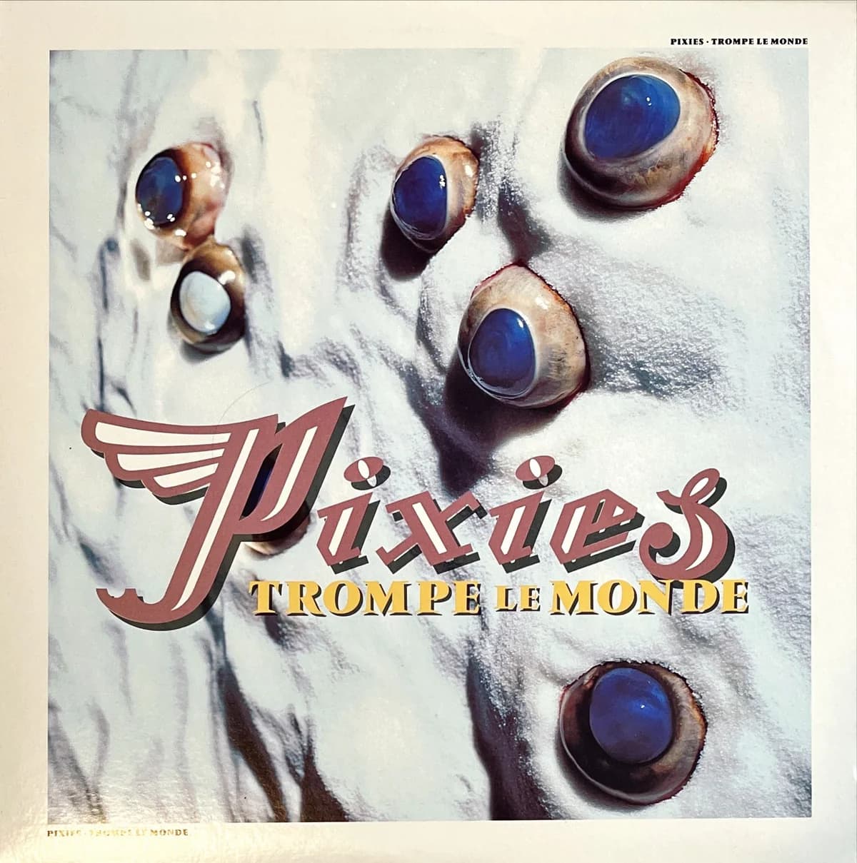

At first glance, Trompe le Monde looks extraterrestrial. Five glossy blue-black forms protrude from a pale, cratered surface, like sensors or mineral deposits on a planet seen at impossible range. Then the image becomes harder to look at. Those blue forms are not stones. They are real bull's eyes.
Vaughan Oliver's starting point was the album title. Trompe le Monde plays on trompe-l'oeil, the tradition of making a flat surface fool the eye into seeing depth and physical reality. Oliver took the idea literally enough to make the sleeve itself a visual trick. He later explained that the background was meant to resemble a planetary surface; co-designer Chris Bigg made it from salt. The organic objects embedded in that artificial landscape came from a butcher.
Getting them was its own problem. Oliver recalled that bull's eyes were difficult to obtain during the period of Britain's mad-cow-disease crisis, but photographer Simon Larbalestier managed to source them. An early plan was to place the eyes in water. That failed when the eyeballs turned milky, so the team abandoned the bowl and built the stranger image that survived: eyes sitting directly in a granular false world.
Larbalestier photographed the construction in color. That matters because color had become a point of tension in the Pixies' visual language. He later said that management had requested color photography for the later Bossanova and Trompe le Monde imagery, a compromise from the monochrome work he preferred. Rather than making the pictures conventional, color made this one more visceral: blue irises, fleshy rims and a chalky ground that is almost skin-like in places.
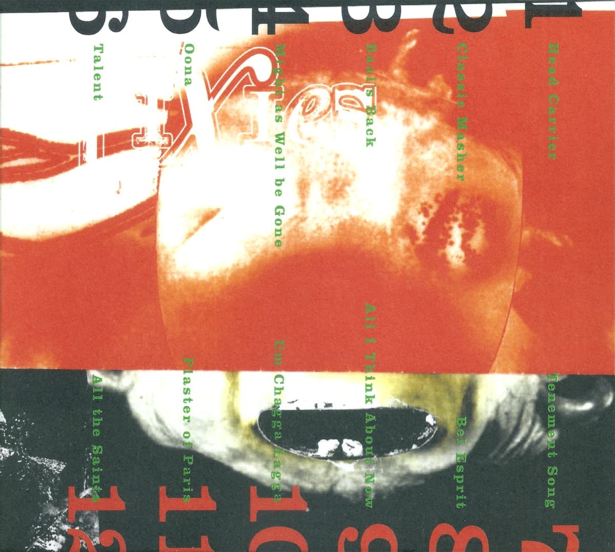
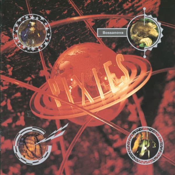
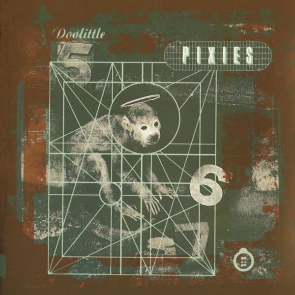
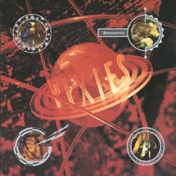
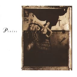
Oliver and Larbalestier had already spent several records refusing the obvious route for Pixies. Surfer Rosa staged a dancer in a distressed, religiously charged room; Doolittle turned a stuffed monkey into an occult-looking diagram; Bossanova built a glowing science-fiction planet. Trompe le Monde pushes that sequence somewhere more bodily. It looks like another planet until the materials betray it. The cover promises outer space and delivers anatomy.
Across the center, the Pixies name arrives in oversized, swooping lettering, with the title tucked beneath it. The typography is conspicuously graphic against the photographed surface, another layer that refuses to disappear into the illusion. The sleeve does not simply perform trompe-l'oeil. It keeps showing you the mechanisms of the trick: false landscape, real eyes, emphatic lettering, all occupying the same square.