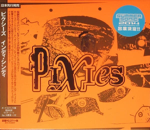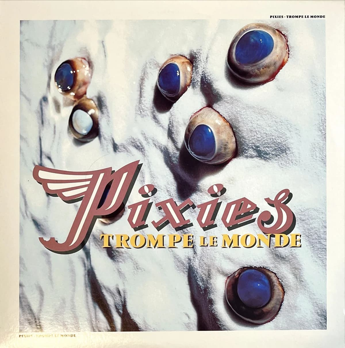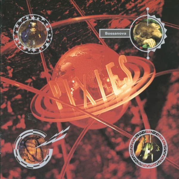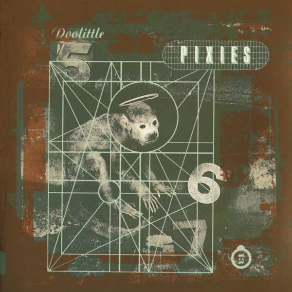


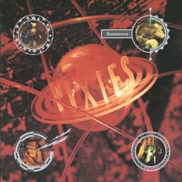
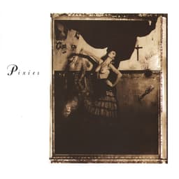
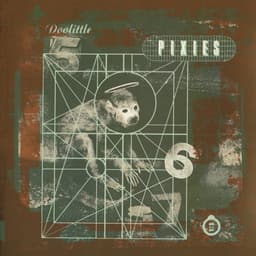
By 2016, Vaughan Oliver had been designing Pixies records for almost thirty years. That history could easily have turned Head Carrier into an exercise in nostalgia: another attempt to reproduce the atmosphere of Surfer Rosa, Doolittle or Bossanova. Instead, Oliver went back to the method that had made those records feel related in the first place. He listened for images, gave collaborators room to interpret them, and let the sleeve grow out of the songs rather than out of a fixed Pixies template.
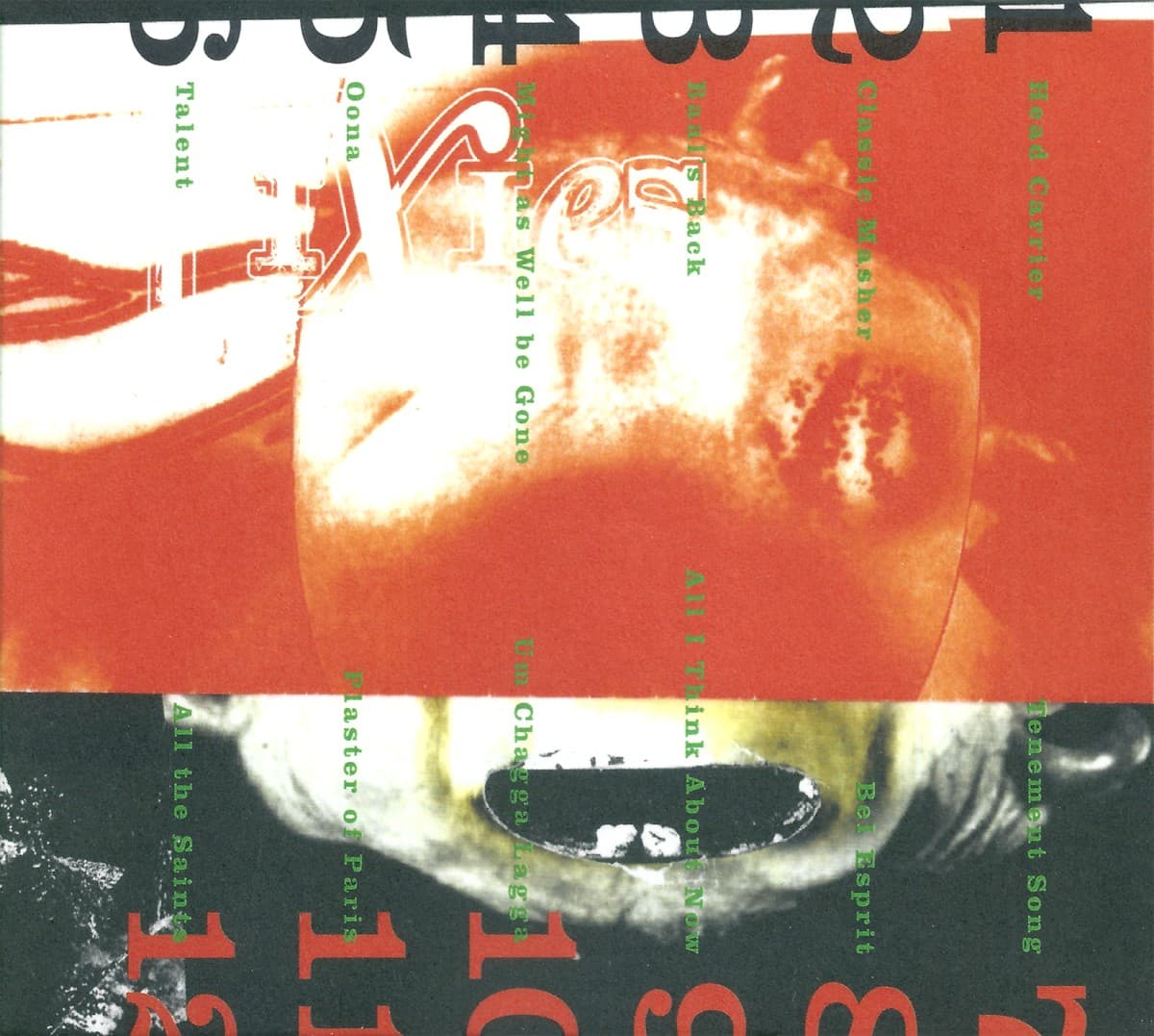
For Head Carrier, Oliver worked again with illustrator Ian Pollock, his collaborator on Indie Cindy, and with Joshua Price, then a University of Greenwich student interning at Oliver's studio. The record's artwork was built from lyric-inspired characters and collage imagery. Oliver said Black Francis supplied a bag of lyrics and deliberately left room for interpretation; Pollock, in Oliver's description, brought the songs' characters to life through his own filter. The result belongs to the familiar Pixies visual world of odd bodies, unstable identities and images that feel suggestive without spelling out a single official meaning.
The front cover adds another tactile layer through its lettering. Price created wooden letterforms for the Pixies name and photographed them for use in the design. That detail matters because the finished sleeve can look as though it was assembled digitally, yet one of its most obvious graphic elements began as a physical object. The process fits Oliver's long preference for materials that leave evidence of being handled, built, photographed or distressed before they become a record cover.
The central image is similarly difficult to settle. It reads as an orange-toned fish against a mottled, collage-like ground, but Oliver and Pollock were not trying to produce a literal diagram of one song. Contemporary design coverage described the package as abstract, textural and darkly comic, with the imagery pulled from characters and fragments across the record. That ambiguity is important. The sleeve gives the eye something recognizable, then refuses to explain why it is there.
Even the title points toward that kind of unstable bodily imagery. Black Francis has explained that the album was initially being called Cephalophore, the term for a saint depicted carrying his or her own severed head. He changed it to the plainer Head Carrier, but the decapitation image remained embedded in the title track and in the record's broader world of strange characters. Oliver's artwork does not simply illustrate a headless saint. It takes the same permission to make the familiar body feel peculiar.
Head Carrier also marked a different phase of Pixies themselves. Released on September 30, 2016, it was the band's first full studio album in twenty-five years conceived and recorded as an album from the start, rather than assembled from the EP sessions that became Indie Cindy. It was also the first Pixies album with Paz Lenchantin as a full member. Yet the visual continuity remained unusually strong: Oliver, the designer who had helped shape the band's 4AD-era identity, was still treating the music as raw material rather than applying a retro logo system.
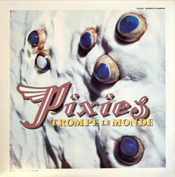
That is what makes the cover useful in the larger Pixies catalog. The old sleeves do not look alike in any simple way. Surfer Rosa is a staged photograph, Doolittle is a strange symbolic construction, Bossanova glows like a miniature planet and Trompe le Monde turns anatomy into a false landscape. Head Carrier keeps that tradition alive by changing the materials again. The continuity is not a recurring image. It is the refusal to make the obvious image.