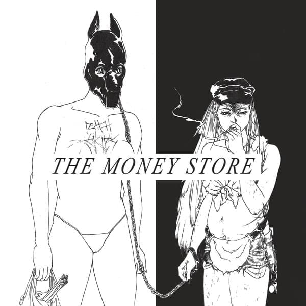


The cover of The Money Store was not drawn for Death Grips. Before the album existed, Chicago artist Sua Yoo had already made the black-and-white illustration for a zine. Death Grips found an image that matched the record they were making and adapted it rather than commissioning a new scene from scratch.
That history was public from the moment the sleeve was revealed. In March 2012, Pitchfork described the cover as a subtly modified version of Yoo's earlier zine illustration. Exclaim likewise identified Yoo as the artist and noted the key alteration: the band's name was added to the chest of one of the figures.
The image shows two stylized figures locked into a power relationship. One is an androgynous submissive held on a leash. The other is a confident woman smoking a cigarette. Death Grips described her as the dominant figure and said the submissive remained strikingly calm. The added Death Grips lettering appears cut into the submissive's chest, binding the band's identity directly to the scene instead of placing a conventional logo above it.
For a cover this provocative, the meaning does not have to be reverse-engineered. Death Grips explained it themselves when the artwork was announced. They said they wanted the sleeve to carry the same progressive edge they associated with the music and connected it to their views on sexuality, feminism, homosexuality, individuality, outsiders and freedom from conventional limits. They called the cover an ambassador to the sound.
That statement is more useful than assigning secret symbolism to every black shape and gesture. The leash is visibly a leash. The cigarette belongs to the dominant figure. The carved band name is an actual modification made for the album. Beyond those facts, claims that the light and dark areas represent morality, that the figures stage an economic transaction, or that every object maps directly onto the album title go further than the documented story supports.
The title and image still create productive friction. The Money Store sounds transactional and commercial, while the cover presents control, submission, identity and bodily inscription. A viewer can draw connections between those ideas, but that is interpretation rather than a meaning Death Grips explicitly assigned to the title-cover relationship.
The album arrived during Death Grips' brief major-label period. Epic released The Money Store in April 2012 after the group had signed earlier that year. The unlikely pairing of a major-label release with a pre-existing underground zine image is part of what makes the package interesting: the sleeve did not polish the band's visual language for a larger market. It brought the confrontational image with it.
Sua Yoo remained connected to Death Grips' visual orbit afterward, but the relationship needs to be described accurately. Yoo did not simply return as the credited artist for the 2015 instrumental release Fashion Week. Reporting on that cover identifies Yoo as the person photographed on it, seated in a large chair. The Money Store therefore links the artist to the band's later imagery in a different way: the person who drew one of its best-known sleeves later became the subject of another.
The strongest story behind The Money Store cover is therefore unusually well documented. We know who made the underlying image, we know it existed before the album, we know the most visible alteration, and we have the band's own explanation for why they chose it. That leaves room for interpretation without forcing speculation into the gaps.