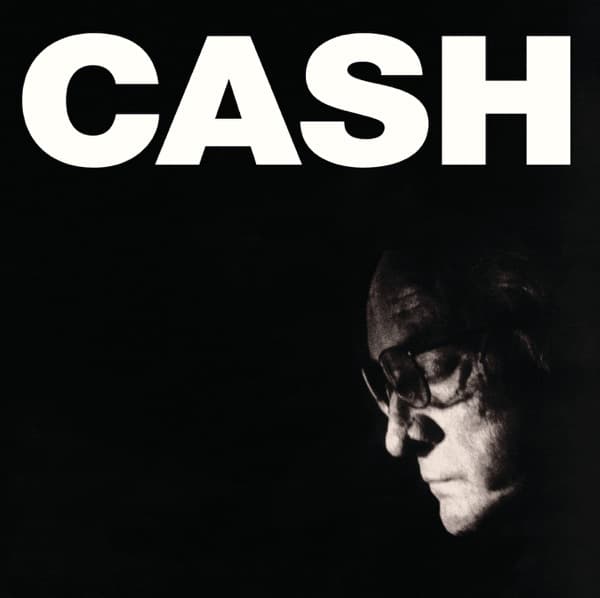
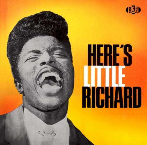
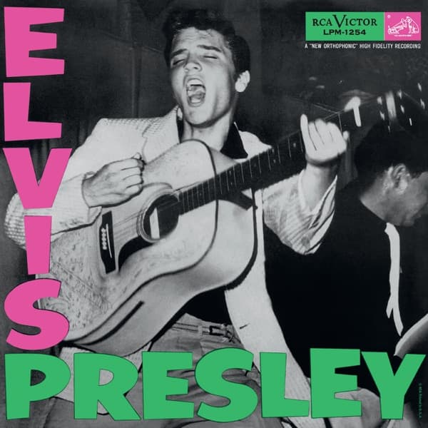
A black-and-white album cover is a choice made against the grain. Colour was available and increasingly expected — and these records dropped it anyway. That refusal is the whole subject: monochrome isn't the absence of a decision, it's one of the loudest a cover can make.
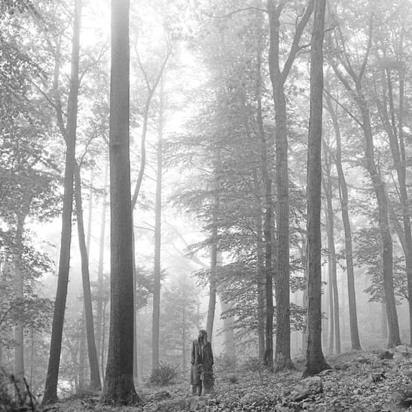
This is a working list of 45 of them, from Elvis Presley's 1956 debut to Taylor Swift's folklore. What connects a rockabilly first album to a pandemic-era singer-songwriter record isn't a genre — it's a claim. Black-and-white asks to be read as documentary rather than advertising, as timeless rather than of-the-moment, as photograph rather than product.
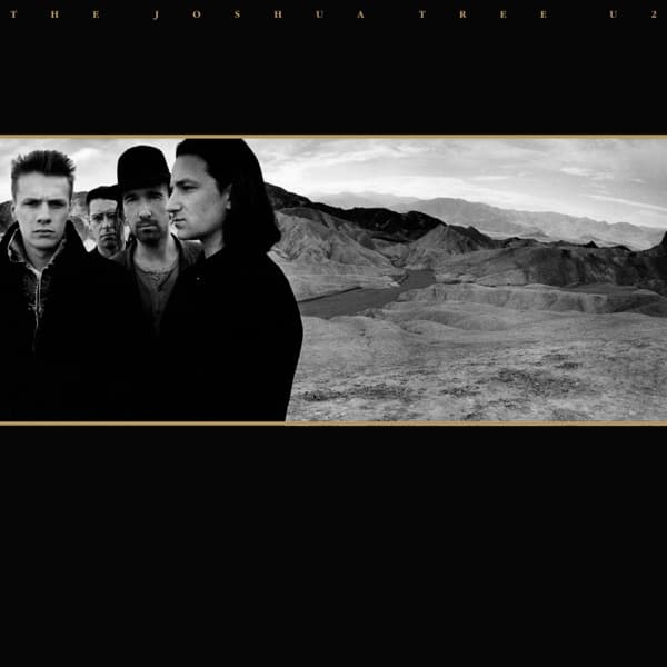
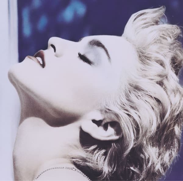
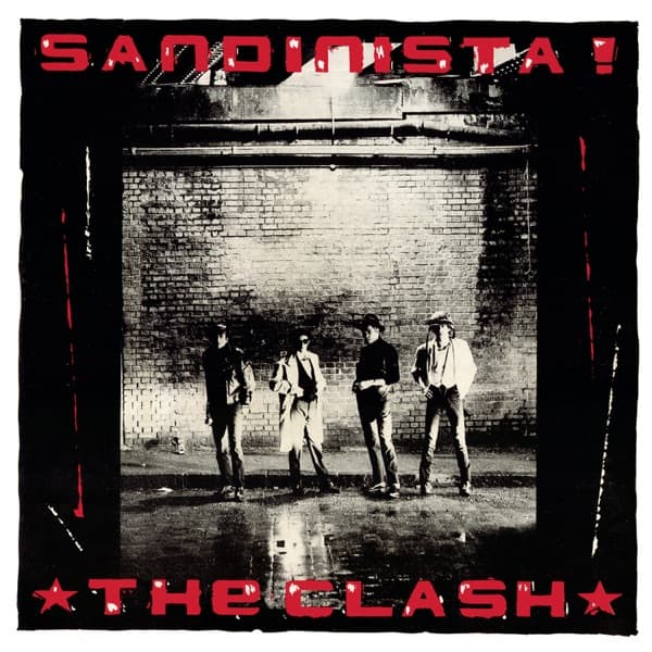
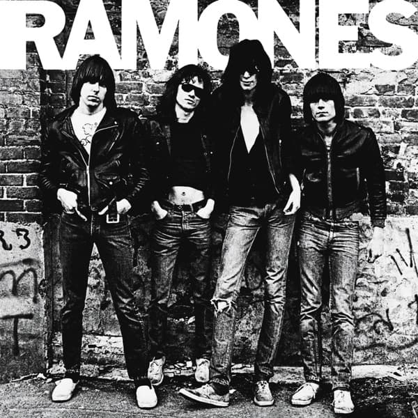
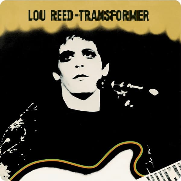
The clearest thread through the set is the photographer. A monochrome cover is almost always a photographer-forward cover, and the same names recur: Anton Corbijn's desert light on The Joshua Tree, Pennie Smith giving The Clash both London Calling and Sandinista!, Mick Rock's high-contrast Transformer, Herb Ritts' True Blue, Roberta Bayley's Ramones on the Bowery. Where a colour cover often belongs to an illustrator or designer, a black-and-white one usually belongs to whoever was behind the lens.
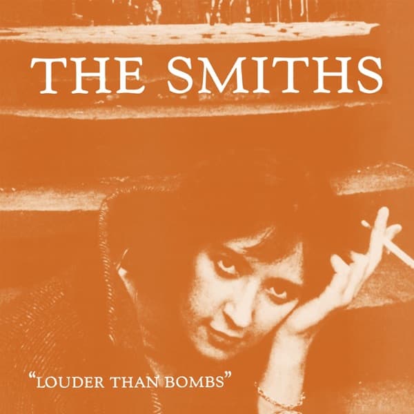
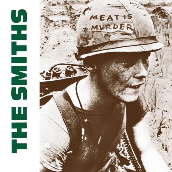
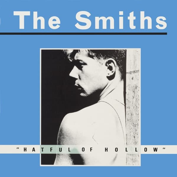
The second thread is authenticity as an argument. Punk and post-punk leaned on monochrome partly because it was cheap for independent labels, but mostly because it looked like reportage — the Ramones, London Calling, and the Smiths' borrowed film-still sleeves all use black-and-white to insist they're documenting something real rather than selling it. Morrissey turned that instinct into an entire visual identity, building sleeve after sleeve from found black-and-white portraits.
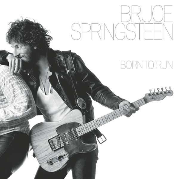
The thing most people miss is that black-and-white is a trick about time. A colour photograph carries the fingerprint of its decade — the exact warmth of 1970s film, the saturation of the 1980s — while monochrome sheds most of those tells. It's a large part of why Rumours, Born to Run, and The Joshua Tree still look like they could have been shot yesterday. Each card below links to the full story of the album: who took the photograph, why the colour was left out, and what that decision has bought over the decades on the shelf.
For the sparest sleeves in music, see the companion guide to minimalist album covers. To follow a single photographer across the catalogue, browse the photographers directory, or explore more covers built on portraiture and monochrome.
- Why do artists choose a black-and-white cover in a full-colour world?
- Because monochrome makes a claim colour can't. Stripping the colour reads as a bid for seriousness, documentary truth, or timelessness — it signals that the image is about form and moment rather than surface. It also ages differently: a black-and-white photograph doesn't carry the date stamp of a decade's colour palette, which is part of why Rumours, London Calling and The Joshua Tree still look contemporary. The absence of colour is not a subtraction; it's a statement about what the record wants to be taken as.
- Is a black-and-white cover the same as a minimalist one?
- They overlap but they're not the same. Minimalism is about how much is on the cover; monochrome is about the palette. A black-and-white photograph can be dense with detail — Pennie Smith's blurred shot of Paul Simonon smashing his bass on London Calling is anything but sparse — while a minimalist cover can be vividly coloured, like Charli XCX's Brat. Plenty of covers are both, which is why you'll see names cross over between this list and our minimalist album covers guide.
- Which photographers are behind the most iconic black-and-white covers?
- A remarkable number trace back to a handful of image-makers. Anton Corbijn shot the desert austerity of U2's The Joshua Tree; Pennie Smith gave The Clash both London Calling and Sandinista!; Mick Rock made Lou Reed's Transformer; Herb Ritts shot Madonna's True Blue; Roberta Bayley caught the Ramones on the Bowery. A black-and-white cover is almost always a photographer-forward cover, which is why this list doubles as a tour of rock's great portrait photographers — many with full profiles in our photographers directory.
- Why were so many punk and post-punk covers black-and-white?
- Partly economics, partly ideology. Black-and-white printing was cheaper for independent labels, but it also fit the movement's documentary, anti-glamour stance — the Ramones, London Calling and the Smiths' found-photograph sleeves all use monochrome to look like reportage rather than advertising. Morrissey built the Smiths' entire visual identity out of borrowed black-and-white film stills and portraits, turning the palette into a signature.
- What's the most famous black-and-white album cover?
- The three that come up most are the Ramones' debut — Roberta Bayley's leather-jacketed line-up against a brick wall — The Clash's London Calling, and U2's The Joshua Tree. Each uses monochrome for a different end: punk authenticity, kinetic violence, and mythic American emptiness. That one palette can serve all three is the case for black-and-white in a single glance.