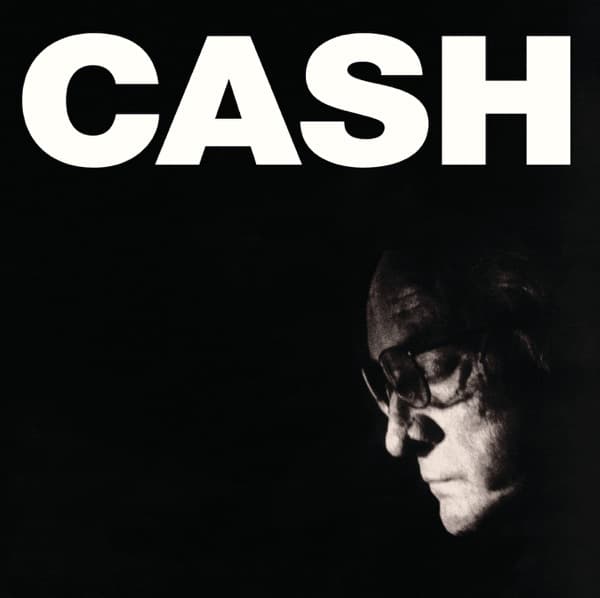
The composition is built on a single stark division. The photograph is monochrome, high in contrast, and cropped so tightly that Cash's features occupy only the lower right quadrant of the square. The remaining three-quarters is pure darkness, and that darkness is the loudest thing on the cover. The vast negative space does more than surround the figure; it presses on him, creating the feeling of a man at the edge of disappearing.
Light is the other governing choice. The face is lit from the left so that one cheekbone and the bridge of the nose catch a cold silver light while the rest sinks into shadow. This is not flattering, warm portraiture. The light is unkind, picking out the worn planes of an aging face and letting everything else drown. It is the visual language of a spotlight finding one small area of a black stage.
The typography answers the photograph in the opposite register. The letters are blunt, sans-serif, without styling tricks, just CASH stamped in white, the kind of surname that needs no explanation. They are bright where the image is dim, hard-edged where the face is soft and blurred into shadow. The palette is kept to grayscale, and those white letters carry the only real brightness on the cover.
The focal path runs along a diagonal. Your eye lands on the letters first because they are big, bright and blunt, then slides down the line of light to the downturned profile, and finally settles into the black that pools around him. That downward drift is the whole meaning of the design in miniature: a name held aloft, a body sinking beneath it.
Read as a portrait, the image becomes a study in restraint and in endurance. The closed eyes behind the dark glasses suggest a man photographed looking inward rather than out at the world. The tight crop and the enormous surname turn the type into something like a marker or a headstone, the name that outlasts the body while the figure beneath slips away. The design refuses to soften any of it. There is no smiling promotional portrait, no full-color warmth, no reassurance offered to the buyer.
What holds the composition together is the balance of just two elements, word and man, set against the void with almost nothing else. The plainness of the type matches the plainness of the sound it fronts. Look once and it is a simple thing: big letters, a shadowed profile, black space. Look longer and it reads as a portrait of a voice that could absorb other people's words and make them sound like its own last ones, framed so that the name stands tall and unshaken above a face already half in shadow. That is why the austerity works. The cover trusts the viewer to sit with silence, and the silence carries the weight.