The first thing your eye finds is not a hotel. It is a row of black palm trees, their fronds spiking against a sky that bleeds from pale gold at the horizon up into deep violet. Only when you look past them do you notice the pale dome, lit an eerie blue, and the tower rising behind a tangle of dark foliage. The building glows faintly, almost floating, and the whole lower third of the frame sinks into near-total shadow. It reads as beautiful and slightly wrong at the same time, which is precisely what it was built to be.
That was the brief. When the Eagles set out to make their fifth studio album, Hotel California, Don Henley wanted an image that would exemplify a classic California hotel and then twist it, portraying that hotel, in Henley's phrase, 'with a slightly sinister edge.' The man handed that puzzle was Kosh (John Kosh), brought in by the band's management as art director and designer. He arrived with an unusual resume: he had already designed The Beatles' Abbey Road and The Who's Who's Next, and now he had to make a luxury hotel feel like a place you might not be able to leave.
Kosh set out with photographer David Alexander to scout locations, and three hotels were photographed against the brief. The winner was The Beverly Hills Hotel, shot just before sunset, its silhouette dissolving into a golden sky. The choice you are looking at is that frame: the hotel is not centered, not proud, not showing off. It is glimpsed through obstruction, half-swallowed by trees and dusk, a fantasy seen from the wrong side.
Getting the shot was closer to a stunt than a photo session. To find the angle, Alexander and Kosh climbed atop a 60-foot cherry picker that dangled out over Sunset Boulevard, and they shot blindly into the sun as the light faded. That explains the flare and the dreamy imprecision of the image, the way the dome burns cool blue while the sky burns warm, and why nothing feels quite anchored. You are seeing a landmark from a vantage point no ordinary guest ever gets.
The strangeness paid off. Because the photo was taken from that unfamiliar height in dying light, most people did not initially recognize the hotel at all. Alexander later told the BBC that very few people who actually knew the Beverly Hills Hotel could identify it here, adding that they were 'in the business of creating fantasies.' The cover works as a kind of place that exists everywhere and nowhere, a hotel of the mind more than an address.
Then there is the sign. In the lower right corner, glowing in cursive blue-white script, sit the words Hotel California, rendered to look like neon tubing bent into looping letters. It is the brightest human-made thing on the cover, a small electric promise floating in the dark shrubbery. Kosh designed the master logo, but the script was almost impossible to bend in real neon. So airbrush artist Bob Hickson was commissioned to paint the neon effect, which was then pasted over the hotel's own sign and re-photographed. What looks like glass and gas is actually paint, illusion stacked on illusion, fitting for a fantasy.
Every layer of this image was worked by hand in ways the casual listener never sees. Dye-transfer prints of the chosen frame were made by Ted Staidel, the careful color process that gives the sky its saturated glow and keeps the blues and golds from muddying into each other. The result is a photograph that feels lit from within, the palms almost lacquered black, the horizon a soft furnace.
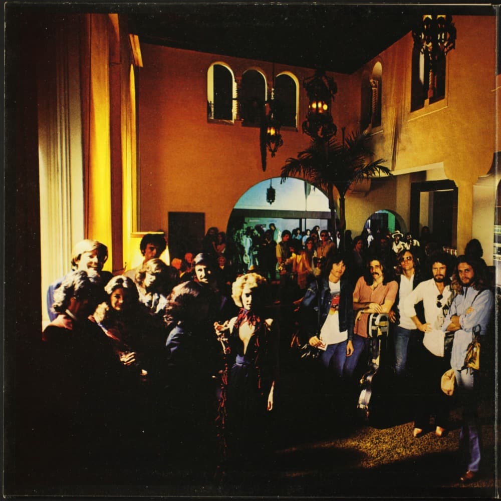
Open the gatefold and the fantasy continues indoors. The interior lobby photo, showing the band surrounded by a crowd of friends, was also shot by David Alexander, but not inside the Beverly Hills Hotel at all. It was staged inside a re-decorated Hollywood flop house called The Lido, dressed up to pass for somewhere grand. The glamour on the outside and the glamour on the inside were both, in the end, sets.
Hotel California was released on December 8, 1976 by Asylum Records, and the cover's fantasy soon collided with reality. Lawyers for the Beverly Hills Hotel threatened Kosh with a cease and desist action over the use of their building. The threat evaporated once it emerged that the hotel's booking requests had tripled since the album came out. The sinister edge, it turned out, was excellent advertising.
Stand back from the whole frame and the achievement is in the restraint. There is no band photo on the front, no faces, no big block type. Just palms, dusk, a haunted-looking dome, and a hand-painted neon word that invites you in. The picture keeps its distance the way the songs do, glittering and unreachable, a warm light seen from a cold place. Everything about it, the impossible angle, the fake neon, the borrowed lobby, the hotel nobody could name, adds up to the same idea Alexander stated plainly: this was the business of creating fantasies, and the fantasy checked in and never left.