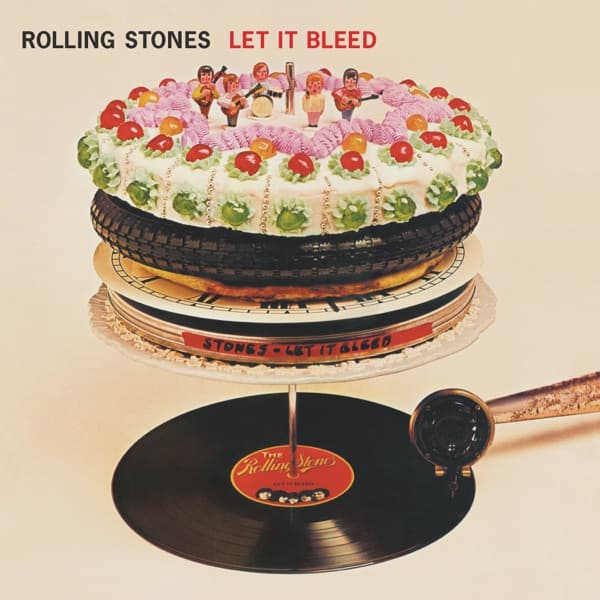


The Let It Bleed cover nearly didn't happen at all — designer Robert Brownjohn's elaborate cake sculpture kept collapsing during the photography sessions, forcing the team to rebuild the edible turntable multiple times. Each reconstruction required hours of careful assembly, with layers of cake, icing, and various food items balanced precariously to create the illusion of a working record player.
The concept emerged from Brownjohn's fascination with transforming everyday objects into unexpected materials. He envisioned the album title literally — a record player that would "bleed" its contents, represented through oozing cake and strategically placed food items. The idea perfectly captured the Stones' blend of sophistication and raw appetite.
Brownjohn sourced the materials from London bakeries and delicatessens, carefully selecting items for both visual impact and structural integrity. The base layer consisted of multiple chocolate cakes stacked and carved to create the turntable's circular form. A car tire served as the tonearm, while a triangular pizza slice became the needle.
The photography sessions took place in Brownjohn's London studio over several days. Each setup lasted only hours before gravity and room temperature caused the structure to sag and collapse. The team perfected their assembly process, working quickly once the final elements were in place.
Robert Brownjohn had already established himself as a master of conceptual album design, having created the innovative projected-body-typography for the James Bond film titles. His approach to Let It Bleed continued his exploration of photography as sculpture, treating the camera as a tool for documenting three-dimensional concepts rather than simply capturing flat graphics.
The cover photographer remains uncredited in most official releases, though the session was reportedly supervised by Brownjohn himself. The lighting setup emphasized the texture contrasts between smooth icing, rough tire rubber, and glistening pizza cheese. Multiple angles were shot to capture the sculpture's dimensional complexity.
Decca Records initially worried about the cover's food imagery, concerned it might appear too frivolous for such a serious musical statement. The label's concerns proved unfounded as the cover became instantly iconic. Critics praised its surreal humor and sophisticated visual metaphor for consumption and decay.
The public reaction was immediately positive, with fans appreciating the cover's playful subversion of both fine art sculpture and commercial food photography. Record stores reported that the distinctive cover helped drive sales, as browsers were drawn to examine the intricate details of the edible construction.
The influence of Let It Bleed's cover extended far beyond rock music, inspiring food photographers and conceptual artists to experiment with edible sculptures. The cover anticipated the rise of food art in galleries and the eventual emergence of Instagram food styling by decades. Contemporary designers still reference Brownjohn's work when creating covers that blend appetite with artistic ambition.
Advertising agencies began incorporating similar food-sculpture concepts into campaigns throughout the 1970s. The cover's success proved that album art could function as both commercial packaging and conceptual art statement. Brownjohn's approach influenced a generation of designers to think beyond traditional photography.
The original cake sculptures were consumed by the production team after photography wrapped — a fitting end to an artwork literally designed to be devoured. Brownjohn reportedly kept detailed notes about the structural engineering required for future food-based projects, though he never again attempted anything quite so elaborate.