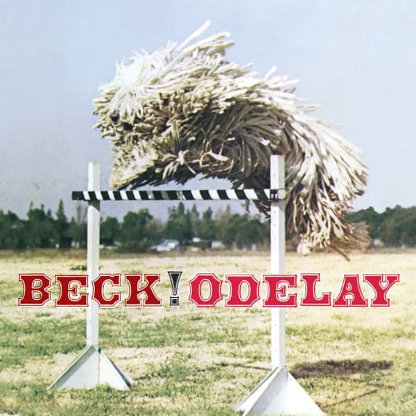
The composition is built on a single suspended shape. Your eye goes straight to the center, where the animal hovers with no clear top or bottom, all its weight thrown sideways in mid-leap. You read the shape as texture before you read it as a body: a Komondor's long corded coat dissolves anatomy entirely, so the cords register first and the dog second. Its legs are barely visible under the shaggy tangle, which is why the creature looks less like a leaping animal than like a haystack that has come alive and decided to compete in agility trials.
Under that flying mass runs the one hard geometry in the frame. The black-and-white striped hurdle, balanced on two silver metal stands that plant into the grass like tripods, is the only object with defined edges, and it does the work of scale and orientation: without the bar you would not know the dog was jumping at all. The stripes also rhyme visually with the chaos above, order against disorder, the straight painted pole against the wind-blown cords.
Everything else is emptiness. The field, the low trees and the pale sky are drained of incident, a stage swept clear of everything but dog and obstacle. That vacancy is what makes the image so disorienting and so funny; there is no context to soften the absurdity, no crowd, no handler, nothing to tell you why this is happening. The eye keeps returning to the animal because there is nowhere else to land. This is the quality the American Kennel Club attributed to photographer Joan Ludwig, an eye for the odd, the comic and the ironic, and it is all over the frame: the absurd dignity of a creature that looks ridiculous being asked to perform an athletic feat.
The lettering grounds the floating chaos. Those serifed, saloon-poster capitals, red with a faint outline, sit low across the bottom edge, weighting the base of the image against the weightless leap above. The exclamation point after BECK gives the whole thing a carnival-barker energy, an old-time showbill announcing an act you cannot quite parse. It reads as a folk-poster flourish rather than a rock-album flourish, a deliberate touch of the 19th-century.
The deeper logic is that nothing here was made new. The photograph is borrowed, a found image lifted whole from another life and repurposed. That method mirrors the music it fronts, an album assembled from recycled samples and riffs pulled from obscure records, sounds that belonged to other people first. A cover that reuses a pre-existing picture is the visual equivalent of that stitched-together approach, assembly presented as authorship. The image works precisely because it refuses to explain itself: a mop mid-flight over a striped bar, offered without caption or apology. Look at it long enough and you land where its first viewers did, not entirely sure what you are seeing, and unable to look away.