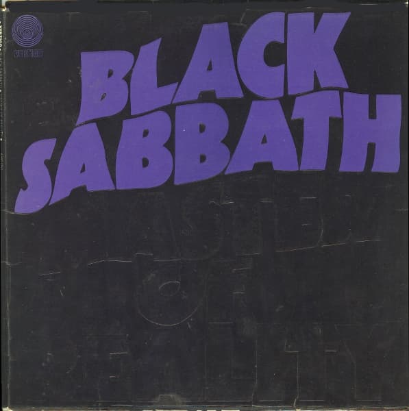

The first thing that confronts you on Master of Reality is not a monster, a graveyard or a photograph of the band. It is the band's name. BLACK SABBATH stretches across the top in warped purple letters, so large and insistent that they seem to push against the sleeve's edges. Beneath it, the album title can almost vanish into the black. On early copies it was embossed in black rather than printed in a contrasting color. You had to catch the light—or run a finger across the cardboard—to find it.
That almost invisible title is the key to the design. Master of Reality sounds like a boast, but the sleeve refuses to spell it out clearly. The band name makes the public announcement; the album title hides in plain sight. Even before a note plays, the record has established a peculiar tension between overwhelming force and the difficulty of seeing what is right in front of you.
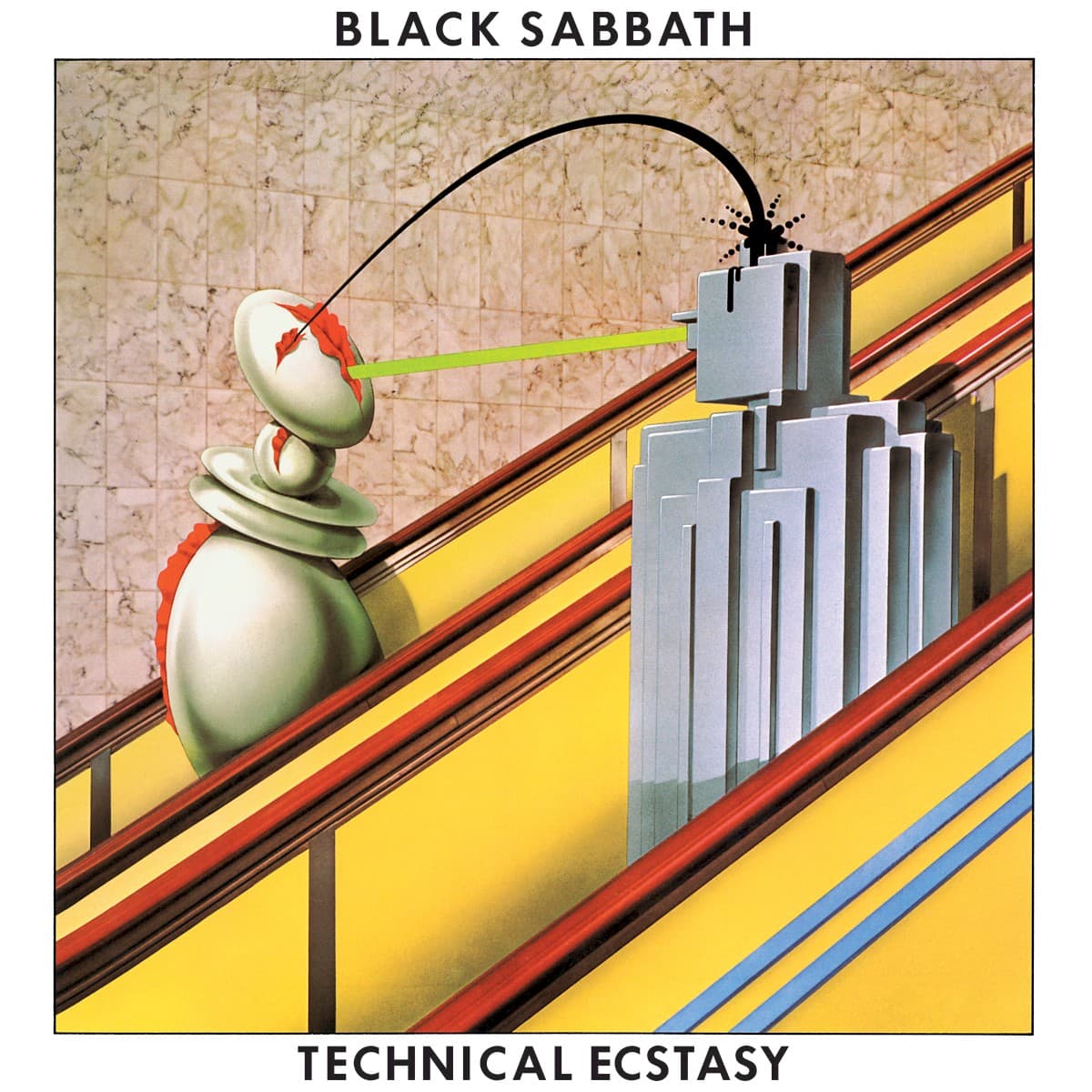
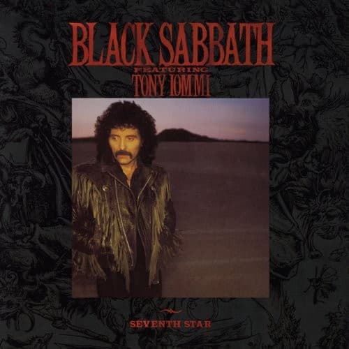
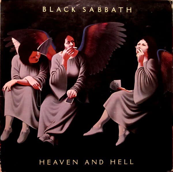
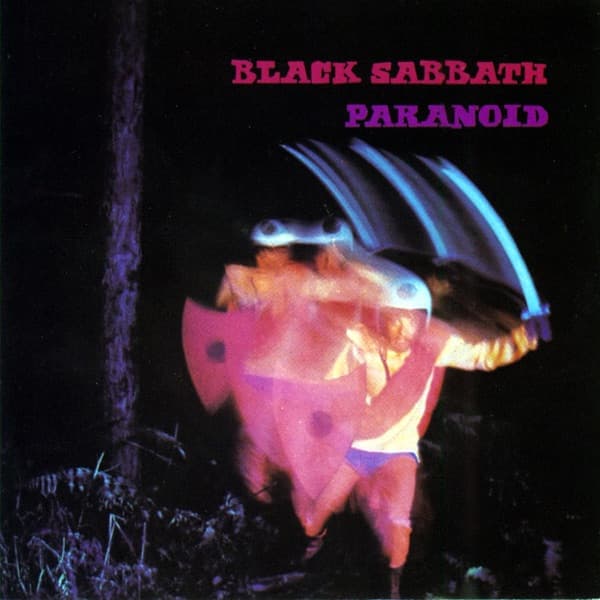
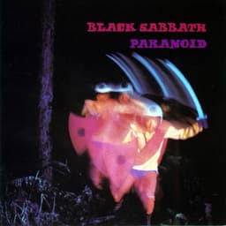
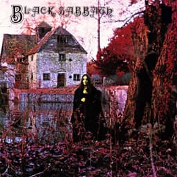
The cover arrived in 1971, when Black Sabbath had already made darkness part of their identity. Their self-titled debut had placed a mysterious figure before a country house; Paranoid used a strange, blurred human image. The third album went further by dispensing with a pictorial scene altogether. The darkness was no longer somewhere depicted in a photograph. It was the background itself.
The typography does nearly all the work. The letters are thick, stretched and visibly distorted, as though the words have been subjected to pressure. Their forms are based on a heavy display typeface associated with the Kabel family, altered into something that looks less like neat typesetting and more like a physical event. The purple is not a conventional warning color. Against black it becomes electric, unnatural and memorable.
What many listeners now recognize as the cover is not precisely what buyers of the earliest LPs handled. On original embossed sleeves the album title was black on black, readable through its raised surface. Subsequent pressings often replaced that costly finish with a printed outline or contrasting color. Across territories the palette changed, too. Those variations are not incidental trivia: they alter the artwork's central trick. A visible title and an almost invisible one produce different encounters with the same record.
The album itself makes a similar argument about weight. Tony Iommi's guitar sounds huge, but the riffs often depend on simple shapes repeated until they become inescapable. Geezer Butler's bass gives the figures another physical dimension; Bill Ward's drumming pushes and pulls against their mass; Ozzy Osbourne's voice floats above the machinery with a surprisingly exposed human quality. The songs don't need elaborate decoration to feel immense.
'Sweet Leaf' opens with a cough and a riff that seems to occupy the whole room. 'Children of the Grave' drives forward with relentless momentum, while 'Into the Void' turns slow, repeated guitar phrases into something vast. Even the quieter 'Solitude' matters to the album's scale: without contrast, heaviness would become a flat effect. The sleeve has its own version of that contrast, placing a vivid band name against a title that nearly disappears.
There is a second piece of the original package that is easy to miss when the album is reduced to a streaming thumbnail. Early pressings included a poster featuring the group, photographed by Keef, the professional name of Keith MacMillan. The musicians were present in the package, but they were not required on its front. That choice lets the sleeve stand as an emblem rather than a portrait.
The original 1971 Vertigo edition belongs to a moment when record packaging was still an object that could reward close inspection. Embossing made the cover tactile. The dark surface caught wear, fingerprints and light differently from a glossy photograph. Later reproductions, especially tiny digital images, can preserve the color scheme while losing the sensation of discovering the raised title.
The authorship of the sleeve is less straightforward than a single designer credit might suggest. Later reissues carry art-direction and design credits for the teams who rebuilt the package, but those should not automatically be attributed to the first pressing. The original visual idea is best discussed through the physical sleeve and its documented variants, rather than assigning it to an unverified individual.
More than fifty years later, the cover still looks startlingly modern. Its economy makes it easy to recognize from a distance: two fields of color, distorted lettering and almost nothing else. Yet the original sleeve also held a private surprise that a distance view could not deliver. It asked to be touched.
Master of Reality became one of the defining documents of heavy metal, and the cover has much to do with how its identity travels. The music feels immense because of what the band concentrates, not because of how many elements they pile on. The artwork follows the same principle. Take away the scenery, the faces and the symbols, and leave only the name, the title and the dark.