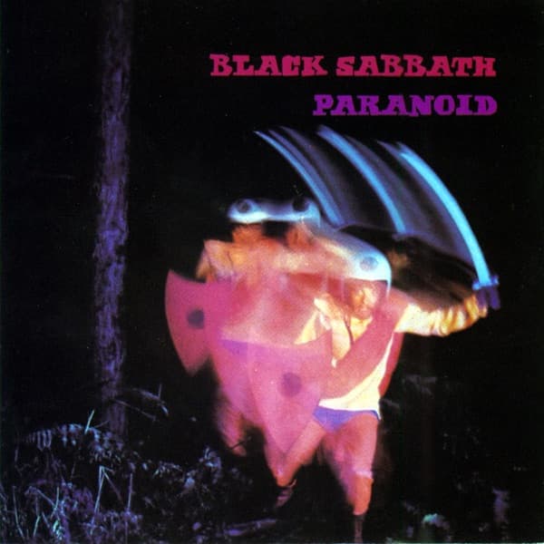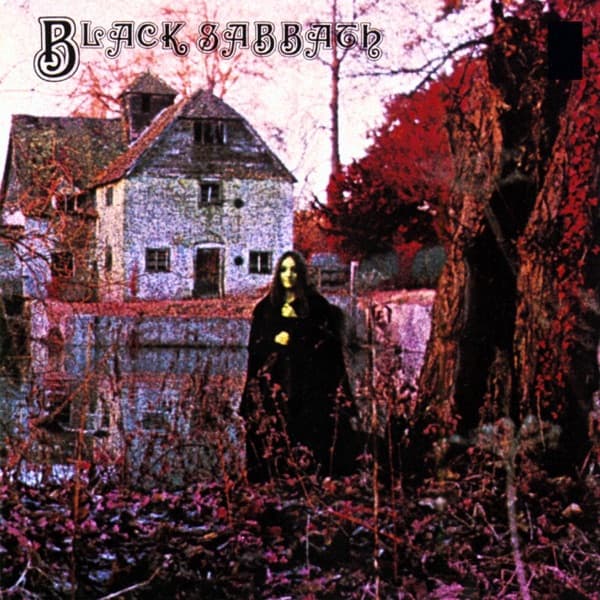
The eye lands first on her: a solitary figure in a dark cloak, standing waist-deep in tangled winter undergrowth, her pale face half-swallowed by a fall of long hair. Behind her, a steep-roofed stone house looms across still water, its windows black and empty. The whole image is drenched in an unnatural high-contrast palette, bruised reds and purples bleeding through the bare trees and reflecting in the pond. It looks like a photograph from a fever. It is, in fact, the opening shot of a genre.
Black Sabbath arrived on 13 February 1970 through Vertigo Records in the UK, with Warner Bros. carrying it to America that June. It is widely held to be the first true heavy metal album, its title track often called the first doom metal song, and the sleeve wrapped around it feels engineered to warn you. The man behind the camera was Keith Macmillan, credited only by his single nickname, 'Keef.' The original line read simply: 'Album designed and photographed by Keef.' He built the gatefold too.
The setting is real and ancient: the Mapledurham Watermill in Oxfordshire, a structure raised sometime in the 1400s that kept grinding until just after the Second World War. That mill, gabled and weathered, gives the cover its gothic spine. But the mist curling over the dark water, the detail that makes the scene feel supernatural, was pure invention. On a freezing early morning shoot, Keef threw dry ice into the pond. When that didn't work well enough, he brought in a smoke machine to manufacture the haze.
The woman in the cloak was the cover's deepest secret. For fifty years no one knew her name. Then, in 2020, she was identified as Louisa Livingstone, who had been roughly eighteen when she posed. She remembered it as 'freezing cold,' recalled having to rise around 4 a.m., and watched Keef hurl dry ice into the water in pursuit of the mist that now defines the image.
There is a quiet irony folded into her story. The young woman who became the silent face of heavy metal grew up to make electronic music under the name Indreba, and she has said plainly that Black Sabbath 'is just not my kind of music.' The person at the center of metal's founding visual never belonged to its world at all.
The outside is only half the unease. Open the gatefold and an inverted cross spread across the spread, its arms filled with the song titles, the credits, and a genuinely disturbing poem. Its lines conjured severed bird wings, poppies that bleed, and 'mute birds, tired of repeating yesterday's terrors.' Where the front photograph unsettles through atmosphere and that lone cloaked watcher, the interior reaches for something darker and more deliberate.
Look again at the cover and the typography seals the mood: the band's name arches across the top in an ornate blackletter script, antique and ecclesiastical, the kind of lettering you'd find carved into a chapel or printed in an old grimoire. It hovers over the scene like a header on a page no one was meant to read. The composition leaves her small and centered, framed by skeletal branches and that brooding mill, alone in a landscape that seems to be closing in.
Keef's eye proved durable beyond this single frame. He went on to shoot the next three Black Sabbath LPs, plus covers for David Bowie and Rod Stewart, and later directed videos for Kate Bush and Motörhead. But this remains his strangest spell: a fake mist, a real medieval mill, an eighteen-year-old in a cloak, and a red-soaked dawn that taught a whole genre how to look like dread.