The cover of Toxicity did not begin with the Hollywood Sign. It began with too many ideas.
By the summer of 2001, System of a Down had recorded more than 30 songs at Cello Studios in Hollywood and was trying to decide what its second album should look like. Sony art director Brandy Flower remembered the process as unusually difficult because everyone arrived with a different visual instinct. Rick Rubin proposed a photograph of a political protest from the 1960s. Serj Tankian wanted Armenian artist Vartan involved. Daron Malakian pushed artwork by his father. John Dolmayan leaned toward illustrated imagery. Shavo Odadjian had a different kind of solution: almost no concept at all.
The band had tracked the record in Studio 2. On its wooden door was a large wooden number 2, and Odadjian photographed it. He liked the image enough to suggest calling the album 2. It was their second record; the door supplied the graphic; nothing else was needed.
The problem was that System of a Down had committed itself to unanimous decisions. Odadjian remembered proposing name after name while the band failed to agree. Flower was trying to reconcile tastes that, as he put it, were miles apart. The cover that now feels inevitable was still only one idea among several.
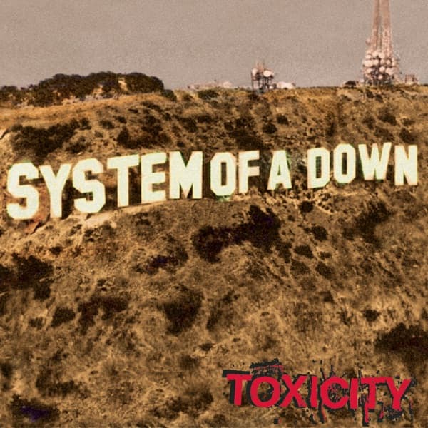
Mark Wakefield, who was working around the band, had already made a low-resolution web banner that altered the Hollywood Sign to read System of a Down. Flower remembered it as a rough, pixelated image, but the premise stayed with Odadjian. Then the physical setting of the sessions made the idea click.
Odadjian walked outside Cello Studios, saw the real Hollywood Sign on the hillside and ran back inside. He brought the others out and asked them to imagine SYSTEM OF A DOWN in its place. His pitch was not an abstract argument about celebrity culture. It was much more personal: Los Angeles was their hometown. The band was from there. Put their name on the landmark.
For once, everyone agreed.
Turning the idea into a record sleeve was another problem. Wakefield’s early banner was far too low-resolution to become album artwork, so Flower rebuilt the image for print. He later described the process as many hours of Photoshop work. The letters were never physically changed on Mount Lee. The finished image is a digital construction designed to make the substitution feel plausible enough that the eye recognizes the Hollywood Sign before noticing that HOLLYWOOD has disappeared.
Even a digitally altered landmark had an owner to deal with. Flower’s boss asked the obvious question: could Sony simply use the Hollywood Sign that way? The answer led the team to the Hollywood Chamber of Commerce. Flower recalled that album and merchandising rights cost roughly $20,000. The Chamber still states that commercial use of the sign or its likeness requires licensing.
That legal step creates one of the cover’s best contradictions. The picture looks like a takeover: a strange, politically charged Los Angeles band has apparently overwritten Hollywood’s most famous name with its own. Behind the scenes, the effect was carefully rebuilt, negotiated and licensed by a major-label art department. The rebellion was real as an image even if the production process was anything but guerrilla.
The finished credits show how collaborative that process was. Mark Wakefield receives the cover art credit. Shavo Odadjian and Brandy Flower are credited with art direction. Odadjian and System of a Down receive album art concept credits. John Dolmayan and Flower made the inside collage art, while Martyn Atkins, Glen E. Friedman, Dolmayan and Hallie Sirota supplied photography used across the package. Odadjian also handled the CD label art. The famous front is therefore only one piece of a larger visual system.
And the idea the band rejected never vanished. Odadjian’s photograph of the wooden 2 from the Studio 2 door was placed behind the CD tray. Remove the disc and the album briefly reveals the identity it almost had. The packaging preserves both solutions at once: the private studio shorthand of 2 tucked inside, and the public Los Angeles statement of SYSTEM OF A DOWN stretched across the front.
Even the final album title arrived through a similarly winding path. Odadjian had brought in a song he called Version 7.0, a joking reference to AOL software versions. The song initially fell through the cracks, then Malakian reshaped it late in the writing process; it became Toxicity and was the last song submitted for the album. The record that nearly went out as 2 ultimately took its name from one of its last finished songs.
That makes the sleeve feel less like a branding exercise planned from the beginning and more like the point where a chaotic project finally found its identity. Several cover concepts, several possible names and several competing aesthetics collapsed into one image simple enough to understand in a second: Los Angeles on the hill, System of a Down in the letters, Toxicity underneath.