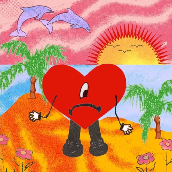
Behind the Covers

graphic-design

7 cover stories in our archive

Behind the Covers' archive includes 7 album covers documented under the "graphic design" design theme, spanning the 1960s, 1970s, 1980s, 1990s. These covers sit within the hip-hop, rock, electronic, alternative, punk, blues, folk tradition and feature work by The Notorious B.I.G., Talking Heads, Joy Division, The Clash and others. Each entry below includes the cover artwork, the designers and photographers behind it, and a short story about the visual choices that defined the release.

Ready to Die by The Notorious B.I.G. — album cover art

Ready to Die by The Notorious B.I.G. (1994)

A bare-skinned baby with a towering afro sits alone on white, and for 17 years nobody knew who he was. The mystery child on The Notorious B.I.G.'s 1994 debut was paid $150 for a two-hour shoot, and his face became one of hip-hop's most argued-over images.

Label
Bad Boy Records
Designer
Cey Adams
Photographer
Butch Belair
Genre
Hip-Hop
Decade
1990s
Read the full story →
Remain in Light by Talking Heads — album cover art

Remain in Light by Talking Heads (1980)

Tibor Kalman's design obscures the band members' faces with red-tinted blocks, reflecting the album's themes of dissolving individual identity — influenced by Afrobeat, Brian Eno's theories, and West African polyrhythmic music.

Label
Sire
Designer
Tibor Kalman / M&Co
Genre
Rock, Electronic
Decade
1980s
Read the full story →
Unknown Pleasures by Joy Division — album cover art

Unknown Pleasures by Joy Division (1979)

A blizzard of white lines on a black field, this 1979 debut carries no band name, no title, nothing. The shape is actually a stack of radio pulses from the first pulsar ever found, and the man who plotted them had no idea his data had become one of rock's most copied images.

Label
Factory Records
Designer
Peter Saville
Genre
Alternative, Rock
Decade
1970s
Read the full story →
London Calling by The Clash — album cover art

London Calling by The Clash (1979)

On 21 September 1979, a frustrated Paul Simonon swung his Fender bass at the floor of New York's Palladium, and Pennie Smith caught it. She thought the shot too blurry to use. Joe Strummer pointed at the contact sheet and said: 'That one.'

Label
CBS Records
Designer
Ray Lowry
Photographer
Pennie Smith
Genre
Punk, Alternative
Decade
1970s
Read the full story →
Physical Graffiti by Led Zeppelin — album cover art

Physical Graffiti by Led Zeppelin (1975)

Peter Corriston spent weeks combing New York for the perfect tenement, then cropped out an entire floor so the buildings would fit a square sleeve. The windows of 96-98 St. Mark's Place became die-cut peepholes that could spell out a name and reveal everyone from Buzz Aldrin to Lee Harvey Oswald.

Label
Swan Song Records
Designer
Peter Corriston
Photographer
Elliott Erwitt
Genre
Rock, Blues, Folk
Decade
1970s
Read the full story →
The Dark Side of the Moon by Pink Floyd — album cover art

The Dark Side of the Moon by Pink Floyd (1973)

A keyboardist asked for something as classy as a chocolate box. What he got was a beam of white light splitting into a rainbow against pure black, a design pulled from a 1963 physics textbook that would end up on more T-shirts than almost any image in rock. Here's how Pink Floyd's prism came to be.

Label
Harvest (UK) / Capitol (US)
Designer
Storm Thorgerson
Genre
Rock
Decade
1970s
Read the full story →
Tommy by The Who — album cover art

Tommy by The Who (1969)

A blue lattice of diamond windows floats in space, doves drifting through cloud and shadow, half-glimpsed faces trapped behind the holes. Mike McInnerney built The Who's Tommy as a puzzle you have to pass through to reach the music: a visual riddle drawn straight from a teaching that life is 'an illusion within an illusion.'

Label
Track Records (UK) / Decca Records (US)
Designer
Mike McInnerney
Genre
Rock
Decade
1960s
Read the full story →

Related design themes