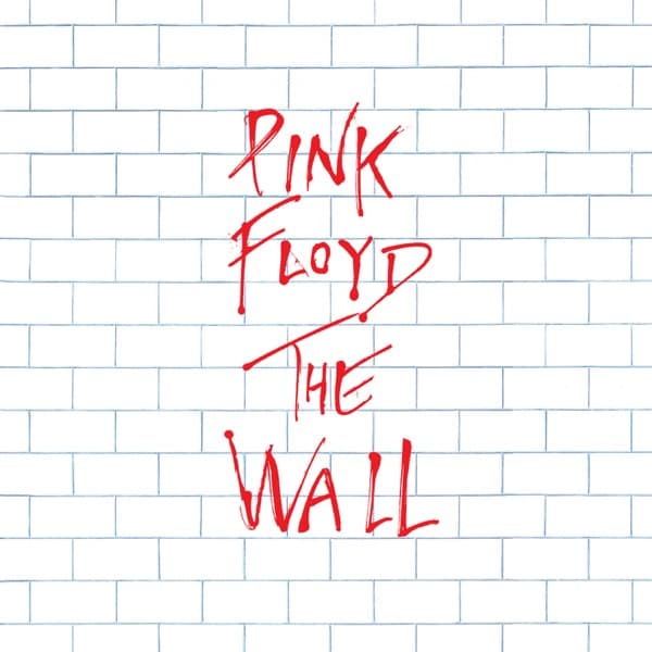
Everything about the front works by refusal. A real album cover usually wants to seduce you; this one builds a barrier between you and the music, then lets a red hand vandalize it just enough to let you in. The bricks run flat and repetitive, mortar picked out in pale blue like the ruled lines of graph paper, so the surface reads as measured, neutral, almost bureaucratic. There is no horizon, no light source, no depth, nothing for the eye to rest on. Faced with so much uniform white, the eye has only one place to go, and that is the scrawl at the center.
Colour does the heavy lifting. The cover is essentially two temperatures: the cold white-and-blue of the wall and the single hot red of the lettering. That red carries the only heat on the whole image, and because it is the one saturated mark against acres of pallor, it dominates a composition that otherwise gives it no help. The contrast is not decorative; it is the argument. Order everywhere, one point of disorder breaking through.
The typography is where the tension lives. PINK FLOYD sits high, jagged and impatient, the strokes thinning and splitting like dry paint dragged too fast across a surface. Below it, THE WALL is larger and heavier, the W seeming to collapse into the bricks beneath it. The letters drip and trail at their feet, closer to graffiti or a warning than to a corporate logo. Nothing here is level or clean. Set against the neat, machine-regular brickwork, the lettering looks like an act of defacement, a scribble that someone dashed off and left behind.
That opposition, the tidy bricks against the untidy scrawl, is the whole picture before a single note plays. The wall is the image of isolation the music describes: a partition raised to keep the world out, keep the self in. The red hand breaking across it is the only sign that anyone is on the other side, the first crack in a barrier built to have none. Scale reinforces it too, the barrier filling the frame completely so that there is no way around it, only through it. What looks at first like nothing, an absence, a dodge, turns out to be a fully argued image: the most stared-at blank in rock, designed so that its emptiness does the talking and its single mark of graffiti supplies the way in.