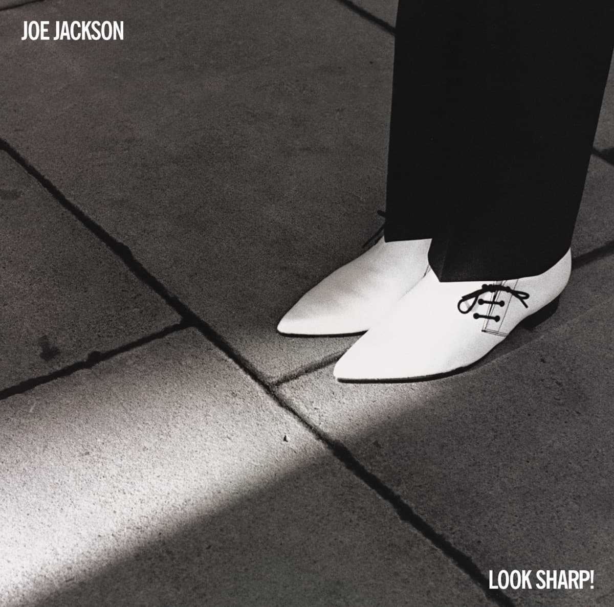
Brian Griffin spent a day photographing Joe Jackson, but the image that became Look Sharp! took only minutes. Griffin later remembered hiring a pale blue Ford Escort, picking Jackson up and heading toward London's South Bank after stopping at the Waterloo Station Wimpy Bar.\n\nWhen they reached the concrete landscape near Waterloo, Griffin noticed a shaft of sunlight hitting the ground. He told Jackson to stand in it and made the photograph with his Olympus OM-1. The white pointed shoes Jackson happened to be wearing became the center of the frame. Griffin's recollection is wonderfully anticlimactic: after an entire shoot, the cover was essentially over in five minutes.\n\nJackson remembered the shoe photograph as similarly unplanned. He had bought the Denson shoes only the day before, and Griffin took just a small number of pictures of them among more conventional portraits. When the contact sheets came back, however, the unusual image stood out.\n\nThe choice did not necessarily delight its subject. Griffin later said Jackson hated the finished sleeve because his face was nowhere on the front and refused to work with him again. Jackson's own recollections have been less theatrical about the dispute, but the tension adds an amusing irony to an image that became one of the defining covers of late-1970s new wave.\n\nArt director Michael Ross built the package around Griffin's photograph. The stark shoes against dark trousers and pavement made the album title feel like a visual command, even though Jackson was hardly presenting himself as a fashion icon. Contemporary critics sometimes took the image's apparent stylishness literally; later accounts emphasize how accidental and tongue-in-cheek the whole thing was.\n\nThe shoes themselves developed an afterlife. Jackson recalled that the art director borrowed them for promotional purposes and never returned them. Years later Rolling Stone tracked the size-eight shoes to the office of an A&M executive assistant. A disposable wardrobe detail had become memorabilia because of one quick photograph.\n\nLook Sharp! was nominated for the Grammy for Best Recording Package. That recognition is especially fitting because the cover's strength came from resisting the obvious debut-album solution. Instead of selling a new artist through his face, Griffin and Ross reduced Joe Jackson to a pair of shoes, a patch of concrete and a lucky beam of light.
Design Michael Ross · Photo Brian Griffin · A&M Records · © respective owner · fair use
Look Sharp!
Brian Griffin photographed Joe Jackson's new white shoes almost as an afterthought during a day of portraits. A shaft of sunlight on London's South Bank turned the five-minute shot into Look Sharp!'s famous cover—and Jackson reportedly hated that his face had disappeared from his own debut sleeve.
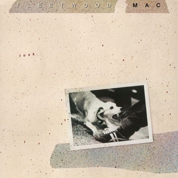
 Read nextTuskA snarling dog clamps onto a man's trouser leg on the front of Fleetwood Mac's Tusk. The truth is gentler: it was producer Ken Caillat's dog Scooter, just playing, frozen forever mid-lunge. Behind that one embossed photo sits a wild sleeve project involving three photographers, blood on a collage, and a band who couldn't stand their own best image.
Quick Facts
Inside the design
Visual analysis
The cover is almost aggressively economical. Brian Griffin gives us pavement, shadow, a narrow blade of sunlight and a pair of white shoes. Joe Jackson's face—the thing a record company would normally consider essential for introducing a new artist—is nowhere to be seen.
That absence is what makes the picture work. The shoes become a stand-in for Jackson himself: sharp, monochrome, slightly severe and impossible to miss. The shaft of light isolates them without requiring a studio backdrop or elaborate lighting rig. Griffin saw the light on the South Bank, asked Jackson to step into it and made the photograph with an Olympus OM-1.
The title completes the joke without needing to explain it. "Look Sharp!" can describe the shoes, the graphic snap of black against white, Jackson's new-wave image or the record's skeptical intelligence. The photograph leaves enough empty space for all of those readings.
The crop is as important as the shoes. By refusing Jackson's face, Griffin turns a portrait into a graphic problem: two bright forms near the bottom of a largely dark image. The human figure is present, but identity has been reduced to stance and footwear.
Michael Ross's art direction lets that reduction remain intact. There is no attempt to compensate for the missing face with a collage, inset portrait or explanatory visual clutter.
It also belongs to Griffin's broader instinct for refusing ordinary musician portraiture. Instead of selling the singer's face, he sold a visual idea. That gamble is why the sleeve remained recognizable long after countless conventional 1979 publicity portraits disappeared.
Why it matters
Why this cover matters
Look Sharp! is a lesson in how little an album cover actually needs.
Joe Jackson was a new artist. The obvious commercial move would have been to put his face on the front and make sure buyers knew exactly who they were getting. Griffin did almost the opposite. He cropped Jackson down to shoes and trousers and trusted one peculiar street photograph to create an identity.
That decision turned an incidental detail—the white winklepicker shoes Jackson happened to be wearing—into an emblem. The image is stylish without becoming fashion photography, and witty without staging an obvious joke.
The sleeve also demonstrates the value of withholding information. By not showing Jackson's face, it creates curiosity instead of satisfying it. A buyer has to connect the shoes, title and music rather than receiving a ready-made celebrity image.
That restraint feels particularly apt for an album full of compressed arrangements and sharp observations. The cover does not attempt to explain Jackson's songs, but it shares their economy: make the point quickly and leave before the idea goes soft.
It also creates a productive argument between artist and artwork. Griffin later recalled that Jackson hated not having his face on the sleeve and never worked with him again. Whether viewed as creative friction or simply Griffin's recollection of the relationship, the irony is hard to miss: the photograph Jackson disliked became one of the images most closely associated with his career.
Historical context
Historical context
Look Sharp! arrived in 1979, when British punk had already blown open the visual rules for new bands and a wave of artists were finding ways to look modern without sharing one uniform style.
Jackson's music was lean, impatient and literate, and the cover avoids the spectacle of late-1970s rock packaging. Griffin's London location work makes the image feel discovered rather than manufactured. His own account is wonderfully mundane: he hired a pale-blue Ford Escort, picked Jackson up, stopped at the Wimpy Bar at Waterloo Station and then walked toward the South Bank.
The famous frame took only minutes once Griffin noticed the shaft of sunlight. Jackson had bought the white shoes on Carnaby Street shortly before the shoot. An ordinary morning in London therefore produced a sleeve that looked more designed than many images built in a studio.
That method also fits Griffin's place in British music photography. His work around the period repeatedly resisted the straightforward head-and-shoulders promotional portrait, bringing ideas from editorial photography and graphic design into record sleeves.
Michael Ross supplied the art direction, turning Griffin's photograph into the finished package. The result belongs to a moment when the LP sleeve still offered enough physical scale for a stark photographic idea to command a shop display.
Look Sharp! was Jackson's debut album. That makes the refusal to show his face even bolder: the package introduced an artist by deliberately withholding the most obvious form of introduction.
Legacy & influence
Legacy and influence
The shoes outlived the argument.
Look Sharp! earned a Grammy nomination for Best Recording Package, and Griffin's photograph became one of the defining sleeves associated with both Joe Jackson and the photographer's career. The image is routinely exhibited and sold as a fine-art photograph decades after its original job as record packaging.
Its influence is difficult to measure cleanly, and there is no need to invent a line of direct imitators. Its endurance is easier to see. The cover still reads immediately at thumbnail size because its idea is so simple: dark ground, white shoes, hard light.
That simplicity also allowed the photograph to survive changes in format. Reduced from an LP to a CD booklet, streaming tile or gallery reproduction, the essential contrast remains intact.
The shoes themselves became memorabilia, which is an unusually literal afterlife for an album-cover prop. What began as something Jackson wore to a quick location shoot became inseparable from the visual memory of his debut.
Griffin's story makes the result even better. There was no giant production behind the icon—just a photographer paying attention quickly enough to notice what the pavement and the morning sun had already arranged.
The cover's continued presence in design collections, including the Museum of Modern Art's holdings, reinforces the point. A commercial sleeve made quickly on a London street crossed into the history of graphic and photographic design without losing the accidental quality that made it work.
About the Look Sharp! cover
What is on the cover of Look Sharp! by Joe Jackson?
Joe Jackson's white pointed shoes and black trousers isolated against pavement, caught beside a dramatic shaft of sunlight on London's South Bank.
Who designed the Look Sharp! album cover?
The Look Sharp! album cover was designed by Michael Ross for Joe Jackson's 1979 release.
Who photographed the Look Sharp! album cover?
The cover photograph for Joe Jackson's Look Sharp! was taken by Brian Griffin.
When was Look Sharp! by Joe Jackson released?
Look Sharp! by Joe Jackson was released in 1979 on A&M Records.
What is the story behind the Look Sharp! album cover?
Brian Griffin photographed Joe Jackson's new white shoes almost as an afterthought during a day of portraits. A shaft of sunlight on London's South Bank turned the five-minute shot into Look Sharp!'s famous cover—and Jackson reportedly hated that his face had disappeared from his own debut sleeve.
Shop this cover
Own Look Sharp! on vinyl & more
As an Amazon Associate and eBay Partner, Behind the Covers earns from qualifying purchases — at no extra cost to you. See our affiliate disclosure.
Color palette
Dominant colors on this cover
#44403c
#181717
#e3dedd
#c5bfbc
#a59f9b
Explore related color collections:
The web behind this cover
Click any node to open the full explorer
More Pop Covers
Back to the archive →

More Black & White Covers
See all →

More from the 1970s
See all →


More on A&M Records



More from 1979
See all →
Keep exploring
Connections across Behind the Covers
Up next
Tusk
Fleetwood Mac · 1979 · Larry Vigon
A snarling dog clamps onto a man's trouser leg on the front of Fleetwood Mac's Tusk. The truth is gentler: it was producer Ken Caillat's dog Scooter, just playing, frozen forever mid-lunge. Behind that one embossed photo sits a wild sleeve project involving three photographers, blood on a collage, and a band who couldn't stand their own best image.
Read this story →Read more in our guides
- A History of Album Cover ArtFrom plain brown sleeves to a billion-dollar design medium: how the record cover became a canvas.
- Psychedelic Album Covers: Color, Distortion, and the 1960sMelting type, impossible color, and collage: how the 1960s counterculture redrew the record sleeve.
- Album Cover Photography: The Single Image That Defines a RecordThe portrait, the concept, the decisive moment: how photographers turned one frame into an album's whole identity.
Want to explore more?
Never miss a new cover story
Get the Behind the Covers app and turn on notifications — we publish new album art deep dives every day.