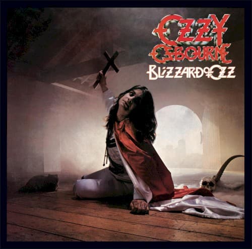
When Fin Costello received the call from Don Arden at Jet Records to shoot Ozzy Osbourne's first solo album cover in 1980, he had no idea he was about to create one of heavy metal's most iconic images. The commission came about when Costello was already working for Jet Records, and the label head - who also happened to be Black Sabbath's manager - asked him to photograph Ozzy's post-Sabbath debut.
The concept was deliberately theatrical from the start. Steve Joule, credited as the album's designer, wanted to establish a visual identity that would distance Ozzy from his Black Sabbath past while embracing his emerging "Prince of Darkness" persona. The idea was to create something with a comic book sensibility - dramatic, dark, but with an underlying sense of theater that would become Ozzy's visual trademark.
Costello set up the shoot at a studio in Metropolitan Wharf, Wapping - a Victorian warehouse district in London's East End that provided the perfect gothic atmosphere. The photographer positioned Ozzy against a dark background, having him clutch crosses in a pose that was both menacing and slightly camp. The lighting was carefully arranged to create dramatic shadows across Ozzy's face, emphasizing his wild hair and intense stare.
During the session, Costello captured the image that would become the album cover - Ozzy in full theatrical regalia, his expression intense and slightly unhinged. According to Costello's later recollections, the shoot had moments of levity despite the dark imagery. At one point during a different session with devil's horns, the studio lights overheated and had to be shut down, leading to an amusing incident where Ozzy, still in full costume, was sent to the local pub for beer.
The photograph perfectly captured what Fin Costello later described as the "sort of comic book image" they were after. This visual approach would carry forward into Ozzy's next album, Diary of a Madman, establishing a consistent aesthetic that helped define his solo career. Costello noted that the same stuffed cat prop appeared on both album covers, creating visual continuity between the releases.
Steve Joule's design work complemented Costello's photography beautifully. The typography and overall layout emphasized the dramatic nature of the image while ensuring Ozzy's name dominated the cover - a crucial marketing decision that established the album as an Ozzy Osbourne release rather than a band effort, despite the original intention to credit "The Blizzard of Ozz" as a group.
When the album was released in September 1980, the cover immediately grabbed attention on record store shelves. The stark, dramatic imagery stood out among other rock releases of the time, perfectly encapsulating the album's blend of heavy metal fury and theatrical horror. Critics and fans responded positively to the visual presentation, which matched the album's sonic intensity.
The cover's religious imagery, particularly the crosses, generated some controversy among conservative groups but also helped establish Ozzy's rebellious image. This calculated provocation became a hallmark of his solo career marketing, with each subsequent album cover pushing boundaries while maintaining the theatrical sensibility established by this debut.
Visually, the cover employs a classic portrait composition with dramatic chiaroscuro lighting reminiscent of baroque religious paintings - an ironic choice given the inverted crosses. The color palette is deliberately muted, dominated by blacks and grays that emphasize the gothic atmosphere. Joule's typography choices are bold and angular, suggesting both heaviness and danger.
The Blizzard of Ozz cover has influenced countless metal album covers since its release. Its combination of religious iconography, dramatic lighting, and theatrical posing became a template for heavy metal visual presentation. The image helped establish album cover photography as a crucial element in metal band branding, moving beyond simple band photos to elaborate conceptual imagery.
The cover's cultural impact extended beyond music into broader popular culture. When Ozzy became a reality TV star decades later, this image remained his most recognizable visual representation, demonstrating its enduring power. The photograph has been reproduced on countless t-shirts, posters, and merchandise items, becoming as iconic as the music itself.
Perhaps most remarkably, Fin Costello shot this legendary image during what was essentially a standard album cover session, not knowing he was creating one of metal's most enduring visual statements. The spontaneous nature of the shoot, combined with Joule's design vision, resulted in artwork that perfectly captured both Ozzy's menacing stage persona and his underlying sense of theatrical humor.