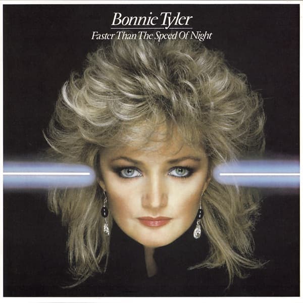

Look closely at the blue beam of light. It runs horizontally straight across the black field of the cover, a thin electric streak like a laser fired through the frame, and then, just before it reaches Bonnie Tyler's face, it breaks. It resumes on the other side. That gap is not an accident of the eye, and it is the small hinge on which this entire sleeve turns.
But first, the face. It fills the center of the frame, a large, tightly cropped close-up emerging from a background so dark it reads as pure void. Tyler's expression is direct and unsmiling, her pale blue-grey eyes ringed in smoky shadow, lips a muted rose. Her hair is the loudest thing here: teased high and wide, hairsprayed into a feathered, backlit halo of blonde that catches the light and glows against the black. It is 1983 rendered in follicles. Below her jaw, two dark drop earrings and the barest edge of a black collar dissolve into the shadow, so that the head appears to hover, weightless and disembodied.
The composition is almost brutally simple: black, hair, face, and that one blue line slicing across at eye level. Your gaze goes first to the eyes, because the beam guides it there, drawing a horizontal path that the face interrupts. The lighting sculpts her cheekbones and leaves the surrounding space unlit, a portrait strategy that turns a singer into an apparition.
At the top, in a restrained serif face, sit two lines of type. Bonnie Tyler is underlined; beneath it, Faster Than the Speed of Night. The title is a phrase about velocity and darkness, and the design answers it literally, a streak of light against the night, moving fast enough to blur at its edges.
That title arrived at a turning point. After four albums on RCA, Tyler had signed with CBS Records, and in the United States the album came out through Columbia. The record was released across Europe on 8 April 1983 and reached the US later that year, a new label betting on a fuller, bigger sound.
The bet had a name: Jim Steinman, who produced the album and built it on his so-called 'Wall of Sound', the towering, operatic arena-rock arrangements catalogued here as AOR and rock. Steinman also wrote its most successful single, 'Total Eclipse of the Heart', the kind of storm-and-thunder ballad that swallowed radio whole. The cover carries none of that bombast in its details, but it carries the mood: something vast and dark, a single figure lit up against it.
Now back to the beam, and its secret. On the European sleeve, the blue light passes behind or across the image so that it interacts with Tyler's head. On the initial U.S. editions, the beam was altered so that it does not pass through her head at all, a deliberate change that makes the American pressing an alternate version of the cover. Two nations, one photograph, and a quiet difference in where the light is allowed to travel. It is the sort of detail that rewards the collector who lines up both sleeves side by side and finally sees it.
Why the eyes land where they do is worth pausing on. Because the background gives the eye nothing else to hold, everything competes at the exact vertical middle: the beam's brightest run, and Tyler's steady stare. The result is a strange tension, light and gaze fighting for the same line, the face winning by breaking the beam. Whatever the intention, the image reads as a woman stopping a streak of energy with her own presence.
Commercially, the presence held. Faster Than the Speed of Night entered the UK Albums Chart at No. 1, a debut straight to the summit for the CBS era. It was certified silver in the UK, platinum in the United States, and double platinum in Canada, the platinum and double-platinum marks abroad confirming that Steinman's widescreen production and that single had crossed oceans.
Strip the sleeve down and it is remarkably economical: no band photo, no scenery, no illustration, just a photographed head, a black ground, two lines of type, and a beam of blue. It trusts the face to do the work, and it trusts the darkness to make the face glow. The teased hair dates it instantly to its year; the void behind it makes it feel like it could hover anywhere.
That is the quiet cleverness of it. A cover about speed and night that barely moves at all, holding still while a single line of light races past. And in the tiny discrepancy of where that light falls, the European version letting it meet her, the American version holding it back, the sleeve keeps one small story for anyone patient enough to look twice.