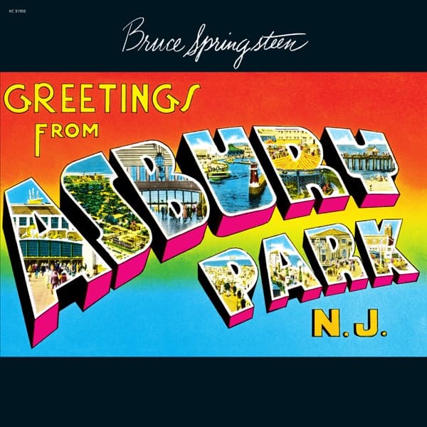
The first thing you notice isn't a face. It's a word, stacked in enormous block letters that arc across the whole square: ASBURY PARK. Each fat, three-dimensional character is filled not with color but with a tiny window onto the Jersey Shore itself. Look inside the A and there's a boardwalk crowd; inside the R, a carousel; inside the P, a beachfront pavilion under a hard blue sky. The whole title behaves like a row of postcards crammed into typography, a souvenir you could mail home. Above it, in loose looping cursive that reads like a signature scrawled across a photo, sits the name Bruce Springsteen. Below, tucked into the bottom right in cheerful yellow, the abbreviation N.J. seals the joke and the pride at once.
That postcard conceit is the entire point, and it was a fight to keep it. When Greetings from Asbury Park, N.J. arrived on January 5, 1973, through Columbia Records, it broke a house rule. Columbia's policy demanded that a debut album put a large photograph of the artist front and center, the better to sell a new face. Springsteen wanted no such introduction. He had found a vintage souvenir postcard in a shop in his hometown, and he argued it fit the music and the place far better than any glamour shot of himself. The label, remarkably, agreed.
So the cover you're holding is a piece of appropriation done in plain sight. The large-letter greeting design was the work of the postcard publisher Tichnor Brothers Inc. of Boston, and the front-cover imagery is credited courtesy of that company. This is a found object elevated to album art, a mass-produced tourist trinket that once sold for pennies on a rack, now bearing the title of a record.
The man who turned that postcard into a finished sleeve was John Berg, credited with the cover design. Berg was Columbia's art director from 1961 to 1985, the presiding eye over a long stretch of the label's most ambitious cover work, and a Grammy winner for his design. His job here was subtraction and framing rather than invention: take an existing piece of Americana, fold in the artist's cursive name up top, and let the object speak. The restraint is the craft. Nothing competes with the letters; the eye travels straight into their little photographic guts, then back out to the horizon-line gradient of orange, red, and blue that the original card used to fake a sunset behind the type.
That gradient does quiet work. The sky bleeds from a warm sunburst at the upper left down into cool blue at the lower right, so the whole card feels like late afternoon at the shore, the hour when the crowds and the neon start to warm up. It's optimistic, a little garish, entirely unpretentious, which is exactly the register of the music inside: Springsteen's loose, verbose folk-rock, songs packed with more words than the melodies can politely hold, spilling out the way the little scenes spill out of each letter.
There is real strategy buried in the choice, too. A conventional debut cover says look at this person. This one says look at this place, and by extension, look where this person comes from. The postcard is a boast disguised as a souvenir. Asbury Park isn't a backdrop; it's the co-star, printed at a scale no photo of a then-unknown singer could have matched. The greeting format literally addresses you, the buyer, as if you'd received mail from the boardwalk.
History has been kind to the gamble. Rolling Stone later placed the album at No. 379 on its list of the 500 Greatest Albums of All Time, and ranked it 37th among the greatest debut albums, a debut that refused to look like one. The cover's afterlife is arguably even louder than its chart life: the large-letter greeting layout became a template others reached for by name, from Stace England's 2005 Greetings from Cairo, Illinois to Jake Owen's 2019 Greetings from... Jake. When your sleeve gets quoted like a catchphrase, the design has outrun the record.
And the songs never left Springsteen's hands. On November 22, 2009, he closed his Working on a Dream tour by performing Greetings from Asbury Park, N.J. in full, front to back, and dedicated the night to Mike Appel, his former manager from the era that produced it. Playing the whole debut decades on is its own kind of returning to the postcard, revisiting the boardwalk printed inside those letters.
Spend another moment with the composition and you see why it endures. Everything is legible from across a room. The scale is comic and confident, the colors are candy-bright, the little embedded photographs reward a closer look without which the cover still works perfectly. It's a design that hides its sophistication behind a bargain-bin object, which is a very Springsteen move: dress the ambitious thing in the ordinary clothes of the place it came from.
That's the story the sleeve tells before a single note plays. A new artist was handed the machinery of star-making, the mandatory portrait, the debut-cover formula, and he answered with a postcard, a signature, and the name of a town. John Berg framed it, Tichnor Brothers had unknowingly drawn it years earlier, and Columbia, against its own rules, let a greeting from the Jersey Shore stand in for a hello from Bruce Springsteen. It worked because the place and the man had become the same introduction.