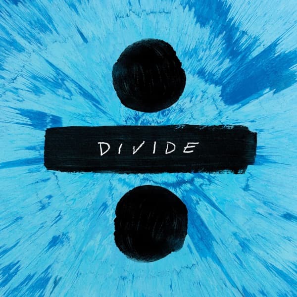
The first thing your eye catches is the collision of black against blue. Two solid dark circles hover in perfect vertical alignment, one above and one below a thick black bar, and together they form a division sign, the mathematical mark for splitting one thing into parts. The bar itself is not printed cleanly; it looks brushed, its edges frayed and slightly ragged, as if laid down in a single loaded stroke of paint. Across the middle of that bar, in loose white hand-lettering that keeps the wobble of a human hand, is the word DIVIDE. The letters are spaced wide and drawn with the same casual, sketch-like confidence, so the title reads less like a logo and more like something scrawled by someone who trusts their own line.
Behind all of that, the entire square explodes. The blue background is not flat but textured into thousands of fine radiating shards, brighter and almost white toward the center where the light seems to detonate, deepening into richer cobalt and teal as it pushes toward the corners. The effect is centrifugal, everything rushing outward from behind the black symbol, so the division sign appears to sit calmly at the eye of its own storm. The two black orbs read almost like planets or pupils, and the whole composition pulls your gaze inward to that central bar and its brushed word, then lets the shattering blue fling it back out again.
It is a bold, near-abstract piece of graphic design, all symbol and energy. But the origin of that visual habit, the very idea of trusting one artist with the face of a record, traces back to the beginning, to an album marked not with a division sign but with a plus.
That first album, +, arrived on 9 September 2011, released through Asylum Records and Atlantic Records. Its cover was not a graphic at all but a hand-drawn portrait of Ed Sheeran himself, made by the artist Phillip Butah. Where the divide symbol is cool and impersonal, the debut was intimate and human: a drawn likeness that put the emerging singer's own face directly in front of the buyer.
The friendship behind that portrait ran deep. Phillip Butah and Ed Sheeran knew each other from back in the day, from a time when Sheeran's own parents, both artists, were mentoring Butah while he was still in school. So when Butah drew the cover for +, he was not a hired stranger flown in for a session. He was someone who had watched Sheeran gig since his college days, who had followed the slow climb toward a first proper album.
The portrait itself was not dashed off. Sheeran sat for Butah over the course of roughly two months while the pastel and pencil likeness took shape. That is an unusual amount of patience for a pop debut, and it shows how much the image mattered to both of them. Butah described what he was reaching for in that drawing: he wanted to show the emerging singer finally coming out of the darkness. He built the portrait so that it confronted the viewer directly, Sheeran's face meeting the eyes of whoever picked up the sleeve.
That phrase, coming out of the darkness, is worth holding onto, because it reframes what a debut cover is for. For an unknown artist, the sleeve is the first handshake, the first time a stranger in a shop looks the singer in the face. Butah understood the assignment as more than decoration. He treated it as a passage, a young musician emerging into visibility, and he made sure the composition forced eye contact rather than letting the subject hide.
Set that against the blue explosion pictured here and you can see how far the visual language traveled. The debut was a face, drawn by hand over weeks, warm and specific and personal. The later symbol is stripped of all that, reduced to a single black glyph floating in a shattering field of light. One asks you to meet a person; the other hands you a sign and lets you fill it with meaning. Yet both share a certain plainness of gesture, the brushed bar and the wobbling white letters here echoing the hand-drawn honesty of that first sleeve.
What connects them most is the through-line of an artist. Phillip Butah has publicly told the story of how he created the cover art for Ed Sheeran's +, describing the two months of sitting, the closeness of the friendship, the wish to pull his friend out of the dark and into the light of a first record. It is a rare thing for a debut cover to come from a childhood mentee of the family, and rarer still for that origin to be remembered and retold.
So while the blue and black division sign in front of you announces a symbol, a mood, and a mathematical idea of splitting things apart, the deeper story runs the other way. It runs back to a plus, to a portrait made slowly by hand, and to a friendship that put Ed Sheeran's own face out into the world before any symbol ever could.