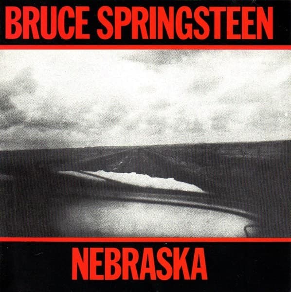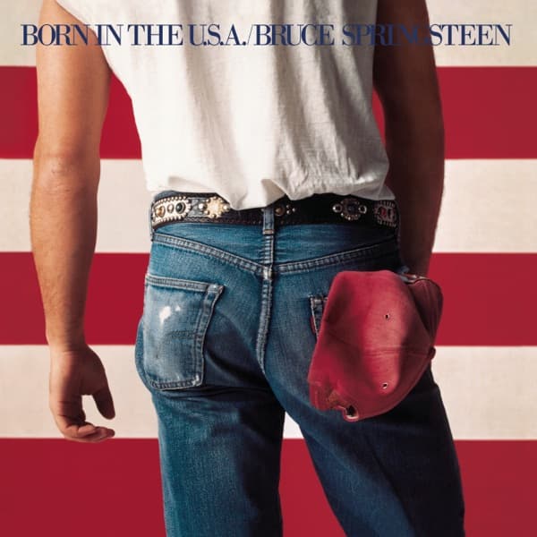





The cover of Born in the U.S.A. looks so inevitable now that it is easy to forget how many other directions were considered. Bruce Springsteen had already worked with Columbia art director Andrea Klein on Nebraska, a stark black-and-white package built around David Michael Kennedy's highway photograph. For the next album, Klein pushed toward something bolder and more colorful.
Springsteen also knew that he wanted the American flag to matter. He later said he was conscious of being an American musician writing about the country and felt the flag's meaning was something people had a right to argue over. Before the shoot, he told Annie Leibovitz that the flag should play a prominent role in the cover.
The route to the final backdrop was not immediate. Accounts of the design process describe ideas involving Joseph Szabo's photographs of American teenagers, a Jasper Johns-like painted flag, and a flag painted by Keith Haring. The version that survived was much simpler: a real American flag, roughly twenty-five feet wide, hung across the wall of Leibovitz's New York studio.
Leibovitz photographed Springsteen in front of it in multiple poses. The image chosen for the front removes the face entirely. Springsteen is turned away from the camera in faded jeans and a white T-shirt, framed against red-and-white stripes, with a red baseball cap hanging from his right rear pocket. The final selection was not, by Springsteen's account, a hidden provocation. He later dismissed the rumor that the pose was meant to suggest urinating on the flag and said the rear-view photograph simply looked better than the pictures of his face.
That distinction matters because the finished image has accumulated interpretations that are easy to mistake for documented intent. The flag is politically charged, the title song is about a Vietnam veteran whose country has failed him, and the cover places Springsteen's body directly against a national symbol. Those elements invite readings of pride, criticism, tension or irony. But the surviving accounts do not establish that Leibovitz and Klein constructed every visual detail as a coded political statement.
Klein's contribution is especially important. Original release records credit Andrea Klein with art direction and design and Annie Leibovitz with photography. Klein directed the visual project, chose the package typography and helped select the final image. MoMA now catalogs the album cover under both women's names, which reflects the collaborative way the sleeve was actually made rather than reducing it to a single famous photograph.
Klein chose Bodoni Bold for the package, a typeface she associated with the visual language of American postage. Its compact red-and-blue block sits above the photograph on the original sleeve and extends the national color scheme without covering the image. The type does not explain the photograph; it makes the package feel graphic and official.
The red cap supplied the one small object that did not come from the flag or Springsteen's clothing. Accounts of the shoot identify it as a cap that had belonged to the late father of Springsteen's friend Lance Larson. Whatever associations later viewers found in it, its documented origin was personal rather than a campaign prop.
Born in the U.S.A. was released on June 4, 1984. Its title track was frequently heard as a straightforward patriotic anthem even though its lyrics tell a much harsher story. The cover underwent a similar loss of control: an image created from flag, denim and a deliberately simple pose became a surface onto which viewers projected competing versions of American identity. Springsteen himself had warned that once a powerful symbol like the flag is released into public view, its meaning is no longer fully yours to manage.