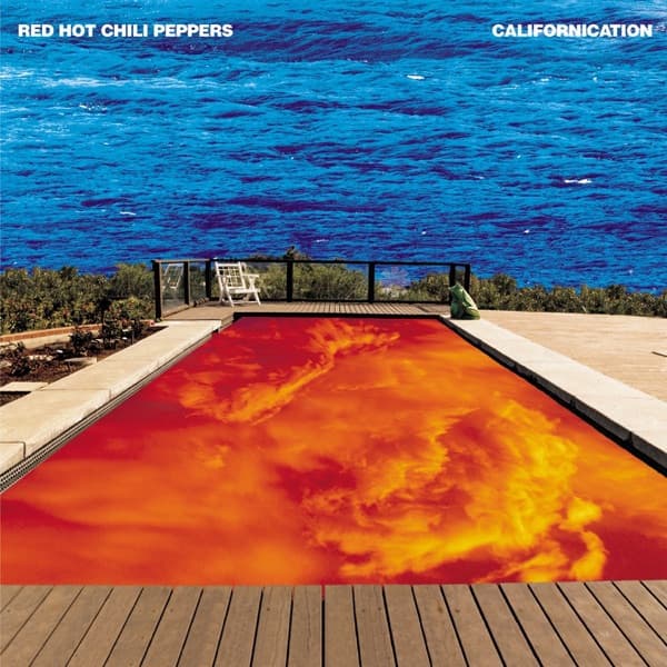
It all started with a dream. John Frusciante had envisioned a place where "the water was in the sky and the sky was in the water," and when the Red Hot Chili Peppers reunited for their seventh album, the guitarist's ethereal vision became the foundation for one of the most iconic album covers of the 1990s.
The Californication cover wasn't the first concept pursued. Lawrence Azerrad, the Warner Bros. Records designer who spearheaded the project, initially worked with the band on multiple directions before settling on the pool imagery. When they finally embraced Frusciante's dream, it perfectly captured the album's themes about California's deceptive paradise and the band's own spiritual rebirth.
Finding the right pool became a physical quest. Azerrad and the band had to "physically audition swimming pools by driving and checking them out in person," keeping photos in "an old fashioned physical binder of locations" delivered by messenger. The perfect pool belonged to the parents of one of Azerrad's childhood friends, adding a personal connection to the surreal artwork.
The creation process was remarkably analog for what appears to be a digital masterpiece. Due to Photoshop's limitations in 1999, Azerrad would mock up the cover on his computer, but when the band approved the concept, he handed it off to movie poster specialists who created "a higher res version of the photo composition" for the final artwork.
Photographer Sonya Koskoff captured the pool imagery, while Tony Woolliscroft shot the back cover photograph. Koskoff had been documenting the band's promotional activities since the late 1990s, making her the natural choice for this pivotal album's visual documentation.
Lawrence Azerrad brought both artistic vision and deep music industry experience to the project. As a Grammy-winning designer who had worked closely with Anthony Kiedis, John Frusciante, and Flea at Warner Bros., he understood their aesthetic sensibilities. His goal was to make it "feel like a classic rock record," which influenced his decision to keep the typography small at the top.
The creation process became intensely collaborative. "They pretty much camped out in my office for a number of weeks," Azerrad recalled. "Anthony would basically use my office as his and sit behind me on the couch and check in with me." This intimate working relationship allowed the band to maintain creative control over every detail.
The printing process became unexpectedly dramatic. When the artwork was prepared for standard four-color printing, the blues appeared significantly duller than the saturated proofs. John Frusciante was "really disappointed" and "didn't understand why it wasn't the same blue" he had been seeing throughout the design process.
To preserve Frusciante's vision, the printer guaranteed a special blue ink specifically for the sky portion of the cover. This technical solution ensured the final product matched the artist's expectations and maintained the cover's otherworldly impact.
The striking orange pool water emerged through what Azerrad called "a happy accident." The fiery orange tones came from "a photo of a flaming red sunset, but it's naturally that color." This serendipitous discovery perfectly complemented the manipulated blue sky, creating the cover's signature color contrast.
The typography choices reinforced the classic rock aesthetic Azerrad envisioned. The small, white sans-serif text at the top deliberately avoided competing with the artwork, allowing the surreal pool image to dominate viewers' attention while still maintaining the necessary commercial information.
The Californication cover became a landmark in album art history, representing both the band's artistic rebirth and the transitional moment between analog and digital design processes. Its success helped establish the template for future Red Hot Chili Peppers releases and influenced countless other alternative rock album covers throughout the 2000s.
The artwork's enduring power lies in its perfect visual metaphor for the album's themes. Just as California itself presents beautiful surfaces hiding darker realities, the inverted pool and sky create a dreamlike disorientation that captures both wonder and unease.
Reflecting on the pre-digital era creation process, Azerrad noted it "strikes me as anachronistic now, but I guess that was before people were really in power using Photoshop on an individual level." The cover stands as a testament to both artistic vision and the collaborative magic possible when technology serves creativity rather than driving it.