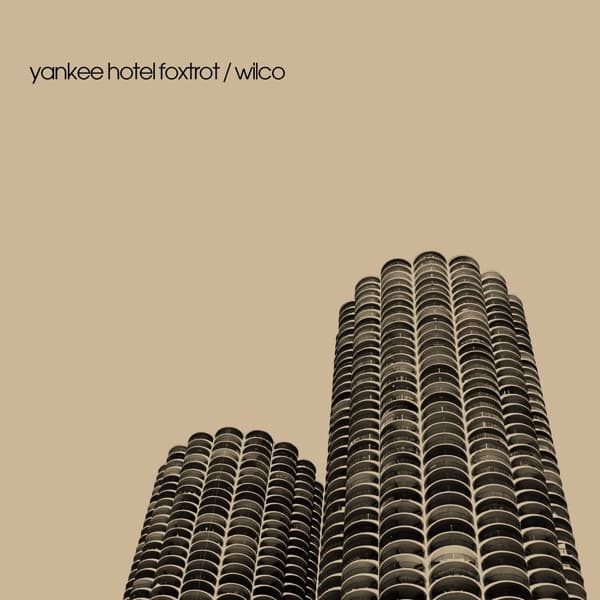
The frame is split unequally between two kinds of matter: solid and empty. The two cylindrical towers rise from the bottom edge and climb the right two-thirds of the composition, while the entire left flank and the top are given over to flat, unbroken sky. That imbalance is the picture's first argument. By refusing to center the buildings, the design lets the eye enter at the bottom-right mass and travel upward along the ribbed balconies until it runs off the top edge, where the towers are cropped rather than capped. We never see their crowns. The structures read as taller than the frame can contain, which converts a photograph of two finite objects into an image of something rising past its own limit.
The upward camera angle is doing the emotional work. Shot from below and tilted, the towers lean slightly, their vertical lines converging as they recede, so the buildings appear to tip away from true. This is the visual equivalent of vertigo: the stable thing is not quite stable. The nearer, shorter tower on the left leans in toward its taller twin on the right, and the two of them together form an unsteady pair rather than a matched, reassuring symmetry. The eye keeps wanting to level them and cannot, which is precisely the unbalanced feeling the composition is engineering.
Colour is held to a single warm register. The sky is a flat sepia-tan, closer to weathered paper or old newsprint than to any real daytime blue, and the towers are rendered in browns and near-blacks that sit inside that same warm family. Nothing is cold. This monochrome treatment strips the image of the present tense; it looks less like a snapshot and more like a document that has aged, a memory of a skyline rather than a live view of one. The absence of any true white or bright accent keeps the mood muted and slightly mournful.
The towers' most distinctive feature, the scalloped tiers of semicircular balconies stacked all the way up, becomes a texture rather than an architectural detail. Repeated hundreds of times, the curved balcony fronts read as vertical ridges of light and shadow, a corrugation that catches the eye the way a fingerprint or a stack of coins does. That relentless repetition gives the buildings a botanical, almost organic quality, less like glass boxes and more like two cobs standing on end. The rhythm is hypnotic and slightly claustrophobic: floor after identical floor with no relief.
Down in the shadowed base, where the two towers meet the bottom of the frame, the exposed structural columns and the darker lower floors form a murky, less legible zone. The clarity is all in the upper reaches catching light; the foundations dissolve into dark. The eye is pulled up and away from the ground, reinforcing the sense that these are things climbing out of something rather than planted firmly in it.
The typography is deliberately weightless against all this mass. Set low in the upper-left corner, in small lowercase sans-serif letters, the title and artist name sit quietly in the empty sky: "yankee hotel foxtrot / wilco." The lettering makes no attempt to dominate; it does not stretch across the towers or announce itself in scale. Its restraint hands the entire visual argument to the photograph and lets the words function as a caption, an aviation-alphabet phrase whispered into the negative space. The forward slash between title and band treats both as equal terms in a short transmission.
The vast field of sky is the most underrated element. That empty upper-left quadrant is not dead space; it is pressure. It gives the leaning towers room to fall into, and it isolates them so completely that no other building, horizon, or context survives to steady them. The cropping that removed any neighbours leaves the pair stranded in a warm void, two forms with nothing to lean against but each other.
Read whole, the image is a study in precarious verticality: two twinned towers, warm and aged and slightly tipping, cropped so they seem to exceed the frame, floating in an empty sky with a barely-there caption. It converts a piece of Chicago concrete into a mood, watchful, unsettled, tender toward the thing it depicts. The design works because every choice, the tilt, the crop, the monochrome, the tiny type, the emptiness, points in the same direction: two things standing together in an unsteady space.