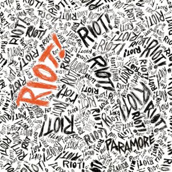
The whole image is built from a single repeated word, and the repetition is the argument. 'Riot' appears in thin nervous outlines, thick shouting capitals, tilted scrawls, and tiny anxious whispers, drawn so many times that the surface behaves like static. Nothing is set in a clean font. Each instance is hand-drawn, which is why it feels alive and unstable, like a wall graffitied over and over by someone who could not stop. The technique itself carries the meaning: mechanical type would have read as calm, but the hand keeps slipping, and that slip is the feeling.
The palette is the discipline that lets the chaos work. It is held to three colors: acres of white, dense black lettering, and orange used as the one flare of emphasis. By denying the design any other color, the orange 'Riot' becomes the flashpoint, the spark in a room full of tinder. That contrast between disciplined limitation and visual overload is the whole point. It reads as tension, as anxiety, as pressure building with nowhere to go. A lesser version of this cover would have thrown a hundred colors at the noise and lost the meaning in the mess; here the black-and-white overload gives the single orange word something to burn against, and the emotion snaps into focus.
Scan the composition and you can feel it move. The black words cluster and swirl, some upright, some diagonal, some upside down, a few reduced to faint outlines as if fading in and out of the noise. The largest, boldest treatments crowd the upper and right portions, while the smaller scrawls fill the gaps like an anxious murmur underneath the shouting. The white space between them never gets to breathe for long. Everywhere the eye tries to rest, another 'Riot' is waiting, and that relentlessness is the feeling of an emotion that will not switch off. The overall effect is text-as-art: the crudely drawn, repeated word visually evokes a rioting crowd rather than describing one.
The boldest choice is what the front leaves out. There are no faces, no group shot, no glamour portrait. The only place the band name appears on the front is a small, handwritten 'PARAMORE' tucked into the lower right, easy to miss among the riot. That absence is the confidence of the design made visible; it lets the concept lead and trusts the emotion to sell itself, refusing the reassurance a portrait would have offered.
Read as a whole, the cover is the title made literal. The word does not appear once, calmly. It erupts, again and again, until the page cannot contain it, and the sketched, overlapping handwriting becomes the picture of an overflow. The lettering also holds more than one temperature at a time, swinging from delicate outline to heavy black shout, so the surface never settles into one mood. That is the quiet mechanism of the whole thing: the word becomes a feeling you can see, and long after you look away the image keeps shouting the same thing over and over, exactly as it was drawn to.