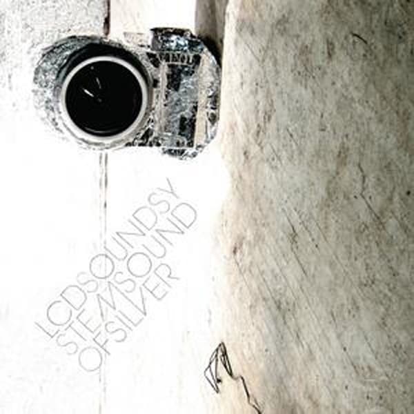
The first thing your eye finds is a lens, a perfect black circle ringed in white, staring out from a body that has been mummified in crumpled aluminium foil. Turn your head and the word CANON reveals itself, stamped along the top plate, because the whole picture has been rotated onto its side. The camera hangs against a wall of scuffed, dirty plaster, its wrinkled silver skin catching hard light in a hundred tiny facets. It looks less like product photography than like something excavated, an object wrapped for safekeeping and then forgotten in a stairwell.
That foil is the entire joke, and the entire truth, of Sound of Silver. When James Murphy made this LCD Soundsystem album, he decided the debut had sounded, in his word, too woody, and he wanted this one to be more silver. So he covered the recording studio in silver fabric and tin foil until the room itself was the concept. The cover simply extends the gag outward: even the camera that would photograph the sessions gets shrink-wrapped in the same material. The theme is not printed on the sleeve so much as physically applied to everything in reach.
The lower left corner is where the design does its quiet work. There, running along the diagonal, sits the title in metallic silver text, LCDSOUNDSYSTEM stacked over SOUND OF SILVER, the letters tight and sans-serif and embossed into the cover so they gleam or vanish depending on how you tilt it. This is a typographic sleeve in the truest sense: no illustration, no band portrait, just the name and the words rendered in the color the whole enterprise is named for. The type is small, understated, pushed to the margin, trusting the strange foil-wrapped camera to hold the frame.
Compositionally the image is deliberately off. Rotating the camera ninety degrees turns a familiar object into a puzzle, forcing you to work out what you are looking at before the CANON logo clicks it into place. The right two thirds of the cover is given over to nothing but that pocked, weathered plaster wall, a field of grey-beige grime with a thin dark crack snaking down it and a loop of wire dangling in the bottom corner. It is an unglamorous, almost derelict backdrop, and it makes the silver object floating against it look even more like an intrusion, a bright thing in a shabby place.
There is a wit in choosing a camera as the subject. An album cover is, at bottom, a photograph's job, and here the photograph's tool has itself become the sight, wrapped and mute, its lens a black hole that reflects nothing back. The foil catches every crease as highlight and shadow, giving the metal a topography, ridges and valleys of light. Against the flat dead wall, the camera is the only thing with volume and shine, and your attention keeps returning to that black circle at its heart.
The music inside earned all this care. Sound of Silver got tagged as dance-punk, dance-rock, electronica, electronic rock, indie rock, a spread of labels that says how hard it was to file. It arrived in the spring of 2007, out on March 20 in the United States and March 12 in the United Kingdom, a joint release from DFA and Capitol Records at home and EMI everywhere else. No sleeve designer, art director, or photographer is credited, which leaves the foil-wrapped camera to speak entirely for itself.
Buyers of the physical release got more than the embossed front. The album came in a gatefold sleeve, opening to reveal a 24-inch by 36-inch full-color one-sided poster and full-color inner sleeves printed with lyrics and artwork. The restraint of the outside, all metallic type and a single strange object, gave way to color and words once you cracked it open, the reticent exterior rewarding the person who actually held the record in their hands.
Beneath the metallic gleam sits a quiet dedication. The album was made in memory of Dr. George Kamen, who lived from 1942 to 2006, a Bulgarian-born pioneer of group therapy. It is the sort of detail that never appears on the front cover and colors everything anyway, a reminder that under the foil and the drum machines there was grief and gratitude being worked out.
The response was immediate and sustained. Sound of Silver drew widespread acclaim and a Grammy nomination for Best Electronic/Dance Album at the 50th Annual Grammy Awards. The Guardian, Uncut and Drowned in Sound all named it their album of the year; Pitchfork ranked it the second best album of 2007 and later placed it at number 17 on its list of the best albums of the entire decade. The silver had set.
That is the payoff of the cover's small, deadpan literalism. Murphy said he wanted the record to be more silver, and rather than reach for chrome futurism or spaceship gloss, the sleeve delivers silver as anyone actually makes it in a room, crumpled kitchen foil pressed around whatever is at hand. The camera against the filthy plaster is silver the way the studio was silver: improvised, homemade, faintly absurd, and completely committed to the bit. You keep looking at that black lens, and the wrapped metal keeps throwing the light back in pieces.