
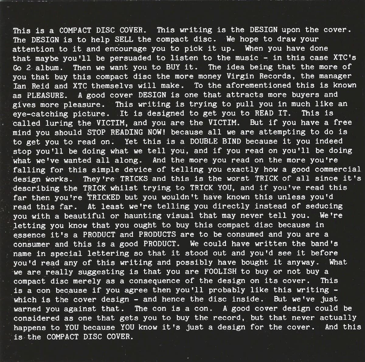
The cover of XTC's Go 2 looks like someone forgot to replace the designer's notes with actual artwork. That is precisely the joke. Hipgnosis, the studio famous for surreal photographic sleeves for Pink Floyd and Led Zeppelin, ended up making one of its most radical covers from nothing more than words.\n\nAubrey Powell later recalled Andy Partridge visiting the Hipgnosis studio to review ideas prepared for XTC. Partridge disliked them. While looking around the room, however, he noticed another concept by Powell's partner Storm Thorgerson: a typewritten sheet beginning with the idea that this was a record cover and proceeding to explain what record covers do.\n\nPartridge asked who it was for. According to Powell, Thorgerson told him it was simply an idea that could be sold to anybody. Partridge loved it and claimed it for XTC.\n\nThe finished front cover turns that studio artifact into a piece of anti-advertising. Instead of using an image to seduce the shopper, the text explains the machinery of seduction: the cover is there to attract attention, encourage interest in the music and ultimately persuade somebody to exchange money for the record. The band name and album title are buried inside the prose rather than elevated into a logo.\n\nThat makes Go 2 unusually self-aware. The sleeve tells the buyer that a sleeve is manipulating them while performing that manipulation successfully. Its refusal to show a conventional image becomes the thing that makes it stand out in a rack full of images.\n\nThe idea also fit XTC's temperament. In 1978 the band was emerging from the British new-wave moment with music that was nervous, witty and suspicious of convention. A cover that dismantled the language of record marketing while still functioning as record marketing was more appropriate than a polished promotional portrait could have been.\n\nHipgnosis had built its reputation by making viewers ask what an image meant. Go 2 performs the same trick without an image at all. It asks what an album cover is for—and then answers the question directly on the cover.
Cover Hipgnosis · Virgin Records · © respective owner · fair use
Go 2
XTC rejected the covers Hipgnosis had prepared for Go 2. Then Andy Partridge spotted an unused Storm Thorgerson idea in the studio: a block of type explaining exactly how an album cover is supposed to persuade you to buy the record. He immediately wanted it.
 Read nextSkylarkingXTC's **Skylarking** cover features a mysterious double-exposed photograph that band members initially hated, calling it too "hippy-dippy" for their sophisticated pop masterpiece. The ethereal overlay technique became iconic despite the controversy.
More from XTC
Quick Facts
Inside the design
Visual analysis
Go 2 weaponizes hierarchy. Album covers normally make the artist name and title immediately legible, then use an image to create desire. Here, a dense rectangle of uniform white type dominates the black field. The information a buyer expects to find instantly is deliberately submerged inside an explanation of why that information usually matters.\n\nThe result is both austere and funny. Reading the text makes the viewer increasingly conscious of being a consumer looking at packaging. Yet the conceptual cleverness makes the package memorable, proving the very persuasive power the copy claims to expose.
Why it matters
Why this cover matters
Go 2 is one of the clearest examples of conceptual album design turning the commercial function of packaging into its subject. Andy Partridge did not choose the concept from the commissioned ideas Hipgnosis showed him; he spotted an unused Thorgerson experiment sitting in the studio and recognized that its dry explanation of record-cover marketing was exactly right for XTC.\n\nThe paradox is perfect: a cover explaining that covers exist to sell records became famous because it was unusually effective at attracting attention.
Historical context
Historical context
Released in 1978, Go 2 was XTC's second studio album, arriving during Britain's transition from punk into new wave and post-punk. Hipgnosis was already synonymous with elaborate progressive-rock imagery, which made the studio's almost image-free solution particularly striking.
Legacy & influence
Legacy and influence
Go 2 remains one of Hipgnosis' most recognizable conceptual designs and a recurring example in discussions of self-referential graphic design. Its idea has been imitated and referenced precisely because the cover exposes the conventions most packaging tries to hide.
About the Go 2 cover
What is on the cover of Go 2 by XTC?
A black field filled with a dense block of white explanatory text beginning with a blunt description of what a record cover is and how cover design is intended to attract a buyer.
Who designed the Go 2 album cover?
The Go 2 album cover was designed by Hipgnosis for XTC's 1978 release.
When was Go 2 by XTC released?
Go 2 by XTC was released in 1978 on Virgin Records.
What is the story behind the Go 2 album cover?
XTC rejected the covers Hipgnosis had prepared for Go 2. Then Andy Partridge spotted an unused Storm Thorgerson idea in the studio: a block of type explaining exactly how an album cover is supposed to persuade you to buy the record. He immediately wanted it.
Shop this cover
Own Go 2 on vinyl & more
As an Amazon Associate and eBay Partner, Behind the Covers earns from qualifying purchases — at no extra cost to you. See our affiliate disclosure.
Color palette
Dominant colors on this cover
#21211e
#40403e
#60605e
#80807e
#9f9f9d
Explore related color collections:
The web behind this cover
Click any node to open the full explorer
More by XTC
Back to the archive →Also designed by Hipgnosis

More Punk Covers
 BTC-501
 BTC-500
 BTC-499
 BTC-483
More Black & White Covers
See all →


More from the 1970s
See all →


More on Virgin Records



More from 1978
See all →


Keep exploring
Connections across Behind the Covers

Up next
Skylarking
XTC · 1986 · Dave Dragon
XTC's **Skylarking** cover features a mysterious double-exposed photograph that band members initially hated, calling it too "hippy-dippy" for their sophisticated pop masterpiece. The ethereal overlay technique became iconic despite the controversy.
Read this story →Read more in our guides
- The Most Influential Album Covers of All TimeThe handful of sleeves that didn't just package a record but changed what every record after them could look like.
- A History of Album Cover ArtFrom plain brown sleeves to a billion-dollar design medium: how the record cover became a canvas.
- Hipgnosis: The Studio That Made Album Covers SurrealThe London studio that decided album covers should look like impossible photographs — and got the biggest bands in the world to agree.
Want to explore more?
Never miss a new cover story
Get the Behind the Covers app and turn on notifications — we publish new album art deep dives every day.