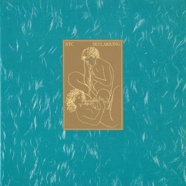

Two figures lie in the grass, playing flutes beneath an enormous wash of turquoise. There is something almost ancient about the scene, as though it belongs on a forgotten concert poster rather than an English pop record from 1986. Yet it is difficult to imagine XTC’s Skylarking wearing anything else. The gentle illustration has become part of the album’s character, even though it was never Andy Partridge’s first choice.
Partridge had wanted a far more intimate image: close-up photographs of male and female pubic hair with flowers woven through it. The idea brought together the record’s recurring themes of nature, desire and the changing seasons. Virgin Records was less enthusiastic. When the concept was shown to retailers, the response was discouraging, and the label abandoned it. XTC needed another cover.
Partridge found a way forward in an illustration by Swiss artist Hans Erni, originally associated with a concert poster. The reclining figures, their flutes and the surrounding open space offered a different kind of sensuality. The design retained the album’s connection to the natural world without the confrontational closeness of the rejected photographs. Dave Dragon received the sleeve-drawing credit on the finished LP, with Partridge closely involved in the choice of image.
The result was a strange sort of happy accident. Skylarking is full of gardens, weather and the passage of time, but also the uneasy things that creep into an otherwise beautiful day. The cover captures the idyllic side of that world. Its figures appear content to stay exactly where they are, playing to one another while everything beyond the grass fades into blue.
The album itself was anything but effortless. Produced by Todd Rundgren, Skylarking brought together songs by Partridge and Colin Moulding in a sequence that moves from the warmth of Summer’s Cauldron and Grass through romance, domestic life, doubt and mortality. Partridge and Rundgren frequently clashed during the sessions. Somehow, out of that friction came one of XTC’s most graceful records.
The artwork is especially effective because it refuses to explain too much. The figures might be lovers, companions or simply two people sharing a tune. Their flutes suggest a conversation without words. The empty space around them makes the scene feel removed from ordinary time, a little like the music itself when one song slips almost imperceptibly into the next.
Open an original LP and the mood shifts again. Cindy Palmano’s inner-sleeve photographs present the band in costume, bringing a playful theatricality to the packaging. The record’s visual world was never limited to the pastoral drawing on the front. The different images sit comfortably beside XTC’s own mixture of wit, precision and eccentricity.
The photographic cover Partridge had imagined did not disappear forever. In 2010, his Ape House label announced plans to revive it for a reissue. The idea that had been considered too risky for record shops in 1986 could finally be seen alongside the familiar illustration. It gave listeners a glimpse of the album as Partridge had first pictured it.
That leaves Skylarking with two very different visual identities. One is earthy, direct and deliberately provocative; the other is open, playful and quietly romantic. The blue-green sleeve became the image most people know, but its story is richer for the alternative that came before it.