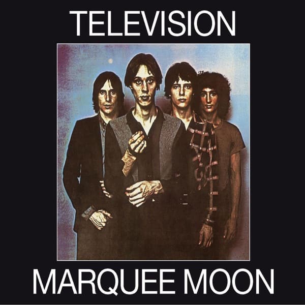
Four men stand against a dark background, their faces and hands caught in a strange wash of pink, yellow and pale blue. Tom Verlaine is slightly forward, one hand raised as though he has been interrupted mid-gesture. Richard Lloyd, Fred Smith and Billy Ficca recede behind him. The image feels both immediate and oddly distant: a band portrait that looks as if it has passed through a malfunctioning machine.
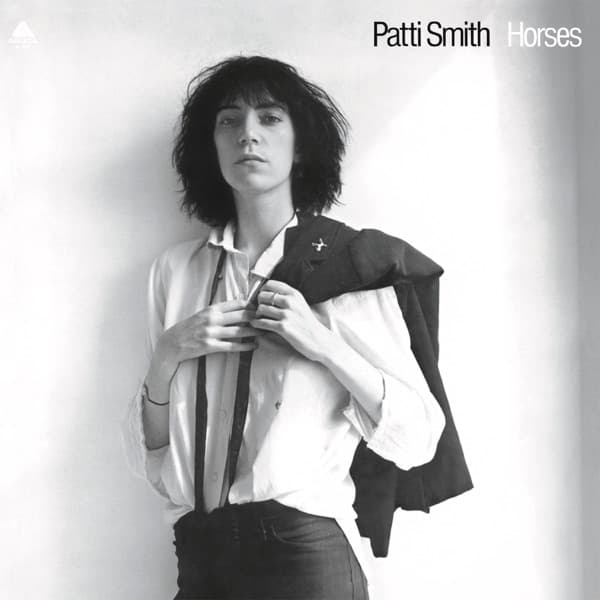
That is close to what happened. Robert Mapplethorpe photographed Television, and the group selected a picture from the session. Mapplethorpe was already closely connected to New York's downtown art world and had photographed Patti Smith for the cover of Horses. For Television, though, the finished sleeve did not simply reproduce his photograph. The band wanted something less polished and more unpredictable.
Richard Lloyd later described taking the chosen black-and-white image to a Times Square print shop to make color photocopies. As the machine produced unexpected hues, he encouraged further experiments with its settings. The result was an image with the uneven color and flattened texture of a reproduction several generations removed from the original. Accounts differ in minor details about who directed the adjustments, but the essential story is consistent: the cover's peculiar coloring came from experimenting with photocopy technology rather than from a conventional photographic color treatment.
The accident was especially apt for Television. By the time Marquee Moon appeared on Elektra Records in February 1977, the group had become an important presence at CBGB in New York. Yet its music rarely behaved like the stripped-down punk shorthand that would later define the scene. Verlaine and Lloyd built songs out of interlocking guitar figures, letting one line interrupt or extend another. The sound was tense, angular and sometimes unexpectedly luminous.
On the cover, the musicians appear together without quite settling into a traditional band pose. Verlaine's outstretched hand gives the composition a point of tension; the other three figures seem to hover behind him. Mapplethorpe's photograph supplies the deliberate arrangement, while the photocopy process disrupts its precision. The bright areas look almost bleached, and the shadows swallow detail. The picture is recognizable as a portrait, but it resists the smooth certainty of a promotional photograph.
Tony Lane is credited with art direction. The title and band name are presented with restraint, leaving the strange photograph to carry the sleeve's personality. Rather than decorating the music with an elaborate fantasy scene, the design lets the group's physical presence become the mystery. Its off-register color is not merely a psychedelic flourish. It makes a straightforward studio photograph look like an artifact of the city that produced the band: copied, altered, circulated and transformed.
That connection is easy to hear in the record itself. The opening See No Evil pushes forward on tightly fitted guitar parts, while Venus and Friction combine street-level imagery with musical turns that refuse to resolve in the obvious way. The long title track stretches its central riff into a sustained exchange between the two guitarists. Marquee Moon is music that repeatedly finds new shapes inside a familiar rock-band lineup. The sleeve performs a similar trick on the simplest possible subject: four musicians facing a camera.
The original album was recorded in New York and produced by Tom Verlaine and Andy Johns. It contains eight tracks, with the title song closing the first side of the LP and Torn Curtain bringing the second to its measured conclusion. Although the band belonged to the same downtown world as the Ramones, Blondie and Patti Smith, the record carved out its own language, drawing as much energy from the players' precision and restraint as from their willingness to experiment.
The back of the original package deserves attention too. Credits identify Billy Lobo with back-cover artwork, alongside Mapplethorpe's photography and Lane's art direction. Those separate credits are a reminder that an album sleeve is a designed object rather than a single isolated image. Editions and reissues can differ in layout and supplementary material, so the front photograph is the most stable visual reference across releases.
Marquee Moon did not become an enormous American hit on release, but its reputation grew through critics, musicians and listeners who heard new possibilities in its guitars. The photograph has undergone a comparable transformation in the public imagination. What began as an unconventional treatment of a band portrait is now inseparable from the sound of a record that helped establish the vocabulary of post-punk and independent guitar music.
Look again at the four figures and the colors that seem to slide away from them. The cover has none of the obvious visual shorthand of punk: no ripped newspaper, no safety pins, no aggressive slogan. Its rebellion is quieter. A fine-art photograph was pushed through a commercial copying machine until something unexpected appeared. That mixture of control and chance is what makes Marquee Moon's sleeve such a persuasive introduction to the music inside.