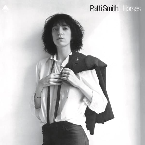
The composition is almost shockingly simple: a figure against a wall, shot from waist level, the frame built on aligned verticals and diagonals so that a pose which looks informal is in fact carefully balanced. The thin black tie supplies a vertical accent that pulls the eye up from the collar to the chin, emphasizing the length of Smith's neck and the sharpness of her jaw. Mapplethorpe lined up her body so that the tip of a light triangle juts from her collarbone like an angel's wing, a small deliberate geometry hidden inside an apparently casual stance.
The palette is virtually monochromatic: the white of shirt and wall, the black of hair and tie, the warm grey of the shadows, the olive tone of the skin. The restriction focuses everything on form and expression, the two elements Mapplethorpe would prioritize throughout his career. The white shirt is crisp but not starched, its whiteness a field of light; the darker tone of the wall behind her head and the shadow under her jaw give just enough contrast to separate figure from ground and lend the image a sculptural quality.
The light comes from a single window source, soft and directional, throwing gentle shadows on one side of the face that give depth without melodrama. That even fall of light makes the whites glow, an overall brightness that reads as clarity or revelation. The photograph proves that visual power comes from what is excluded as much as from what is included.
The jacket over the shoulder is the single dramatic gesture, a reference to rat-pack cool that Smith reclaims for an androgynous purpose. That androgyny is the picture's real argument. Female artists on album covers were expected to be legible as glamorous, sexy, wholesome, or mystical; this image refuses all four. The men's shirt, the flat chest, the angular face, the direct gaze, the absence of makeup or jewelry, the shouldered jacket: every element combines into a portrait of gender as performance, of femininity as something that can be donned, discarded, or reinvented at will. Read as an early celebrity portrait, it captures Smith's unconventional and androgynous side while holding to a precise equilibrium of oppositions, white shirt against shadowed blazer, hard gaze against graceful pose.
The typography keeps its distance. Smith's name and the album title sit in a clean, modern font, set apart from the figure so the words behave as a caption rather than a competing design element. That deference lets the photograph dominate the sleeve with the authority of a gallery print. The monochrome and the plainness together give the image a quality unfixed to its moment, equally at home in 1975, 1955, or 1925. What it finally says is that a woman looking straight into the camera, with nothing to sell and nothing to prove, can be the most compelling image imaginable.