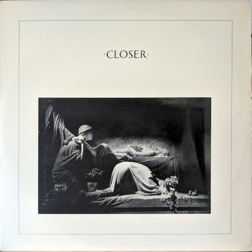
The cover looks as though it has been taken from another century. Above a photograph of mourning figures, the word CLOSER sits in widely spaced Roman lettering. The paper is pale, the picture nearly black, and the scene appears to be a funeral. Nothing about the sleeve announces a Manchester post-punk group, the sound of synthesizers, or the year 1980. That distance between what the eye sees and what the record contains was central to the design. What nobody involved could have anticipated was how painfully literal the image would seem by the time the album reached shops.
The photograph was made by Bernard Pierre Wolff at the Monumental Cemetery of Staglieno in Genoa, Italy. It shows a marble sculpture on the Appiani family tomb, made by Demetrio Paernio in the early twentieth century. The sculpted figures gather around a reclining body in an arrangement that evokes the lamentation of Christ. What can look at first like a carefully staged photograph of human mourners is a photograph of stone. The camera's darkness and the sculpture's drapery blur the boundary between a living ritual and a permanent memorial.
Peter Saville, who had designed Joy Division's debut album Unknown Pleasures, came across Wolff's cemetery photographs in the art magazine Zoom. He was fascinated by the images and showed them to the band during discussions about their second album. The musicians chose the photograph together. Saville has repeatedly emphasized this sequence: the artwork was selected while Ian Curtis was alive, not commissioned afterward as a tribute or a prediction.
That distinction matters because Curtis died on 18 May 1980, before Closer was released. The sleeve was suddenly transformed by a fact outside the design studio. Saville recalled learning the news from Factory Records co-founder Tony Wilson and immediately realizing the difficulty of releasing a record with a tomb on its front. There were discussions about changing the image, but the original choice remained. The record appeared in Britain on 18 July 1980, two months after Curtis's death.
The cover's power comes partly from the refusal to make that coincidence easy. It would be tempting to describe the monument as a coded message from Curtis, or to say that the band deliberately designed a farewell. The surviving accounts do not support either claim. The photograph appealed to the band before the tragedy. Its later meaning arose from the encounter between a pre-existing artistic choice and an event no designer could control.
Saville's typography intensifies the sense of distance. The title is not set in the rough, urgent language often associated with punk sleeves. It is drawn from classical inscription, with monumental letterforms that could belong to an architectural fragment. The generous white border and the soft, almost engraved-paper quality of the original package turn the photograph into something resembling a historical print. The album's title appears above it as if carved into a memorial. Rather than dressing Joy Division in contemporary fashion, the sleeve borrows the authority and ambiguity of an antique object.
The design also connects Closer to the ideas behind Factory Records. The label treated sleeves, catalog numbers, posters and other printed objects as part of a larger visual identity. Saville's work did not simply reproduce the band or illustrate the songs. It asked what happens when a modern record is placed inside an object that seems to belong to a different cultural moment. On Closer, the tension is especially sharp: a photograph of a century-old memorial houses music made with the nervous energy and studio technology of 1980.
There is a second story in the album's music. Joy Division recorded the nine tracks with producer Martin Hannett at Britannia Row Studios in London. Compared with the stark pulse of Unknown Pleasures, Closer moves through wider spaces and more unsettling arrangements. The opening track, Atrocity Exhibition, begins with a lurching rhythm; Isolation brings keyboards into a brittle, almost danceable frame; The Eternal and Decades close the album in a slower, more spacious register. The sleeve doesn't literally illustrate those tracks. But its severe composition gives listeners a visual world in which to encounter them.
The photograph is also easy to misunderstand. It is not a snapshot of Curtis's grave, and the figures are not actors arranged for an album shoot. The monument is the Appiani family tomb in Staglieno. A different Wolff photograph, of the Ribaudo family tomb's angel sculpture in the same cemetery, was used for the twelve-inch sleeve of Love Will Tear Us Apart. Together, the images formed an accidental visual sequence around the band's final releases. They were related by photographer and location, not by a retrospective commission after Curtis's death.
The original British LP was issued by Factory with the catalog number FACT 25. On surviving copies, the cover's near-monochrome palette and restrained lettering make the record feel unusually deliberate even when viewed from a distance. The central photograph occupies a defined rectangle rather than bleeding to the edge, so the empty paper becomes an active part of the composition. The image draws the viewer inward; the surrounding white space holds it at a respectful distance. That combination is why the sleeve can look both intimate and ceremonial.
There is a subtle difference between describing the picture and interpreting it. The physical facts are clear: a photograph by Wolff, a sculpture by Paernio, the Appiani tomb in Genoa, and a design associated with Saville and Martyn Atkins. The grief we read into it is real as a response, but its meaning is not fixed. Some viewers see a religious lamentation; others see a work of sculpture, a Victorian-feeling memorial, or the shadow of Curtis's death. The cover can accommodate those readings without having been conceived to express all of them.
The work has since moved beyond record shops. The Museum of Modern Art holds an example of the sleeve in its design collection, crediting Peter Saville, Martyn Atkins and Bernard Pierre Wolff. That institutional recognition is fitting. Closer is a remarkable example of how a sleeve can use existing art, typography and material choices to create something new, without requiring a conventional illustration or a photograph of the musicians.
The record remains impossible to separate entirely from the circumstances of its release. Yet reducing the cover to a prophecy would erase the very process that made it: a designer finding a photograph, a band responding to it, and a label willing to put an apparently ancient image around contemporary music. The tragedy changed what people saw, but it did not create the artwork. Closer's enduring force lies in that uncomfortable space between intention and hindsight.