Karl Ferris listened to the Hollies' new music and pictured them trying to break through something.
Not a door. A membrane.
By 1967 the Hollies were known for immaculate harmonies and tightly made pop singles. But the music they were recording for Evolution was beginning to stretch outward. Ferris later said he imagined the group pushing through into a psychedelic world, and he decided to make that transition physical.
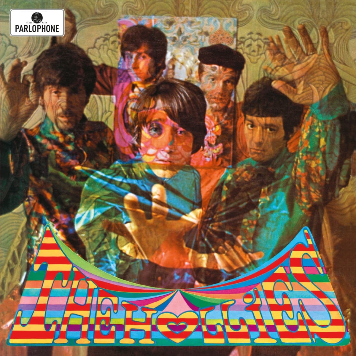
In the studio he photographed the band pressing their hands and faces against clear plastic. The material distorted them just enough to make the picture feel as though the musicians were emerging through a surface rather than merely standing in front of a camera.
Then Ferris kept building.
He layered the band photograph with a William Morris wallpaper pattern and additional illustration. His girlfriend Anke contributed drawing and lettering elements, and Ferris worked with the Dutch design collective The Fool, who handled lettering, the back cover and the band's extraordinary clothing. What looks at first like one delirious psychedelic photograph is actually a constructed image with several creative hands inside it.
Ferris was already interested in what he called 'icons with eyes'—photographs that used intense color, unusual optics and direct gazes to create something more visionary than documentary. Evolution gave him an ideal subject because the title itself invited transformation.
The cover therefore does something more precise than dressing the Hollies in the visual fashion of 1967. The band appear to be crossing from one state into another. Hands reach forward. Faces are partially obscured and multiplied by the layers. Ornamental pattern refuses to stay in the background. The image is about transition, and the title tells you what kind.
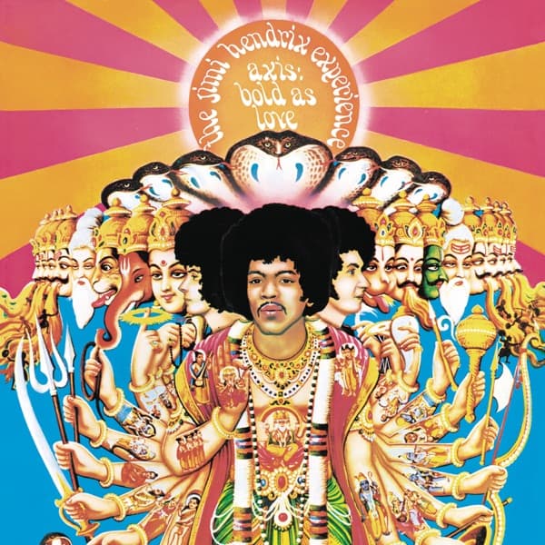
Ferris later remembered music journalists reacting strongly to the sleeve and described it as an important calling card for the work that followed. Soon he was photographing and designing for artists including Jimi Hendrix and Donovan. Whether or not one accepts every later claim made for the cover's priority, its timing is undeniable: Evolution arrived in June 1967, at the moment British pop packaging was exploding into psychedelia.
The Hollies' own official archive still presents the original image as the face of the album. That matters because psychedelic-era records often acquired alternate sleeves across countries and reissues. Evolution's British artwork remains the image through which this particular turn in the band's career is remembered.
The cleverest part is that the cover never abandons the Hollies themselves. Ferris could have buried them beneath abstraction. Instead, the visual effects make the group the event. They are not standing beside psychedelia. They are pushing into it.
Inside the design
Evolution tries to make a musical change visible as a physical event.
Karl Ferris photographed the Hollies pressing against clear plastic, with hands and faces appearing to push toward the viewer. He later explained the idea directly: the group was breaking from its established pop-beat identity, and he imagined them pushing through a membrane into a psychedelic world.
That makes the distortion more than period decoration. The band is not simply surrounded by psychedelic graphics; the photograph stages the moment of crossing into them.
Ferris then layered the portrait with a William Morris-style Art Nouveau wallpaper pattern and an illustration incorporating the word "Love" by his girlfriend Anke. The Fool contributed lettering, the back-cover design and the group's costumes. Several different visual languages therefore collide in one square: photographic portraiture, nineteenth-century decorative pattern, hand-drawn counterculture graphics and fashion.
The clear membrane is especially effective because it keeps the Hollies recognizable while physically disrupting their faces and bodies. We are still looking at a group portrait, but the portrait is resisting its own flat surface.
That tension separates Evolution from a sleeve that merely adds psychedelic color around a conventional photograph. Ferris builds the transition into the act of photographing the band.
The density is deliberate. Earlier Hollies sleeves could present a clean, legible pop group. Evolution makes the viewer work through layers to reach them.
The title then supplies the final piece. The image does not simply say "psychedelic." It says that something familiar is in the process of becoming something else.
Why it matters
Evolution is compelling because the cover is not merely psychedelic in appearance; Ferris had a specific narrative for why it should look psychedelic.
The Hollies were trying to expand what listeners expected from them. Ferris translated that transition into the image of bodies pushing through a transparent barrier. The visual effect and the album title reinforce one another without needing literal explanatory text.
The sleeve also sits at an important intersection of 1967 London visual culture. Ferris' experimental photography and The Fool's graphic and fashion work belonged to the same rapidly changing world in which record covers were becoming spaces for ideas rather than simple publicity portraits.
That collaboration matters. Psychedelia was not one visual technique. On Evolution, photography, clothing, lettering, illustration and decorative pattern all contribute different pieces of the effect.
The cover therefore documents a network of creative disciplines moving alongside the music. Bands were changing how records sounded while photographers and designers were simultaneously changing what a pop group was allowed to look like.
Ferris later said the cover helped bring him to the attention of other musicians—including Jimi Hendrix. Whether or not a viewer knows that history, Evolution looks like a door opening.
More importantly, it avoids a common weakness of period psychedelic art: decoration without argument. Ferris' membrane gives the visual excess a reason to exist. The Hollies are not simply wearing the new style. They are shown forcing their way into it.
Historical context
The Hollies released Evolution in June 1967, at the height of the extraordinary visual and musical acceleration surrounding British pop.
Graham Nash in particular was pushing the group toward more adventurous studio work. Ferris has recalled attending Hollies sessions at Abbey Road while the Beatles were working on Sgt. Pepper nearby, an unusually vivid picture of how compressed that moment was: bands hearing one another's experiments almost in real time.
Ferris was already developing what he called psychedelic photography through color and optical experimentation. For Evolution he worked with The Fool, the Dutch design collective closely associated with London's psychedelic scene.
The resulting sleeve therefore did not arrive after psychedelia had hardened into a nostalgic style. It was made while artists, photographers, designers and musicians were still deciding what that style could be.
That timing also helps explain why Victorian and Art Nouveau references could feel new rather than backward-looking. Psychedelic designers routinely raided older decorative traditions, enlarging and recoloring them until nineteenth-century ornament became part of a futuristic youth culture.
The Hollies occupied an interesting position inside that change. They were already successful hitmakers, not an unknown underground group trying to signal allegiance to a new scene. Evolution therefore had to communicate expansion without making the band unrecognizable.
Ferris' solution preserves their faces while subjecting them to distortion. Historically, that compromise is part of what makes the cover useful: it shows mainstream British pop absorbing psychedelic visual language in real time.
Legacy & influence
Ferris regarded Evolution as a breakthrough.
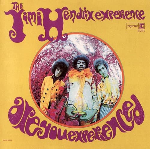
He later recalled that the sleeve drew attention from other major musicians and said Jimi Hendrix saw it and wanted something similarly psychedelic for the American release of Are You Experienced. Ferris would go on to create that now-famous Hendrix portrait.
That connection gives Evolution an unusually clear place in the genealogy of psychedelic album photography. It was not simply one colorful sleeve among hundreds made after the style became fashionable; it helped establish Ferris as a photographer musicians sought when they wanted their image to signal a new consciousness.
The cover also preserves the Hollies at a transitional point. Their gift for polished pop had not disappeared, but the visual language announces that polish would no longer define the limits of what they could attempt.
Placed beside Butterfly, released only months later, Evolution becomes even more interesting. Here the band is visibly forcing its way through the barrier. On Butterfly, the transformation metaphor can occupy the sleeve without a conventional group portrait at all.
That sequence gives the Hollies a small but unusually legible visual narrative across 1967.
Today Evolution still feels crowded and strange because its layers were built from actual experiments—plastic, superimposition, pattern, costume and hand-drawn graphics—not from a single psychedelic filter.
Its lasting value is therefore not that it looks generically "Sixties." It records several artists inventing that look while the decade was still happening.