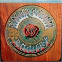
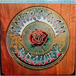
Before Aoxomoxoa was an album cover, Rick Griffin's image belonged to the Grateful Dead's poster world. Griffin's own biography says he initially made the piece for upcoming Dead shows; the band liked it enough to reuse it for their third studio album in 1969. That origin matters because the sleeve does not behave like a conventional portrait or product package. It behaves like a psychedelic poster: information, ornament and symbolism are compressed into a single visual field.
Griffin also helped give the album its peculiar name. His biography describes his fascination with palindromes and credits him with the title Aoxomoxoa; accounts of the album also connect lyricist Robert Hunter to the invention. The word's lack of ordinary meaning fits the image. Rather than explain itself, the cover invites the viewer to enter a private visual language.
At the center is Griffin's extraordinary lettering. The band's name seems to grow rather than sit on the image. Around it are skulls, plantlike forms, a blazing sun and imagery associated with fertility, death and rebirth. Some descriptions read the sun as simultaneously resembling an egg being fertilized. These motifs make the sleeve feel cyclical: life pushes toward death while death feeds another beginning.
The most famous piece of fan lore concerns the words GRATEFUL DEAD. Generations of viewers have claimed Griffin hid the phrase WE ATE THE ACID inside the lettering. Drummer Bill Kreutzmann later acknowledged that the alternate reading can be seen if you look at it the right way, while also describing Aoxomoxoa itself simply as a cool palindrome. That distinction is important: the acid reading is beloved fan interpretation, not something this page should present as a documented secret message from Griffin.
The cover's status has outgrown rock memorabilia. The Museum of Modern Art holds Griffin's 1969 Aoxomoxoa album-cover lithograph in its architecture and design collection, while the Grateful Dead's official archive explicitly credits the front-cover illustration to him. What began in San Francisco's psychedelic poster culture became a museum-held example of graphic design.
## The back cover: the Dead's world made visible
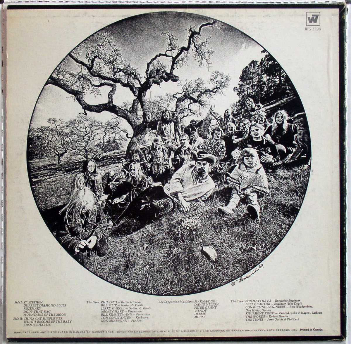
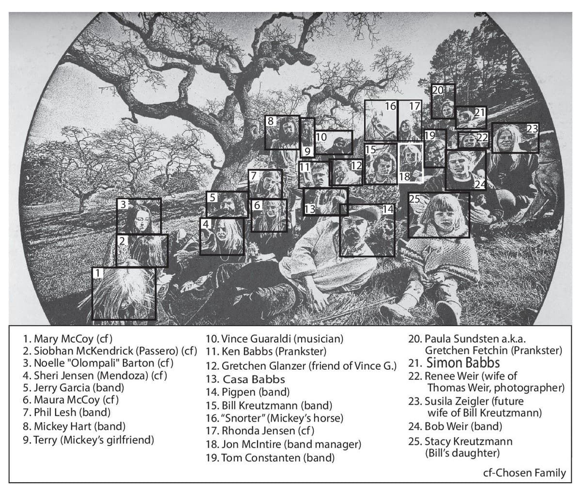
The back cover changes the scale completely. After Griffin's cosmic, symbolic front, the sleeve turns to an actual community. The Grateful Dead's official archive credits the photograph to Thomas Weir. The image shows the band and members of their extended circle gathered beneath a large oak at Olompali, the Marin County property that became an important gathering place for the San Francisco counterculture in 1966–69. The juxtaposition is one of the package's strongest ideas even if it was not conceived as a formal thesis: Griffin gives the Dead a mythic universe on the front; Weir shows the human network around them on the back.
The photograph has generated its own mythology. A persistent claim identified one of the children as a young Courtney Love, whose father Hank Harrison had connections to the Dead. That identification is disputed. Bill Kreutzmann explicitly wrote that the child was his daughter Stacy, not Courtney Love. That makes the rumor useful to mention only if it is corrected: the back cover's real interest is not a celebrity cameo but the way it documents the family-and-friends ecosystem surrounding the band.
Another remarkable face in the photograph is jazz pianist Vince Guaraldi, best known for the music of the Peanuts television specials. Guaraldi was friendly with members of the Dead and appears in accounts of the back-cover gathering. His presence is a reminder that the Dead's Bay Area orbit crossed musical worlds that look much more separate in hindsight.
Seen together, the two sides make Aoxomoxoa richer than the front image alone suggests. The front is Griffin's invented symbolic cosmos—sex, birth, death, rebirth, lettering and visual riddles. The back grounds that psychedelic universe in a specific place and community. One side asks the viewer to decode; the other asks the viewer to recognize a tribe.