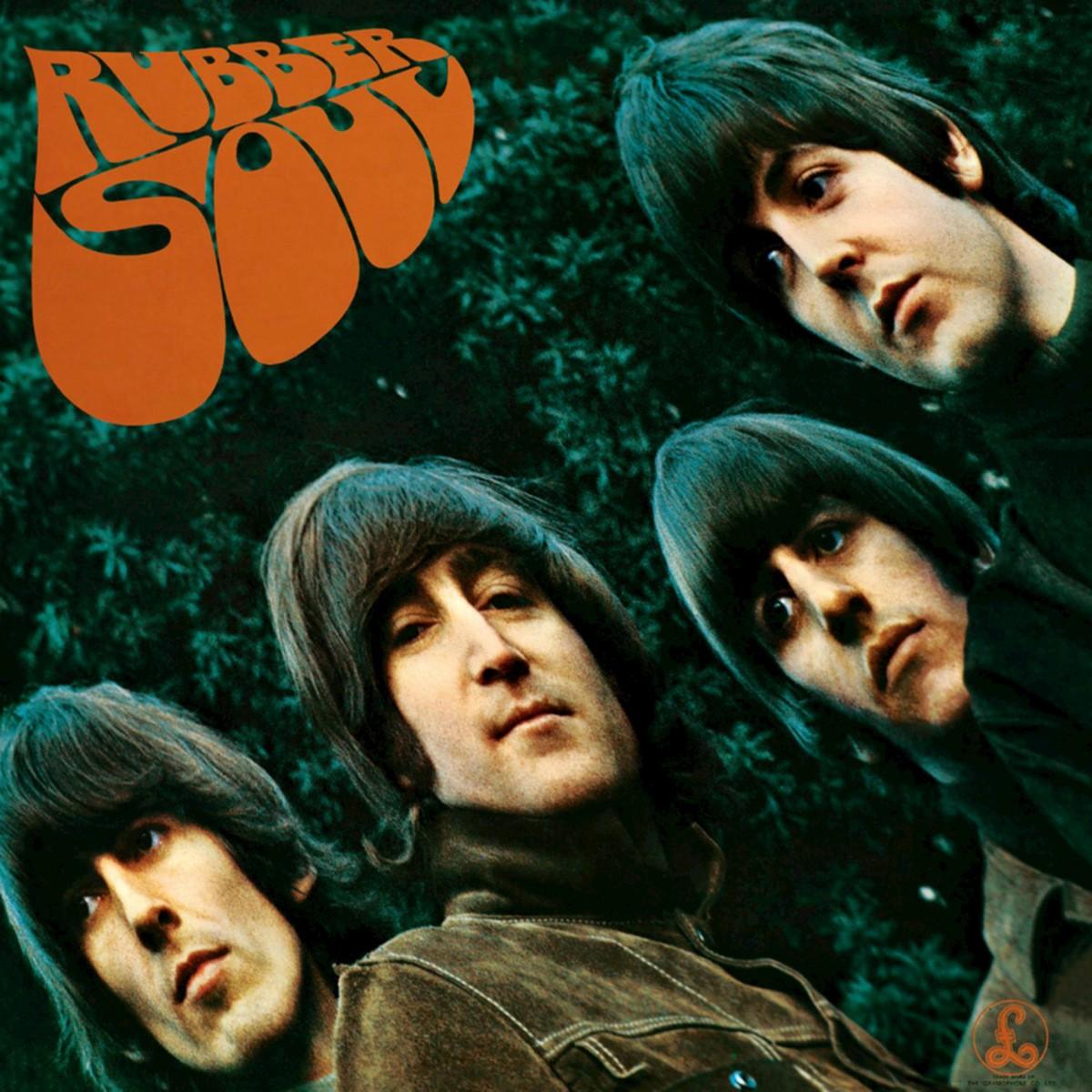
On the front of Rubber Soul, four of the most recognizable people in the world look as though they have been pulled out of shape. John Lennon, Paul McCartney, George Harrison and Ringo Starr lean toward the camera, their faces stretched and their expressions unexpectedly reserved. Above them, the album title bends in soft, uneven letters. The Beatles' name is nowhere to be seen. In December 1965, that absence said as much about the band's confidence as the strange photograph said about its changing music.
The picture was taken by Robert Freeman, whose association with the Beatles had already produced some of their defining early sleeves. He photographed the group at John Lennon's home in Weybridge, Surrey, using a setting that felt far removed from the tidy studio portraits of Beatlemania. The four wear casual, muted clothing, and the trees behind them dissolve into a soft green background. Even before the image was distorted, it was less interested in selling four smiling personalities than in capturing the group as a unit.
Freeman later described how the distinctive stretching happened while he and the band were looking at projected photographs. The image was being projected onto a piece of card; when the card tilted or shifted, the faces became elongated. Instead of asking for a correction, the Beatles liked what they saw. The anecdote has become inseparable from the cover's history, although it is best attributed to Freeman's account rather than presented as a precisely documented accident. What is certain is that the final design chose the distortion rather than hiding it.
Charles Front supplied the title lettering. It is easy to overlook his contribution because Freeman's photograph is so memorable, but the letters are what make the sleeve cohere. They look hand-shaped, almost rubbery, swelling and narrowing across the upper left of the frame. Their warm orange-brown color stands apart from the photograph's greens and dark jackets, while their soft outlines echo the stretched faces below. The result is not simply a photograph with words placed over it. The typography and image are telling the same story.
The absence of a prominent band name is equally deliberate in its effect. A new group would have needed its identity spelled out; the Beatles did not. The four faces were enough. That decision lets the picture operate less like an advertisement and more like a statement: these musicians were prepared to be seen differently. The cover does not shout about experimentation. It asks the audience to notice that something familiar has shifted.
The record arrived in Britain on 3 December 1965, only months after Help! and at the end of an extraordinarily productive year. Its songs revealed a band moving away from the straightforward romantic declarations of its earliest hits. Norwegian Wood introduced the sitar into a Beatles recording, with George Harrison's playing contributing a new texture to the group's sound. Nowhere Man offered a portrait of isolation rather than a conventional love song. In My Life treated memory with an intimacy and uncertainty that would have been hard to imagine on their first album. Girl and Michelle showed different kinds of sophistication in melody, mood and arrangement.
Rubber Soul did not emerge in isolation. The Beatles were listening widely, absorbing folk-rock, soul, American pop and new studio possibilities. Their songwriting partnership was changing, too: Lennon and McCartney were increasingly writing from distinct personal perspectives while still shaping the band's shared identity. The sleeve captures that in-between moment. The four musicians remain unmistakably together, but their image is no longer fixed in the bright, reassuring conventions of early publicity.
There is a further complication when discussing the album as a historical object. The original British Parlophone edition and the American Capitol edition did not contain identical track lists. The US release rearranged the material and drew on songs from the British Help! album, producing a somewhat different listening experience under the same title and cover. Modern digital editions commonly use the British sequence. A cover history should acknowledge this rather than imply that every buyer in 1965 heard the same record.
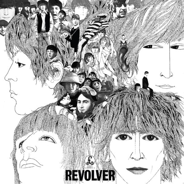
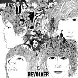
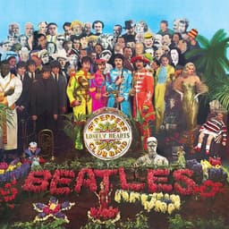
The photograph's distortion is often described as psychedelic, and it certainly anticipates the Beatles' more adventurous visual work. But Rubber Soul is not yet the extravagant constructed world of Sgt. Pepper's Lonely Hearts Club Band or the stark illustration of Revolver. Its power comes from how little it needs. Four faces, a green background and a title that seems to bend with the image are enough to suggest a band in motion.
That may be why the sleeve has aged so well. It does not rely on a topical costume or an elaborate concept that needs explaining. The viewer can feel the difference before knowing anything about projection equipment, the recording sessions or the album's place in the Beatles' career. Rubber Soul is the sound of a group discovering new ways to make records, and its cover gives that discovery a visual form.