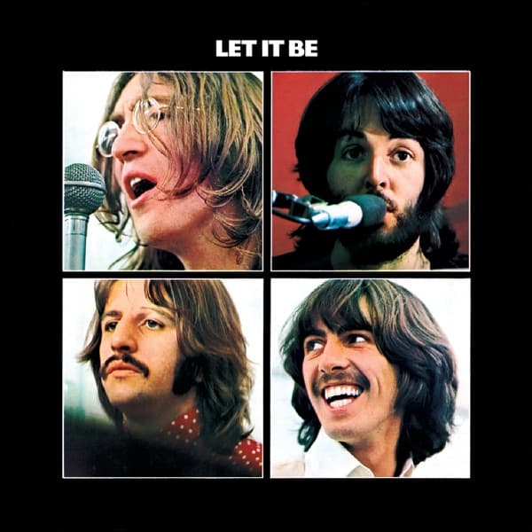
The released cover of Let It Be is built from four separate portraits: John Lennon, Paul McCartney, Ringo Starr and George Harrison, each boxed into his own rectangle against a black field. Ethan A. Russell took the photographs. John Kosh, Apple's creative director, designed the sleeve that turned those images into the final 1970 package.
That division of credit is printed on the original UK packaging itself: 'Designed by John Kosh. Photographs by Ethan A Russell.' It is also preserved in release records for the 1970 album. The distinction matters because the front cover is not simply a photograph. Its meaning and recognizability come from the way Kosh isolates, crops and arranges four different portraits inside a severe black structure.
The album had once been heading toward a very different cover. When the project was still called Get Back, the Beatles considered recreating the photograph from their 1963 debut, Please Please Me. Photographer Angus McBean, who had taken the original Manchester Square stairwell image, returned in 1969 to photograph the band in the same location. The resulting picture deliberately echoed the earlier pose, fitting the project's original back-to-basics idea.
That Get Back package was abandoned as the album changed shape. The unused McBean photograph later appeared on the Beatles' 1973 compilation 1967–1970, but it was not the image chosen for Let It Be. When Kosh returned to the project, he used Russell's January 1969 photographs instead.
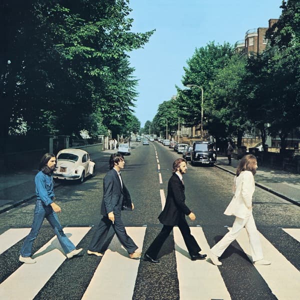
Kosh had already been working with the Beatles as Apple's creative director and had designed the sleeve for Abbey Road. For Let It Be he moved in almost the opposite direction from a conventional group portrait. Four photographs share one cover, but the band members do not occupy one photographic space. Black borders keep them visibly separate.
It is tempting to treat that separation as a deliberate coded statement about the Beatles' breakup. The timing certainly gives the design that resonance: Let It Be was released in May 1970 as the group's public story was ending. But the safest account keeps production fact and later interpretation distinct. What is documented is Kosh's black four-portrait design and Russell's photography. The idea that the grid intentionally announces the breakup is a compelling reading of the finished sleeve, not a creator quote we should present as established intent.
The UK release made the packaging more elaborate than the front sleeve alone suggests. Early copies came in a box with a large Get Back book containing photographs and dialogue from the filmed sessions. Kosh was involved in that wider package as well. Far from showing that little design work went into the project, the box, book, sleeve and slipcase made Let It Be one of the Beatles' more involved physical album packages.
The front cover remains powerful because Kosh reduced that larger project to a very simple visual formula: black ground, white title, four color portraits. Russell supplied four distinct images; Kosh made their separation into the structure of the sleeve. The accurate creator story therefore needs both names: John Kosh designed it; Ethan A. Russell photographed it.