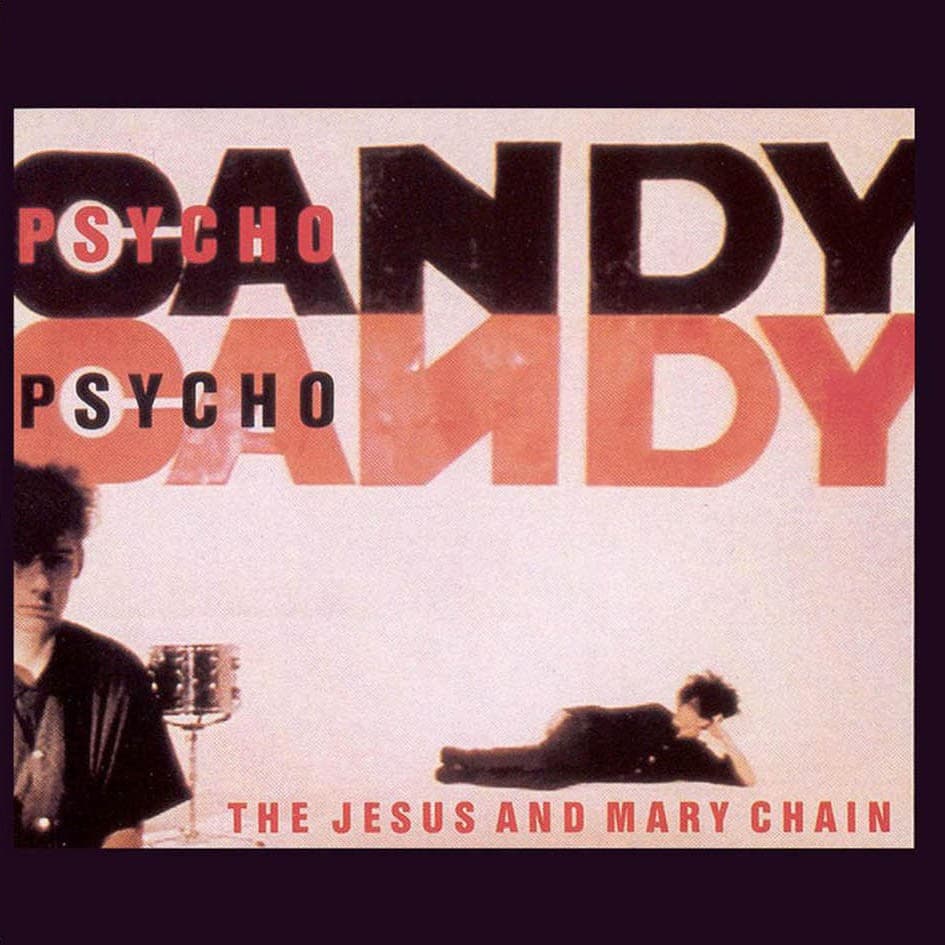

Psychocandy announced The Jesus and Mary Chain by refusing to make the band easy to see. The cover is a murky red-and-black field in which faces and bodies emerge only partially from grain, shadow and contrast. It is recognizably a band image, but it behaves more like damaged evidence than a conventional debut-album portrait.
That roughness was rooted in the group's circumstances rather than added later as a marketing pose. In an excerpt from Zoë Howe's history of the band, the Reid brothers are described as doing almost everything themselves in the early days, from making music to putting together sleeves and recruiting friends to help. The photographs used on Psychocandy's front cover were taken in the bedroom Jim and William Reid shared in East Kilbride. An image that would become one of the defining covers of 1980s British alternative music therefore began in a domestic room, before the band's mythology had fully hardened.
The finished package credits Greg Allen with art direction and a group of photographers with sleeve photography: Alastair Indge, Bleddyn Butcher, Chris Clunn, Mike Laye, Rona McIntosh and Stuart Cassidy. MusicBrainz preserves that multi-photographer credit on the release record. Because the surviving package credits do not reliably map the exact front-cover frame to one individual, the most accurate attribution is collaborative rather than forcing a single photographer into structured metadata.
The title works with the picture in the same way the music works with melody. Psychocandy is built from opposites: pop hooks and abrasion, sweetness and damage, invitation and distance. The cover makes a parallel move. It uses the familiar form of a band portrait, then degrades it until identity becomes unstable. The group is present and obscured at the same time.
That tension helped the sleeve avoid the obvious visual language of either post-punk severity or glossy pop. It does not illustrate feedback, romance or danger literally. Instead, it makes those qualities perceptual. Red supplies heat and urgency without becoming a symbol that needs decoding; deep blacks swallow detail; grain makes the photograph feel unstable. What survives is attitude, proximity and texture.
The cover also belongs to the band's self-built early period. Howe's account describes the Mary Chain as an autodidactic group that created sleeve interiors, gathered its own visual materials and enlisted friends as needed. That matters because Psychocandy's visual identity was not simply attached to the record by an outside campaign. The same small circle that was figuring out how the band should sound was also figuring out how it should look.
The record itself was released by Blanco y Negro on November 18, 1985. Its songs paired concise, often simple pop structures with extreme guitar feedback and noise, a combination that later became a reference point for noise pop, shoegaze and alternative rock. The sleeve does not diagram that musical formula, but it translates its logic into an image: a recognizable subject buried beneath an aggressive surface.
Four decades later, that is still why the cover works. It is not technically polished in the conventional sense, and it does not need to be. Its power comes from turning limitation, grain and obscurity into identity. The faces are there, but you have to look through the noise to find them — exactly the bargain Psychocandy asks of the listener.