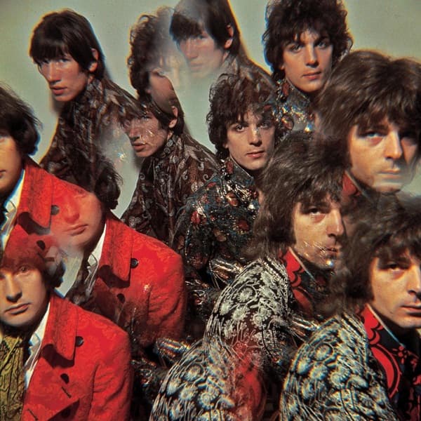
Only a few months after the Hollies appeared to push through a psychedelic membrane on Evolution, they disappeared from their own cover.
Butterfly puts the creature first.
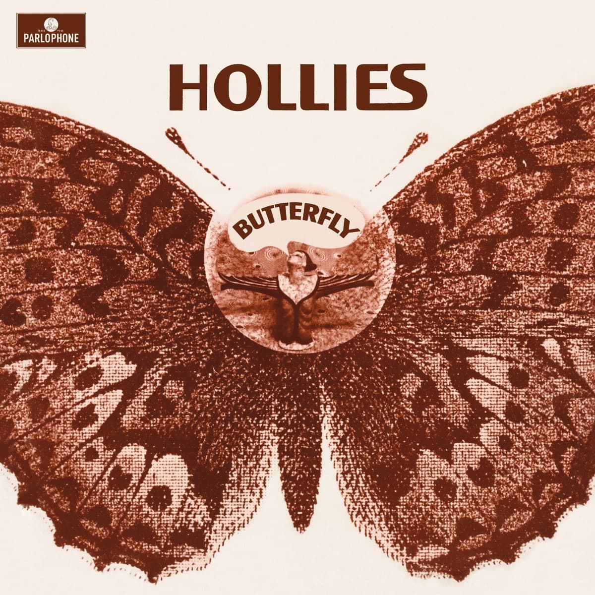
The 1967 British sleeve is dominated by a large, ornate butterfly, its wings opened into a nearly symmetrical field of pattern and color. There is no conventional group portrait competing for attention. For a band that had spent years being sold through recognizable faces and immaculate pop presentation, the decision feels like a quiet declaration: the record's imagined world matters more than the personalities making it.
That makes sense for the music. Butterfly was the Hollies' second album of 1967 and the last new studio album to feature Graham Nash before he left the group. Nash was pushing toward experimentation, and the record contains some of the band's most overtly psychedelic writing and production.
Unlike Evolution, whose construction has been described in detail by photographer Karl Ferris, the authorship of Butterfly's original UK artwork is not as securely documented in the public sources reviewed for this entry. That uncertainty is worth preserving rather than filling the credit box with a familiar psychedelic name. The Hollies' official archive confirms the original artwork and the album's place in the catalogue, but a reliable primary credit for the sleeve's illustrator or designer has not surfaced in the material used here.
What can be read directly is the design itself. The butterfly gives the cover a natural center and an almost heraldic symmetry, but its interior patterning pushes it away from scientific illustration. It is less an insect pinned for study than an emblem from the imaginary landscape of the songs.
There is also a useful contrast with what happened in North America. Epic did not simply issue the British album unchanged. The US and Canadian configuration appeared as Dear Eloise / King Midas in Reverse, with a different track selection and different artwork. That means the butterfly image belongs specifically to the identity of the original British album rather than to every 1967 version of this material.
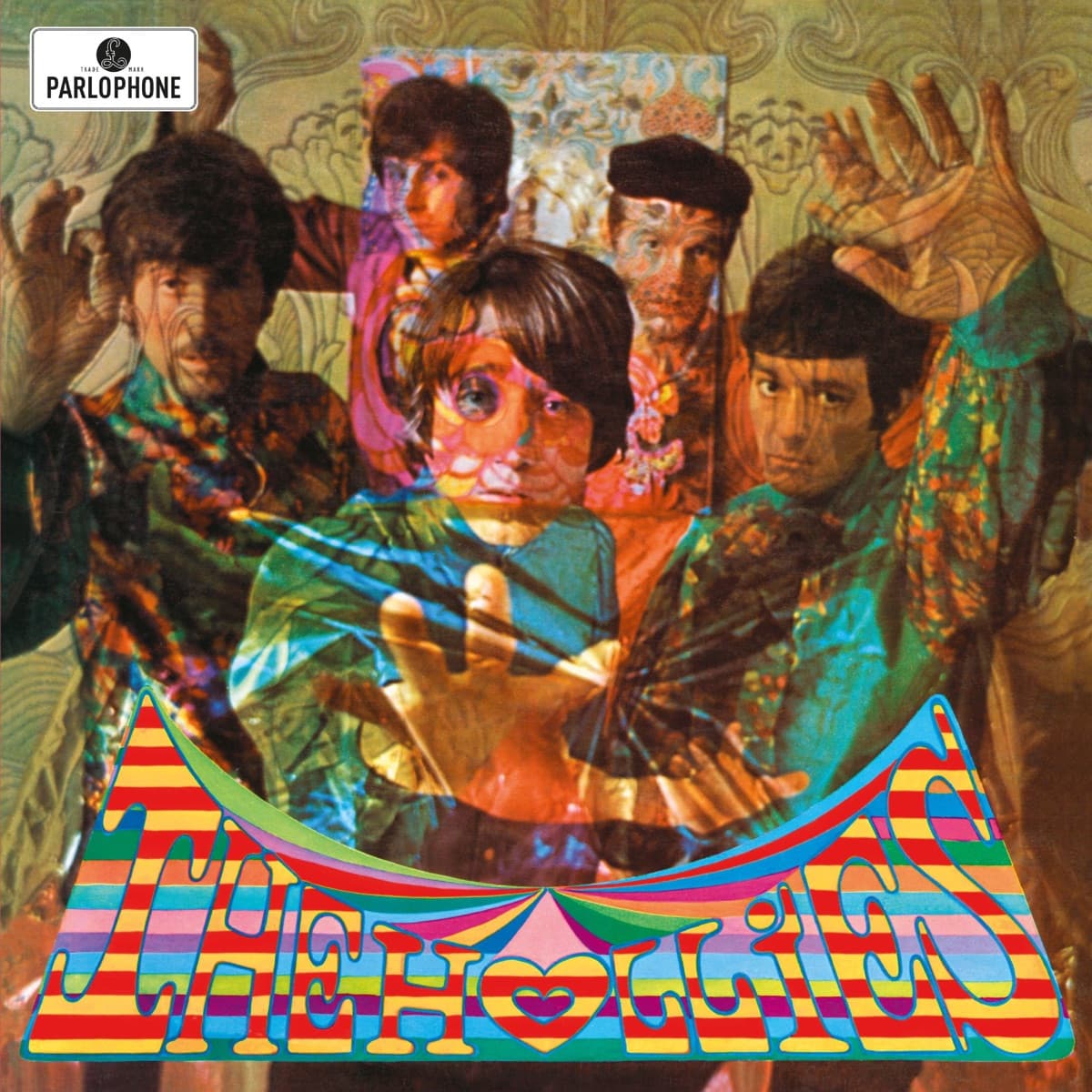
Seen beside Evolution, the two UK sleeves make a striking pair. Evolution shows the Hollies in the act of crossing into psychedelia. Butterfly shows what might be on the other side: the band members have vanished and a symbolic creature has taken over the square.
Within a year, Nash would be gone too. That gives the cover an accidental poignancy it did not need to announce in 1967. The image was built for transformation; the group itself was about to transform.
Inside the design
Butterfly does not announce psychedelia by photographing the Hollies in psychedelic clothes. It lets the image itself become the transformation.
A large butterfly dominates the sleeve, its patterned wings creating a symmetrical field around the title and group name. That symmetry gives the cover an almost emblematic quality: less like a band portrait than a sign or specimen enlarged until it becomes a world.
The absence of a conventional group photograph is significant after Evolution, where the Hollies were visibly pushing through layers of plastic, pattern and color. Butterfly goes a step further and allows the metaphor to replace the musicians entirely.
That makes the title do visual work. A butterfly is an obvious symbol of transformation, but here it also suits the album's increasingly dreamlike songwriting. The image is decorative without needing to describe any individual song.
Symmetry provides order inside the psychedelic surface. Rather than asking the eye to wander through an uncontrolled collage, the wings create a strong central structure. Ornament can become elaborate without the composition losing its balance.
That distinction matters because psychedelic design is often remembered as pure visual overload. Butterfly demonstrates another route: one recognizable natural form can organize the entire sleeve while still supporting fantasy and decorative excess.
The strongest choice is restraint. Rather than cram every psychedelic device onto the sleeve, the design organizes its strangeness around one recognizable form.
And because the musicians themselves are absent from the front, the buyer encounters the album as an image before encountering it as a celebrity product. That is a significant change from the visual expectations surrounding an established pop group.
Why it matters
Butterfly is valuable in the Hollies' visual story because it completes a transition that Evolution had dramatized only months earlier.
Evolution showed the band pushing into a psychedelic world. Butterfly no longer needs to show the push. The transformation has become the cover itself.
That progression mirrors what was happening musically as Graham Nash, Allan Clarke and Tony Hicks explored more self-contained and experimental writing. The cover does not turn the Hollies into a different band, but it signals that the clean pop-group portrait is no longer sufficient.
The decision to let an emblem replace the band also changes the relationship between fame and packaging. The Hollies were recognizable stars by 1967. A sleeve could reasonably be expected to capitalize on their faces. Butterfly trusts the title, imagery and established name instead.
That makes the package feel more like a self-contained artistic object and less like promotional photography.
It also gives the album a distinct identity from the alternate North American configuration, Dear Eloise / King Midas in Reverse, which used different artwork and sequencing. For collectors and later listeners, the British Butterfly sleeve is therefore part of understanding the album as its own designed statement rather than merely a container for overlapping songs.
Its importance is not that it invented the butterfly as a psychedelic symbol. It did something subtler: it used an instantly understandable symbol of metamorphosis to make a band's creative transition legible without explaining it in words.
Historical context
Butterfly was released in Britain in November 1967, only months after Evolution.
That short gap matters. Psychedelic pop was changing so quickly that two albums from the same band in the same year could occupy noticeably different visual territory.
The Hollies were also nearing the end of the Graham Nash era. Nash's songwriting ambitions and growing interest in more adventurous studio work were pulling against some of the commercial expectations around the group. Butterfly would become the final Hollies studio album released while he remained a member.
The broader British context was equally volatile. By late 1967, psychedelic imagery had moved rapidly from underground clubs and boutiques into mainstream record shops. Floral forms, Art Nouveau references, elaborate lettering and symbolic imagery were no longer restricted to a small counterculture.
Butterfly belongs to that moment of expansion, but its place in the Hollies catalogue gives it a specific function: it follows Evolution's explicit image of the band breaking through a membrane into psychedelia.
In North America, listeners encountered much of this material differently. Epic issued an alternate album titled Dear Eloise / King Midas in Reverse with a changed running order and different artwork.
The British Butterfly package therefore belongs to a particular version of the Hollies' history. Album sequencing, title and sleeve combine into a statement that was partially dismantled when the material crossed the Atlantic.
That difference is a reminder that in the 1960s an "album" was not always a single global object. Labels could change titles, tracks and covers by territory, leaving later listeners with multiple visual histories for much of the same music.
Legacy & influence
Butterfly has never had the single-image cultural ubiquity of Sgt. Pepper or Disraeli Gears, and there is no reason to pretend otherwise.
Its importance is more intimate. Placed beside Evolution, it shows how quickly the Hollies' visual language changed during 1967. Within months, the band moved from a manipulated group portrait about entering psychedelia to a sleeve that could dispense with the portrait entirely.
The album also became a marker for the end of a lineup. Graham Nash left the Hollies after the group's next phase of recordings, making Butterfly the final studio LP released during his original tenure with the group.
That gives the metamorphosis imagery an accidental retrospective resonance. The sleeve was not designed as an announcement that Nash would leave, and it would be misleading to read it as one. But later history makes an album called Butterfly, wrapped in an image of transformation, feel uncannily placed at the end of a creative chapter.
The differing North American release also affected the cover's afterlife. Listeners who knew the songs through Dear Eloise / King Midas in Reverse did not necessarily share the same visual association, so Butterfly's imagery remained more closely tied to the original British album identity.
For modern viewers, the cover works best as part of a sequence rather than as an isolated claim to iconic status. Evolution depicts the crossing. Butterfly depicts what waits on the other side.
That relationship is valuable for Behind the Covers because it shows how album art can tell a story across releases. The individual sleeve matters, but the change from one sleeve to the next can reveal even more about what a band thought it was becoming.